Ampersand Book Studio Lettered Editions
As those who have been following the development our edition of T.J. Cobden-Sanderson’s The Ideal Book know, telling the story of the creative process is a central element of my vision for Ampersand Book Studio. Not only that, but in sharing the creative process, I benefit from real-time feedback from followers, partners, patrons, and fellow creators. It makes the creative process much more social than it might otherwise be. So, I am pleased to announce that, based on recent conversations, I have decided to use the release of the Vellum Edition of The Ideal Book as a launching pad for Ampersand Lettered Edition of our books.
As some of you know, I had originally planned on producing only twelve copies of the Vellum Edition of The Ideal Book. As a new private press – one that is much more of a passion-project than a commercial enterprise – I thought it best to be conservative in my plans. However, I have been very pleasantly surprised by the initial interest in the Vellum Edition. So, I thought to double the edition size to 24 – still a quite modest number, but one which will allow more lovers of The Ideal Book to have the full experience of a facsimile of the original. When I shared these plans in the LibraryThing Fine Press Forum, there seemed to be understanding and support for the modest expansion of the edition size. But you all took it further, suggesting that, rather than offering 24 copies, I should offer 26 copies and letter them. What a brilliant idea! I know this is in no way unheard of in the Fine Press world, but it never even crossed my mind. This is a perfect example of why I share the creative process, seeking input along the way.
Rather than the “normal” lettered editions offered by some other presses, I have decided to use this as an opportunity to begin offering the Ampersand Lettered Edition of 27 copies. “Wait! 27?!?” I hear people ask. Yes. 27.
The TL;DR version is that for much of the 18th and 19th centuries in the U.S. and England, the ampersand was actually taught as the 27th letter of the alphabet, following the Z. And given the name of our small press, it just makes sense that our lettered edition include 27 copies.
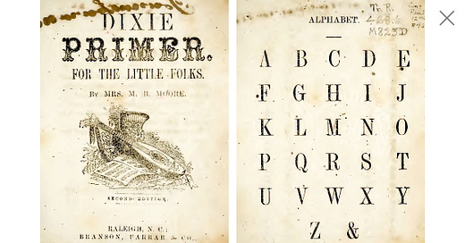
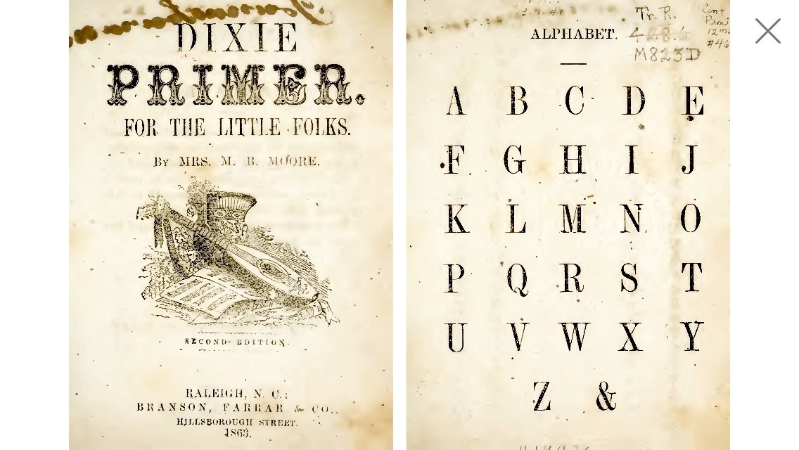
This 1863 educational booklet is just one of many such resources used for teaching the 27-letter alphabet.
Even the word “ampersand” emerged from when children would recite the alphabet aloud, concluding with “x, y, z, and per-se and.” By 1905, the many variations of this were documented in L.E. Horning’s A Dictionary of Slang and Colloquial English:
Ampersand… 2. the sign &. Variants: And-pussy-and : ann passy ann : and-passy : an-parse : aper-sie : per-se : am¬passy : am-passy-ana : am-pene-and : am-pus-and : am pussy and : am-pazad : am-siam : am-pus-end : ap-perse-and : em¬per-siand : am-perzed : zumzy-zan”
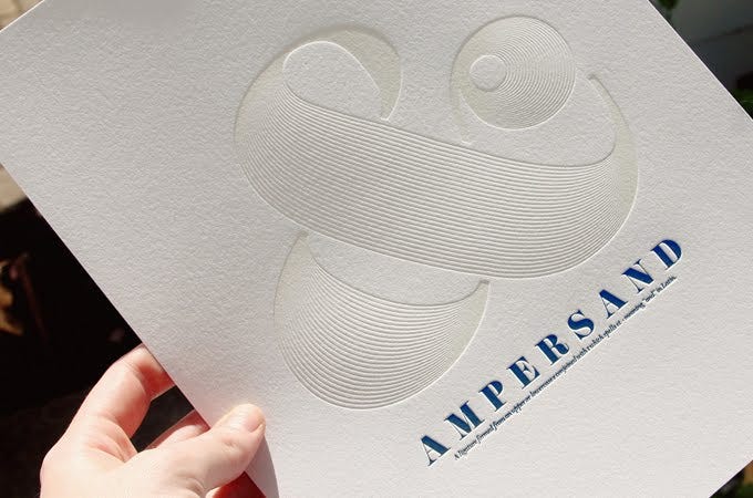
So… here is the working draft of the new colophon that will be used exclusively in the Ampersand Lettered Edition:
A draft of the colophon to be used exclusively in the Ampersand Lettered Edition.
For those interested in the whole journey – what the ampersand represents to me, its fascinating history, and the ways in which it has been a creative force in typography – read on.
What the Ampersand Represents
For our small press, the ampersand symbolizes the bringing together of disparate things. It is inclusive and additive. It is a symbol that unites ideas, cultures, stories, and people. And its expression allows for creativity and diversity.
The book has a similar capacity to unify. Ampersand Book Studio is dedicated to telling diverse stories artfully. Each of our editions – ranging from legends of Indigenous peoples for use by their communities of origin to period-accurate bindings of works of historical fiction – is a passion project which seeks to share stories beautifully.
But how did this literal and figurative symbol come to be? And how has it become the locus for typographical creativity and expression?
Graffiti Under the Volcano
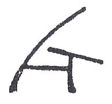
Although Cicero’s scribe, Tiro (?-4BC), used a simple “⁊” as shorthand for the Latin word “et” (or “and” in English), the first recognizable ampersand was found in the ruins of Pompeii. Sometime prior to the volcanic eruption of 79AD, an anonymous graffiti writer hurriedly scrawled a message on a wall, and in his or her haste, merged the “E” and “T” of the word “and” into what would become known as a ligature:
The first ampersand as inscribed on a wall in ancient Pompeii.
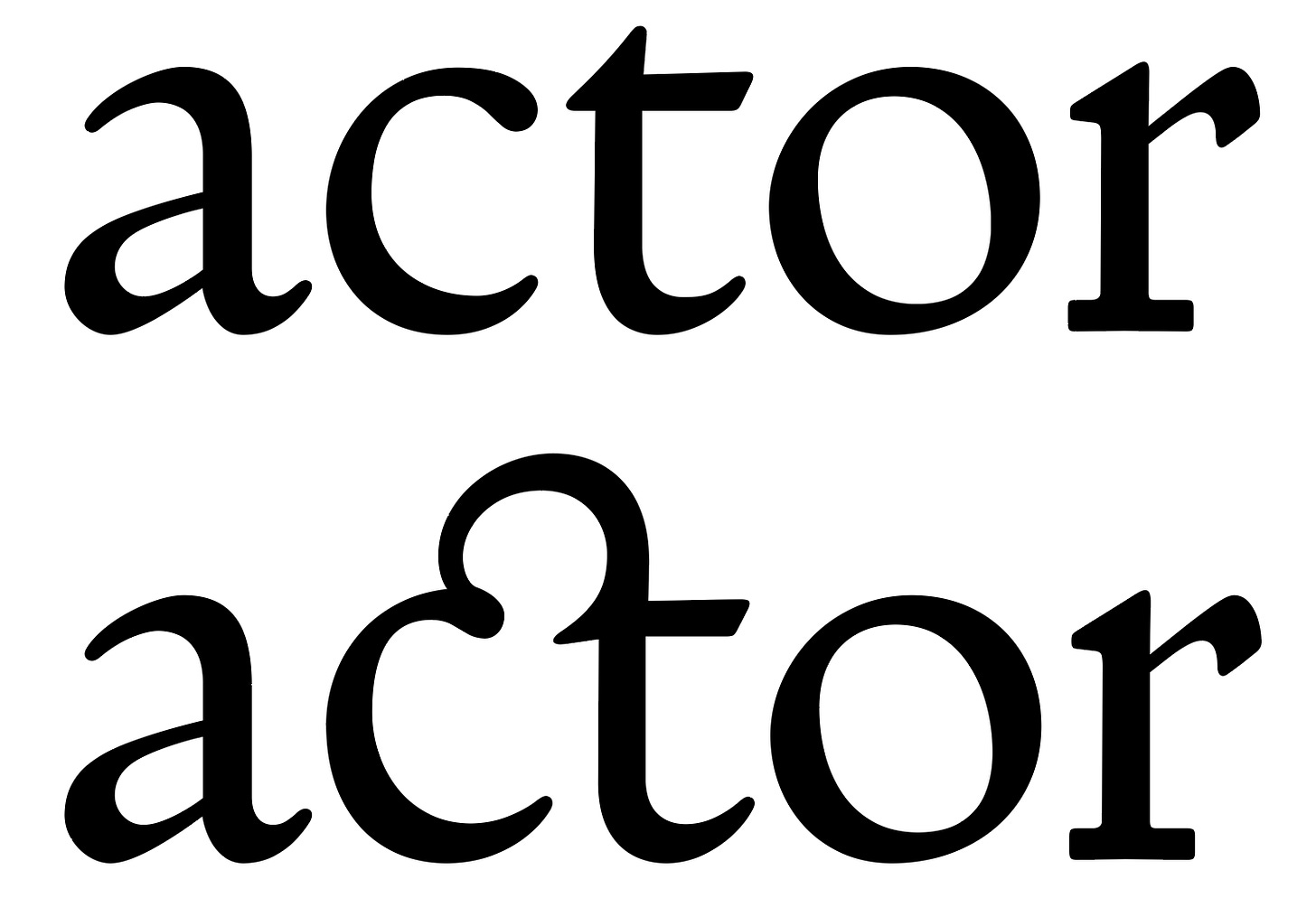
A ligature is a unique combining of two separate letters into a single glyph. It is not hard to see how the separate and basic letters could easily be merged into a single form.
In the top image, a simplified “E” is highlighted. In the bottom image, the “T” is highlighted. Together, they are a ligature of the word “et” or “and.”
A ligature of the “ct” combination in Doves Roman, the typeface developed for and used by Cobden-Sanderson’s Doves Press.
The Evolution of the Ampersand
The “et” ligature became common in writings that use the Roman alphabet. In his wonderful Shady Characters blog, Keith Houston has a three-part examination of the fascinating history of the ampersand. [Unusually for the internet, the comments to the blog are as insightful and interesting as the original article!] There, he annotates this page from Tschichold’s A Brief History of the Ampersand, noting its use in the 7th century Book of Kells (Britain) and in 8th century France.
The most important examination of the history and evolution of the ampersand, Formenwandlungen der &-Zeichen, was published in German in 1953 by Jan Tschichold (1902-1974, typographer, theoretician and teacher). In 2018, -zeug published a remarkable duotone translation/facsimile of Tschichold’s A Brief History of the Ampersand, translated into English and augmented by a type-specimen pamphlet containing 288 examples of the ampersand – many of which were newly created for this edition.

Why Typographers Love It
As is clear from the lovely -zeug edition, typographers absolutely love the ampersand (and to a lesser degree all glyphs). It allows for a much greater level of freedom and creativity than other letters for two primary reasons. First, the ampersand is most frequently used in places like headings and titles, exactly the context in which you want the type to draw attention. Compared to body text – where any element that stands out interrupts the flow of the reader – headings tend to be short. They are where the type can show off a bit. Even Cobden-Sanderson recognized this, arguing “for the especial beauty of the headings of chapters, capital or initial letters, & so on.” [Interestingly, Cobden-Sanderson also used the ampersand within texts much more than is common today. I suspect that this was a choice of his compositor, J.H. Mason, as it may have helped create more balanced line lengths. But that is purely speculation, and it may have been done under Cobden-Sanderson’s direction.]
Second, all of the other letters actually developed in relation to one another; there are forms and elements that are shared in common… the “m” and “n” are the same vertical line followed by two and one humps, respectively… the “q” is a backward “p” [hence printers were reminded to “mind your ‘p’s and ‘q’s”]… and even the “b” and “d” are essentially up-side-down versions of “p” and “q”. Making these letters too different from one another creates confusion for the reader and is, generally, poor typography.
In the history of our alphabet, the ampersand is a dinosaur.
It should have gone extinct a long time ago, but has survived nonetheless. We use it so frequently that it’s easy to forget its origin as two letters entangled, spelling out a word in Latin. The written forms of Latin had scores of contractions and other marks for abbreviation. All of those marks died alongside the Latin language itself, except for the ampersand. (And much less prominently, the “Rx” symbol we now take to signify pharmaceuticals.)
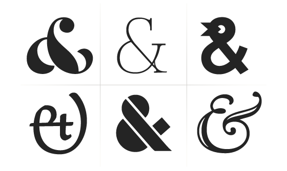
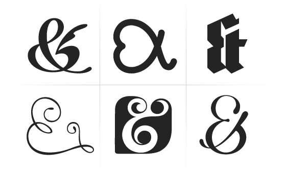
Visually, the ampersand is a loner. Thanks to its convoluted development, it has no relatives among any of the letters. And it has a strange brief to satisfy, operating on the same scale as letters but never being mistaken for one. So the type designer is left to wing it, right from the start. It’s tempting to think that the top bowl will find guidance in the figure eight, or that the diagonals can cribbed off the K or X. It never works out that way.
Usually, letters help to form one another, by setting precedents and providing contexts. But the ampersand doesn’t receive any of that support. That makes it hard to draw, because so many different shapes might look plausible at first. But it also opens an unusually large window for experimentation and risk. It’s how the designer can put on a fireworks show in this one shape, especially in seriffed italics.
In the end, the ampersand is a beautiful and uncooperative creature, one we’re lucky to have inherited.
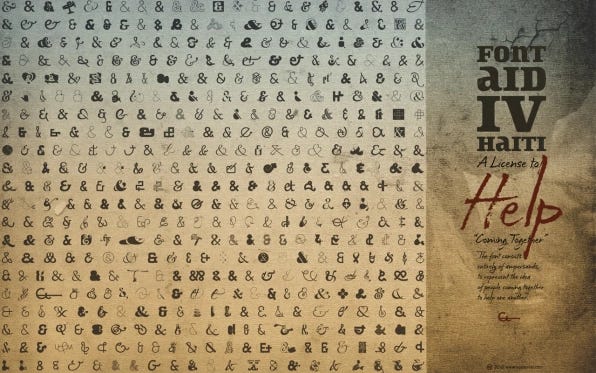
The ampersand has developed its own design language. Or more like its own design Tower of Babel. It allows for creativity and expression. Indeed, as an outlier, it almost demands it. In 2010, the Society of Typographic Aficionados collected more than 400 ampersands into a single font in order to help the humanitarian response to the Haitian earthquake. The resulting font is still available.
Samples from the Coming Together font, made up entirely of ampersands.
Letterpress and the Ampersand
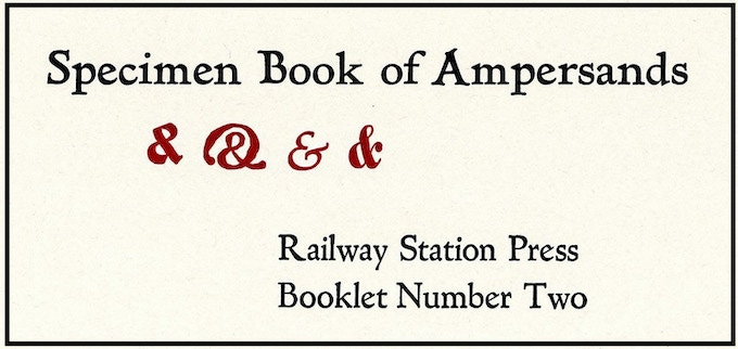
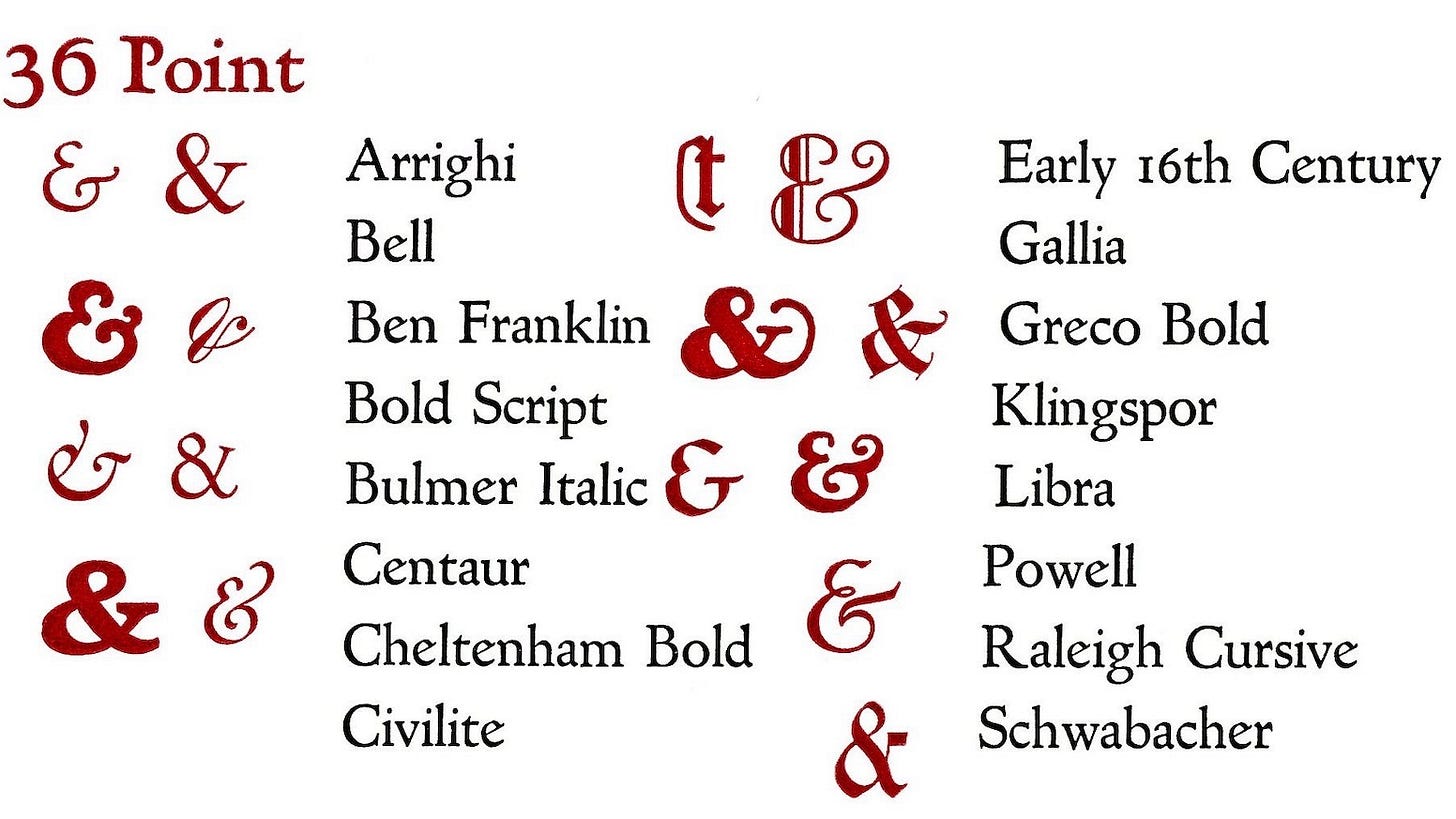
With drawers filled with different typefaces, letterpress studios often had scores of different ampersands. Usually presented only as a part of the broader typeface, in recent years, the ampersand has drawn a bit of attention. Earlier this summer, Railway Station Press completed a Kickstarter campaign to reprint A Letterpress Tribute to the Ampersand and a specimen book of letterpress ampersands.
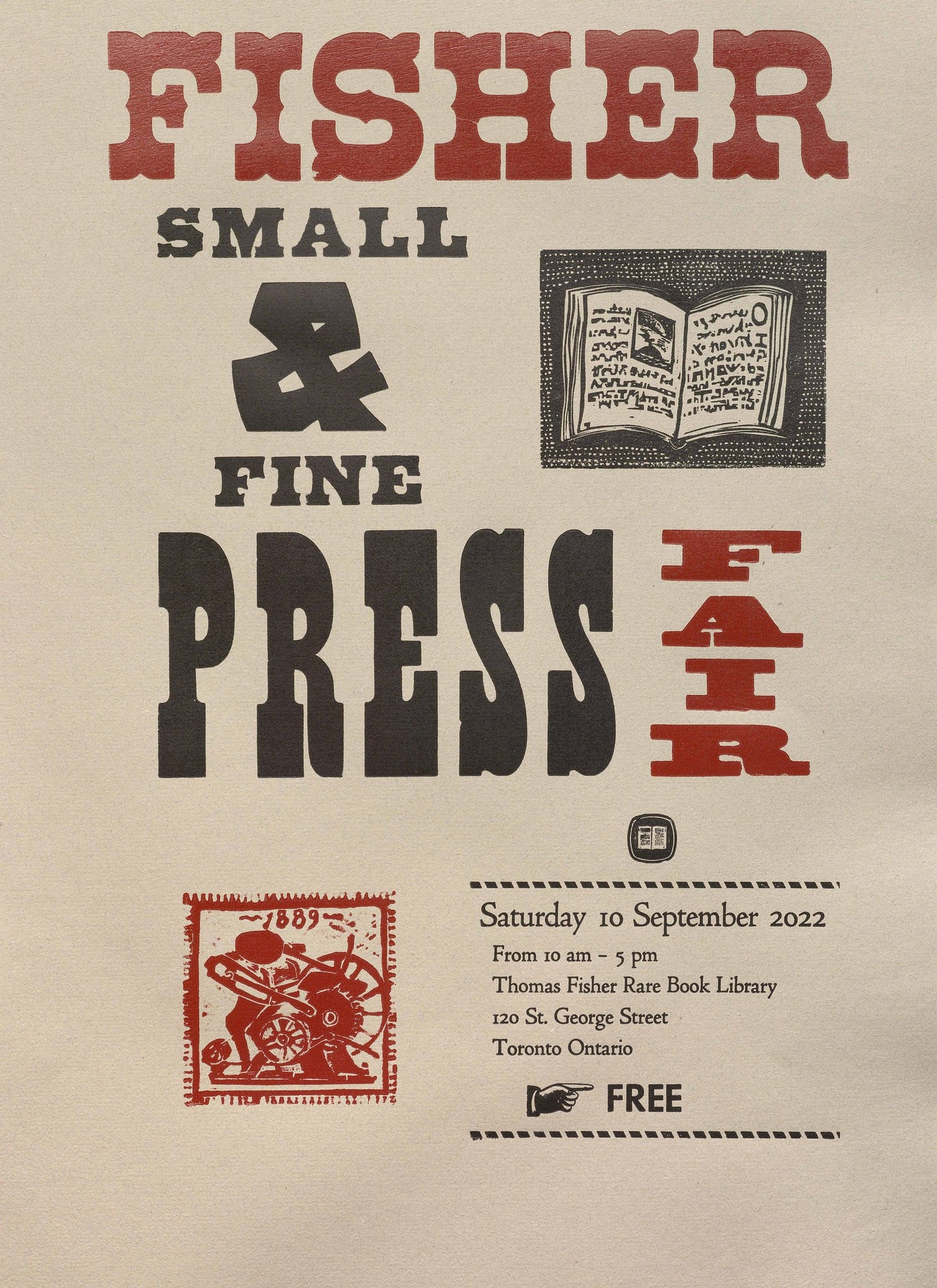
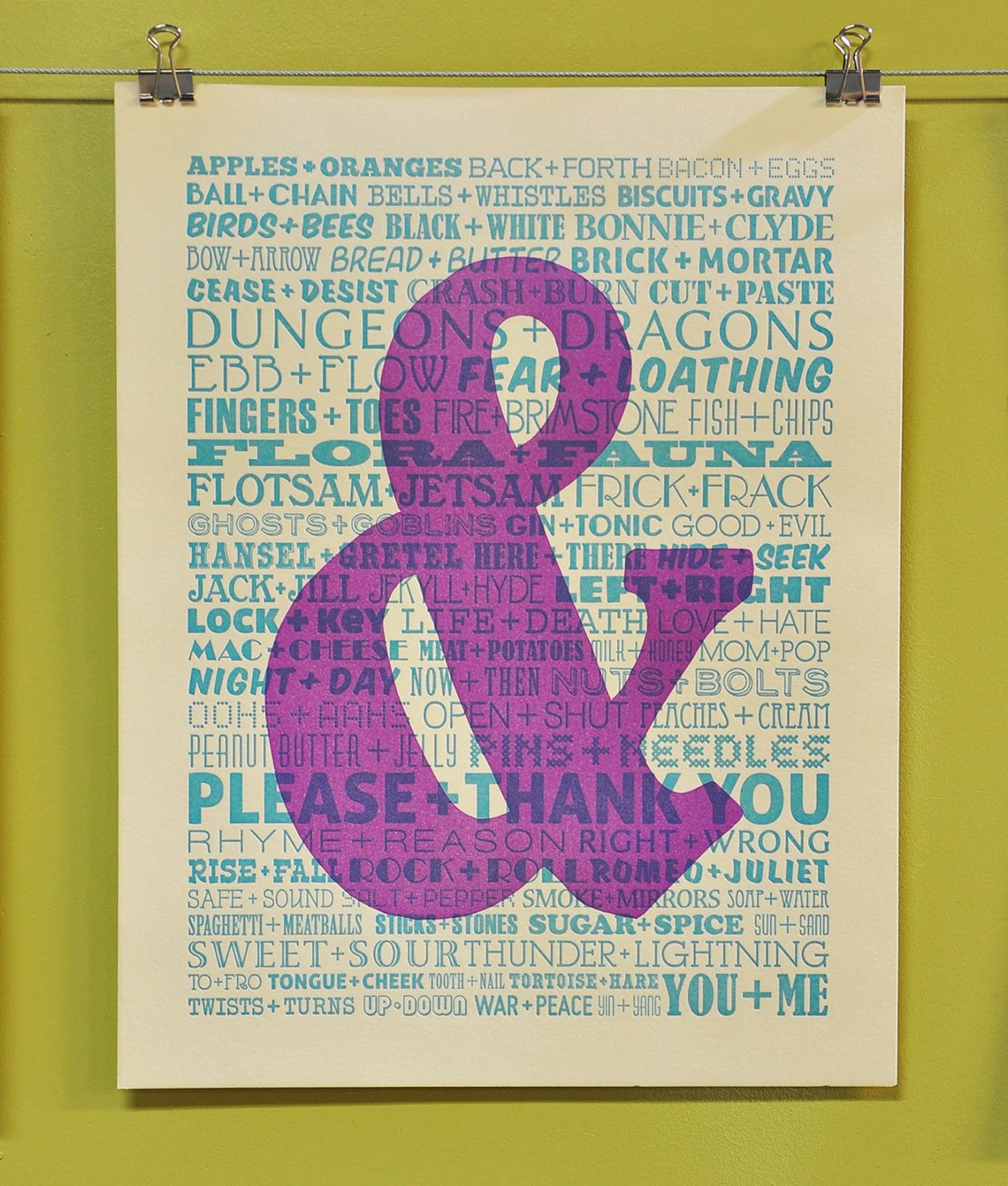
More commonly, however, the ampersand is used as a primary design element in letterpress broadsides and other ephemera…
https://fisher.library.utoronto.ca/news/fisher-small-and-fine-press-fair-2022
Coming Full Circle
Clearly, our connection to the ampersand is philosophical, aesthetic, typographical, literal, and figurative. For me, it just makes sense to offer a 27-copy lettered edition of our publications. I hope you agree.
If you are interested in pre-ordering one of the remaining lettered copies of The Ideal Book, please visit our shop.








Excellent article, Tristan. Thanks for sharing!
https://flic.kr/p/dM3kQt
From the Bauer'sche Gießerei about the &
Maybe I would OCR my hires-scan and translate it via Google.
Carsten.