Edward Johnston & the Especial Beauty of Headings
The Master Calligrapher Who Ties Together Millenia of Typography
Note: This is the second in a series of posts previously shared on the Ampersand Book Studio Patreon page. This post was originally posted on August 16, 2022. Look for a brand new essay – “The” Fine Press Essay: "The Ideal Book" as Imagined by the Fine Press Movement – on Wednesday, September 7.
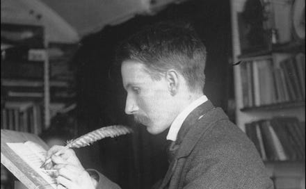
In “The Ideal Book or Book Beautiful,” Cobden-Sanderson had argued “for the especial beauty of the headings of chapters, capital or initial letters, & so on.” To that end, when producing Doves Press masterpieces, he commissioned work by the father of modern calligraphy and typography, Edward Johnston (1872-1944).
https://upload.wikimedia.org/wikipedia/commons/5/5a/Edward_Johnston.png
Born in Uruguay to a Scottish military officer father and abolitionist mother, Johnston returned to England as a child. After a brief time studying medicine in Edinburgh, Johnston discovered a passion for type and calligraphy. Having studied medieval manuscripts at the British Museum and developed his own distinctive style, he began working on commissioned projects, including those offered by Cobden-Sanderson and The Doves Press.
THE DOVES PRESS EDITIONS
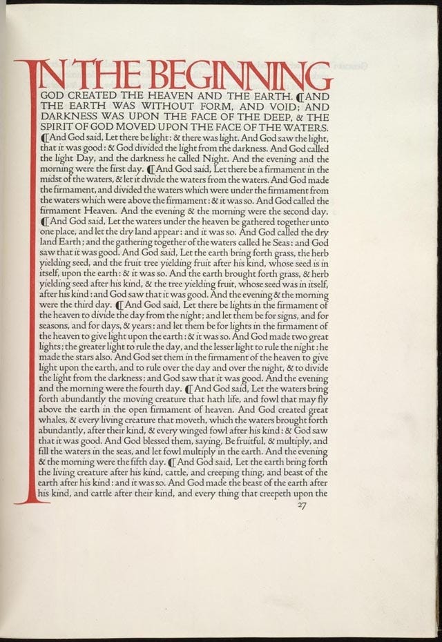
The two most notable Doves Press editions featuring the work of Johnston are the opening pages of Paradise Lost(1902) and The Bible (1902-1905). For these works, Johnston’s decorative work both created visual impact and provided a frame for the remaining text on the page. Indeed, these two pages are among the most famous in the history of printing in the English language.
JOHNSTON'S THEORY & PRACTICE
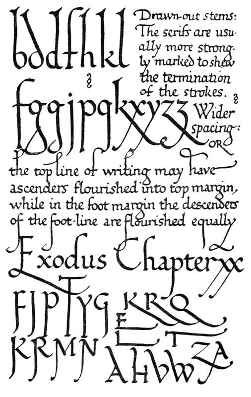
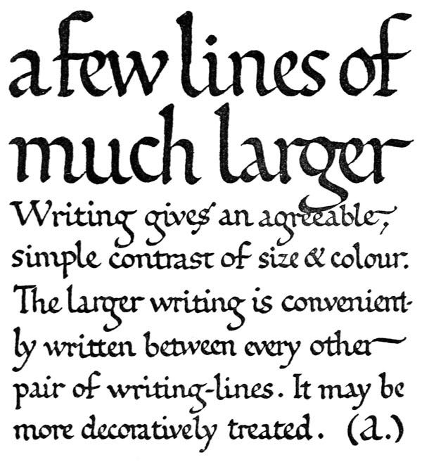
A few years after the release of these The Doves Press editions, Johnston published his magnum opus, Writing & Illuminating, and Lettering (1906), in which he explores the philosophy and practice of the hand-drawn letter.
In it, it is possible to see his “why” behind the designs he had used for The Doves Press, such as the use of extended or “drawn-out stems” and the mixing of different sizes and colors of text at the start of chapters...
JOHNSTON'S MODERN MOVE: THE UNDERGROUND
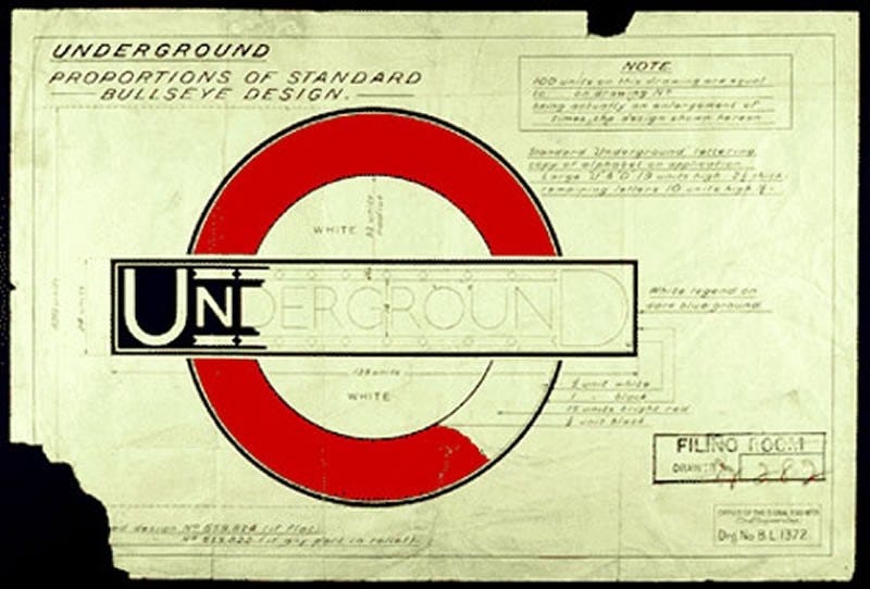
Despite a focus on calligraphy based in medieval manuscripts, today, Johntson may be best known for his work creating one of the most iconic, modern type designs of the 20th century. In 1913, he was tasked with helping brand the growing London Underground. His new sans serif typeface – and the circle-and-bar logo he also designed – was a radical departure from more ornate, neo-gothic calligraphy, capturing the modern spirit of one of the world’s great transportation systems.
Edward Johnston’s notes http://hogd.pbworks.com/w/page/18698601/f/roundel.jpg
Johnston Typeface (https://pocketbookuk.files.wordpress.com/2015/08/johnstonmerge.jpg)
https://stoneletters.files.wordpress.com/2012/03/ed-johnston_0001.jpg
THE TYPEFACE OF THE 20TH CENTURY: JOHNSTON'S UNDERGROUND, NOT GILL SANS
Johnston’s new typeface had a profound influence on many of the most important typographers of the 20th century. Gill Sans – one of the most used typefaces in the world, and a font that appears in the menus of virtually every computer for the last 30 years – was derived from Johnston’s Underground typeface. Indeed, Eric Gill, who licensed Gill Sans to the Monotype company in 1928, acknowledged this in a letter to Johnston:
“I hope you realise that I take every opportunity of proclaiming the fact that what the Monotype people call Gill Sans owes all its goodness to your Underground letter. It is not altogether my fault that the exaggerated publicity value of my name makes the advertising world keen to call it by the name of Gill.”
Given the derivative nature of Gill Sans – as well as the posthumous revelations about Eric Gill’s history of pedophilia and incest – it might be high time to rename this classic 20th century typeface after its true originator, Edward Johnston. Or better yet, start using the Underground font, a modern recreation of the Johnston original produced by P22 Type Foundry.
"FORSAKING HIS STANDARD OF THE ROMAN ALPHABET"?
Not everyone was happy with Johnston's departure from the more classical style. Johnston’s pupil, Graily Hewitt – a well-known calligrapher and novelist of the time – wrote of the new Underground typeface:
"In Johnston I have lost confidence. Despite all he did for us…he has undone too much by forsaking his standard of the Roman alphabet, giving the world, without safeguard or explanation, his block letters which disfigure our modern life. His prestige has obscured their vulgarity and commercialism."
Hewitt’s assessment, however, fails to see the connections between Johnston’s early work and that of this new, modern typeface. In developing the Underground type, Johnston actually returned to what he thought was the most pure letterforms of all time: the inscription on Trajan’s Column (AD 113). Indeed, when asked to list his accomplishments for the publisher of Who’s Who many years later, he simply noted, “Studied pen shapes of letters in early MSS, British Museum, 1898-99. Teacher of the first classes in formal penmanship and lettering, LCC Central School, 1899-1912. Designed block letters based on classical Roman capital proportions (for London Electric Railways).” [Emphasis added.]
Johnston's original notes on the Underground typeface (Victoria and Albert Museum)
As The Guardian noted in 2016, “The resulting typeface, now known as Johnston, took the Roman capital and stripped it right back, creating something that felt at once timeless and radically modern."(https://www.theguardian.com/artanddesign/2016/mar/10/edward-johnston-london-underground-typeface-100-years-ditchling-sussex-eric-gill)
The Ampersand "Ideal Book" Broadside
Clearly, the Ampersand Book Studio letterpress broadside owes at least as much to the typographic work of Edward Johnston as it does to the words of T.J. Cobden-Sanderson. To learn more about how we actually went about creating a new layout reminiscent of Johnston’s work for The Doves Press, check out The Ideal Book Broadside, Part III: Creating A New "Johnston".
Remember, the limited edition broadside is available for sale on the Ampersand Book Studio website: ampersandbookstudio.com.

