Thanks to everyone who has supported our Kickstarter campaign for our fine press edition of Patrick O’Brian’s Master and Commander. If you are new to our Substack, welcome aboard! And to our old shipmates, it is wonderful to sail with you again.
Here on Substack, I write essays related to our current project. I love stories and histories, and writing helps me clarify my design choices and book creation processes. And, as Patrick O’Brian’s Aubrey/Maturin series is one of my all-time favorite reads, I may also indulge in a bit of sea-faring discussion as well.
Endpaper Design
One of the places in a book where a design can “show away” is in the endpapers, the two decorative pages at the very beginning and ending of the book. Playing an important structural role in the book, they also serve as the reader’s first experience of what lies between the covers. They have the capacity to go beyond the merely decorative, introducing the reader to the tone and content of the pages to follow. In her paean to the the artform, “The Unsung Delight of a Well-Designed Endpaper,” Sarah Laskow writes,
“when you open a book, an endpaper is the first secret hiding in between the covers, and a good one can deliver a jolt of wonder… Endpapers are often overlooked—an over-eager reader can breeze by even the most striking—but they’re an art form with a history all their own. For centuries, designers have taken the formal necessity of joining a book’s pages to its cover and turned it into an opportunity for creativity.”
From the 15th-18th centuries, books were entirely made by hand, as were their endpapers. Although they varied by region and even between individual bookbinders, by far, the most common decorative endpapers of the early printed book were made of hand-marbled paper with other options such as paste papers being less common. Usually produced in-house or locally, these papers were beautiful, albeit without any illustrative or thematic connection to the book’s contents.

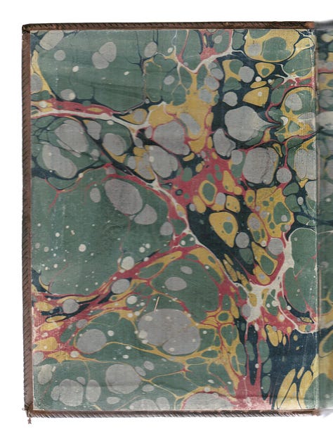
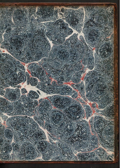
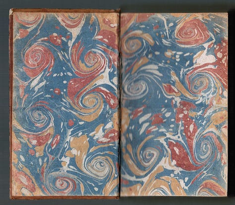

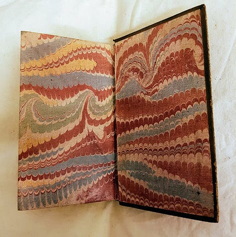
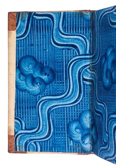
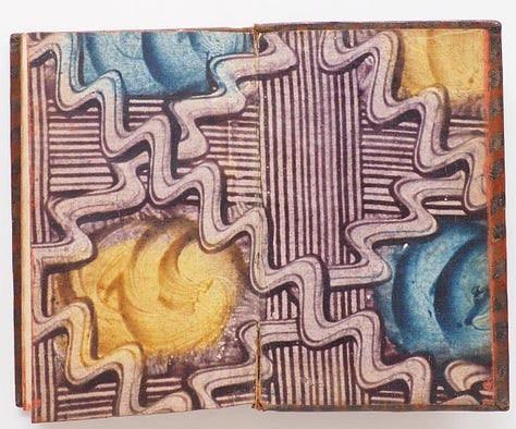
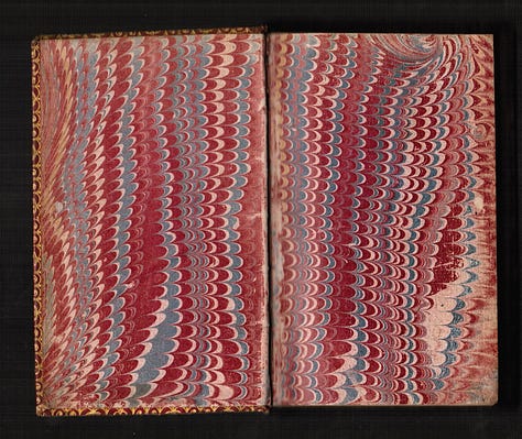
One of the themes of Patrick O’Brian’s work is that of the transition from an old world to a new “modern” one. When Master and Commander begins, modernity had not yet fully arrived in the Royal Navy nor in the book publishing world. But change was in the wind. In A Companion to the History of the Book, Rob Banham observes that “in 1800,” – the same year that our literary friends meet, “books were still bound by hand, usually after being sold to the bookseller or private individual as flat sheets or in paper-covered boards which were not intended to be durable. By the end of the century, all the various aspects of bookbinding had been mechanized and most books were sold bound.”
With industrialization came massive changes to book production. By the end of the 19th century, machinery had been developed to fold and gather sheets, stitch or staple them together, and apply glue to the spines. As Banham notes, steam engines often powered belts and pulleys in binderies, making book creation an industrial production more than a skilled craft. There also developed a sharp division of labor within the binding process: the folding, sewing, and gluing of the text block (i.e., inside of the book) was a completely separate process from the making of the cover or case. The thing that literally connected the two? Endpapers. They are sheets bound as a part of the text block and glued to the cover of the book. To this day, this process of “casing in” – the securing the cover to the bound pages by gluing the endpapers to the covers – is still all that holds many hardcover books together.
Although I will explore book structure – and how the handmade process we use in our edition of Master and Commander is superior to this industrialized process – in a future post, industrialization had at least one benefit relevant to our endpaper story: new printing processes and presses made it efficient to print decorative endpapers, rather than make them by hand. Although this change had its drawbacks – such as the decline of the lovely craft of hand marbling – it did open up possibilities for endpaper design. By the early 20th century, figurative designs in the form of illustrations, patterns, maps, and other printed images became ubiquitous.
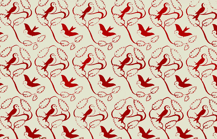
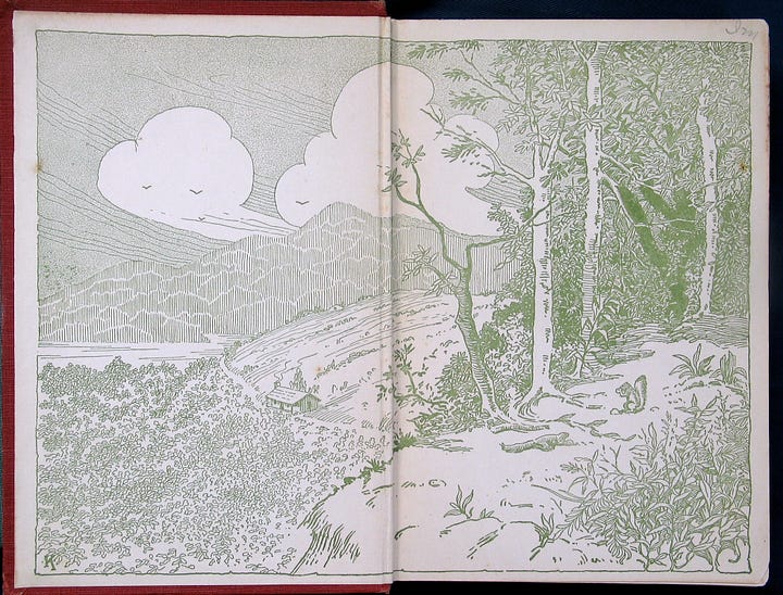
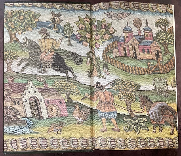
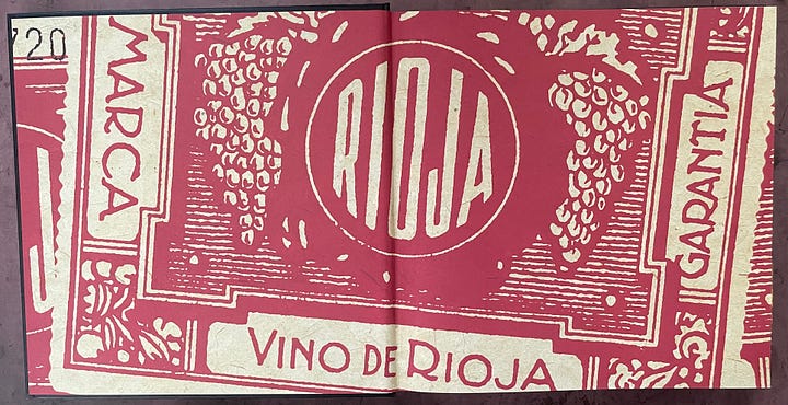
Although such wonderfully imaged endpapers have largely fallen by the wayside over the past 50 years, I am sure that all of us have at least one memory of opening the cover of a book to experience the “jolt of wonder” to which Sarah Laskow referred. Printed endpapers can frame the text to follow, illustrating the contents, visually expressing a theme or mood, contextualizing the content, and more. It is into that tradition and within this context that we began to reflect on the endpapers of our edition of Master and Commander.
Maps as Endpapers: A Natural Choice
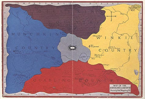
Given their aesthetic importance, and the opportunity for expression they afford, endpaper design was one of the first priorities in planning our edition of Master and Commander. Historically, Stephen Maturin’s literary world would have been populated with books featuring marbled endpapers. I knew I wanted to use marbled paper for the covers, as was also common. For the endpapers, however, I wanted to invite readers into the world of Master and Commander. The natural choice seemed to be a map. Whether real or imagined, a map can help the design provide a visual entry-point to the world of the book. Some really important books of the late 19th and early 20th century have used maps as the introduction of a book’s world. Although used frequently in children’s books – including classics such as The House at Pooh Corner (1928) and The Wizard of Oz (1908) – they have also been used extensively in books on travel and history.
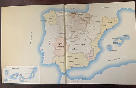

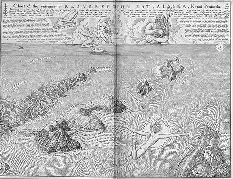
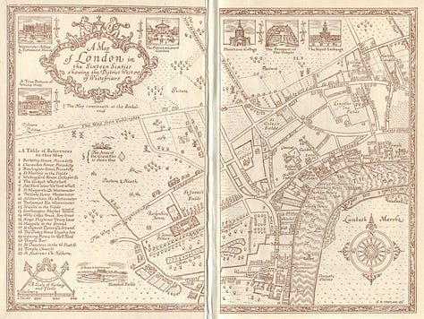


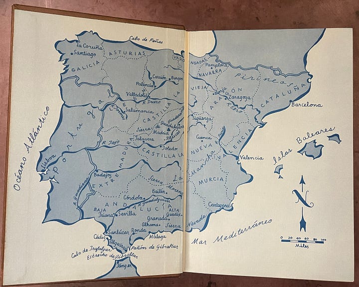
Finding a map of Mahon, a harbor and town in Minorca, quickly became a goal. Not only was Mahon the home port of HMS Sophie, Jack’s first command, perhaps more importantly, it serves as the geographical genesis of the Aubrey/Maturin friendship and the setting for much of Master and Commander. A map of Mahon, then, seemed like the natural foundation for our endpaper.
I just love maps. I even worked in a map and travel book store when in graduate school (pre-google maps and Siri, of course). Maps can be beautiful and informative. They can guide our journeys, whether they be of the imagination or to an actual destination. They can show us the world as it is, as we want it to be, or how we want others to think of it. They can tell the truth or lies, sometimes both at the same time. So, I decided to indulge my love of maps and find one appropriate to our volume.
Finding the “right” map for the job, however, proved to be more than a small challenge. It led to making inquiries with rare map dealers, corresponding with the wonderful team of experts at the National Maritime Museum in Greenwich, and scouring the internet. Ultimately, I found the solution in a library here in my desert home.
Maps, of course, have a history far more vast than their use in endpapers, so let’s start with a basic understanding of the maps of the the Georgian era.
All the (Naval) News Fit to Print: Mapping the News
‘Orion was in the rear of the windward division: we lay ninth, with Agamemnon ahead and Minotaur astern, and as we bore down I could see the whole of Collingwood’s division and the enemy’s line clear from the Bucentaure down to the San Juan de Nepomuceno. They lay thus,’ – placing a series of biscuit-crumbs – ‘and these are their frigates . . . No, I will fetch a box of tooth-picks, and cut them in half for the frigates.’
– from The Fortune of War
Throughout the Aubrey/Maturin series, the action of naval engagements is “mapped out” on the dinner table. Biscuits, glasses, even spilled wine serve as markers of everything from enemy ships to a dangerous lee shore. These informal maps serve a vital function of storytelling within the service.
At the other end of the spectrum were the invaluable detailed charts used by the captain and master to navigate the seas. Marked with meridians, lines of longitude and latitude, shoals and currents, depths, and other nautical details, these maps – along with the sextant and the chronometer – made navigation across the globe possible.

In between these two extremes, however, there were the popular or explanatory maps of the Georgian era. In the late 18th and early 19th centuries, the British public voraciously read accounts of the actions of the Royal Navy in far-off places. Newspapers – and most especially in the Naval Chronicle – published first-hand accounts of “engagements” large and small from every corner of the globe, the details of courts martial, naval poetry, a monthly register of naval events, and much more. Indeed, Patrick O’Brian too must have spent countless hours pouring over its pages for inspiration.


What the Naval Chronicle rarely included, however, was maps, and most readers had never seen the coast of Essex, never mind the far-flung shores of the Indies or Mauritius. Thus, there emerged a market for maps – some detailed and accurate, others more, shall we say, imaginative – to help readers make sense of what they read. And where there is a market, there are entrepreneurial people to serve that market.
Most of the popular maps of the era were prepared by engravers rather than cartographers. They were printed in black-and-white in magazines and books or, sometimes, as single sheets. These maps were then often hand-tinted to create a much more useful and attractive tool for understanding the events of the day.
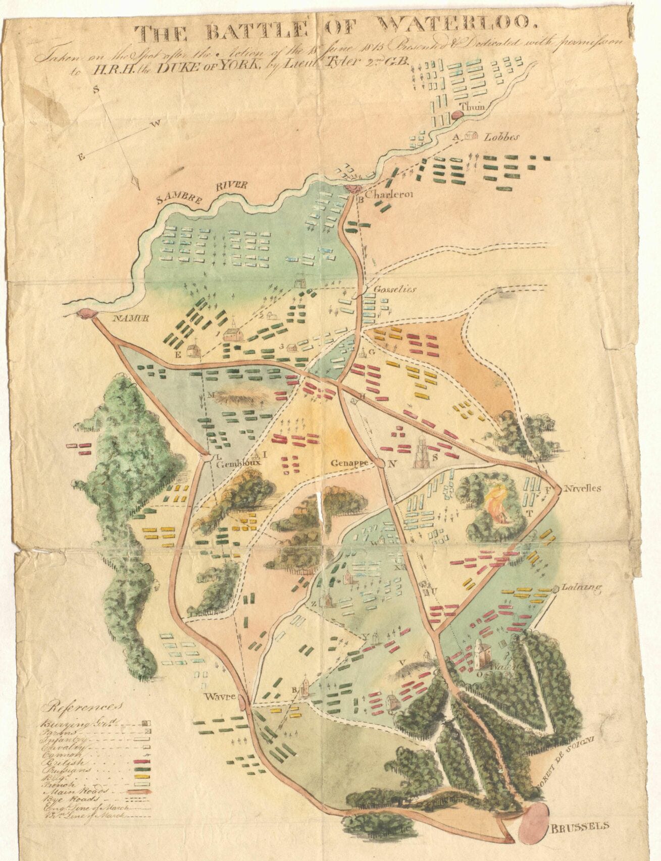
As Stephanie Elizabeth Stillo notes in her article, “Putting the World in Its ‘Proper Colour’ – Exploring Hand-Coloring in Early Modern Maps”: “even in early modern retail settings, where we know a remarkable amount about printing processes and patterns of demand, who exactly applied hand-color is difficult to determine.” Stillo indicates that the results were not always what one might hope, providing an early example:
The Rare Books and Special Collections Division of the Library of Congress holds a fully hand-colored copy of Dutch mapmaker Fredrik de Wit’s late seventeenth-century compiled world atlas. The Library’s copy of the de Wit compilation has a certain clumsy elegance. The hand-coloring throughout the bound atlas is often cumbersome, thick, and uneven. Colors careen into one another at political borders and coastlines, and the brilliance of the cartouches and decorative festoons are often lost on the interior continental features. Nonetheless, the color is faithful, never failing to illuminate relevant features—the hand of a committed, but perhaps not exceptionally skilled, colorist.
If we want to emulate the hand-colored maps of the era of Master and Commander, we needed to start with finding the right map: not too technical, not too fanciful, but a map to set the stage for Jack and Stephen to meet.
A Map of Mahon
In 1800, when our story begins, the Minorcan town of Mahon was a critical British port. Home to much of the Mediterranean fleet, its narrow, deep-water harbor was protected by the Spanish 16th century St. Philip’s Castle, a fortification rebuilt by the British in the 1760s. It was also in this Minorcan town that Jack and Stephen first met: “The music-room in the Governor’s House at Port Mahon, a tall, handsome, pillared octagon, was filled with the triumphant first movement of Locatelli’s C major quartet,” begins the saga. And it was from Mahon that Jack and Stephen first set sail in what would become an epic story.
For our edition, I wanted to find a map that would capture the location of at least some of the action of Master and Commander. An initial online search led me to an 1801 map attributed to London engraver John Cary.
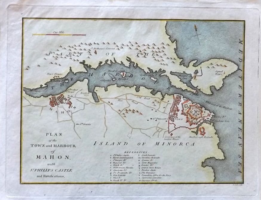
Although an excellent map in many ways, the design requirements of our edition made its relatively square shape less than ideal. Moreover, finding a high resolution version of this map in a public collection proved elusive. Even the wonderful staff at the Royal Museums Greenwich – home to the National Maritime Museum and the Royal Observatory – were unable to locate a copy for us.
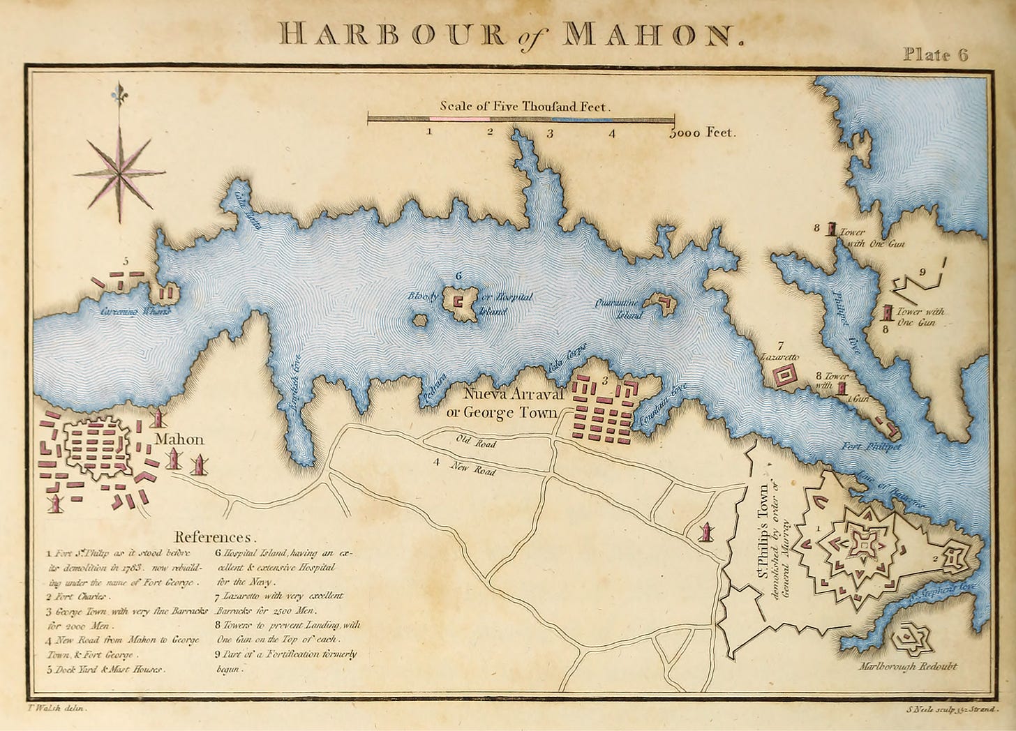
Eventually, I was able to locate a digital version of this 1803 map created by London engraver Samuel John Neele (1752-1824) that seemed to fit the bill:
This map ticked all of the boxes. It is both of the period and much more horizontal than the 1801 Carey map, making it much more useful as a large-sized image designed to spread across the two pages of our book’s endpapers.
Given that my hand-coloring skills are not as good as even the “committed, but perhaps not exceptionally skilled, colorist” of the era, I turned to more modern techniques. Utilizing multiple layers within Adobe Photoshop to create our prototype, I created an effect more than a little reminiscent of hand-colored maps:
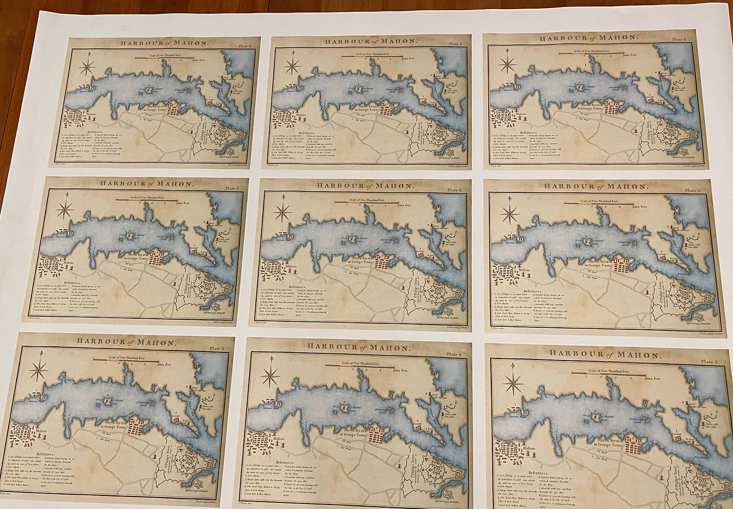
I then worked with Eric Doyle of Betts Printing here in Tucson to produce prototype copies of the map using a large, archival giclée printer:
However, while this Wiki Commons version of the map is fine for online viewing and for prototyping purposes, the available scans found online are not detailed enough for our edition. Fortunately, the wonderful Special Collections of University of Arizona Library is virtually around the corner. To my surprise and delight, they have an original copy of the book in which the map first appears: Journal of the Late Campaign in Egypt (London 1803) by Thomas Walsh.


At least as exciting as finding an original copy of the map was the ability to read Walsh’s first-hand description of Mahon at the time when Jack and Stephen would have met. It certainly helped me better imagine the place of their nascent friendship.
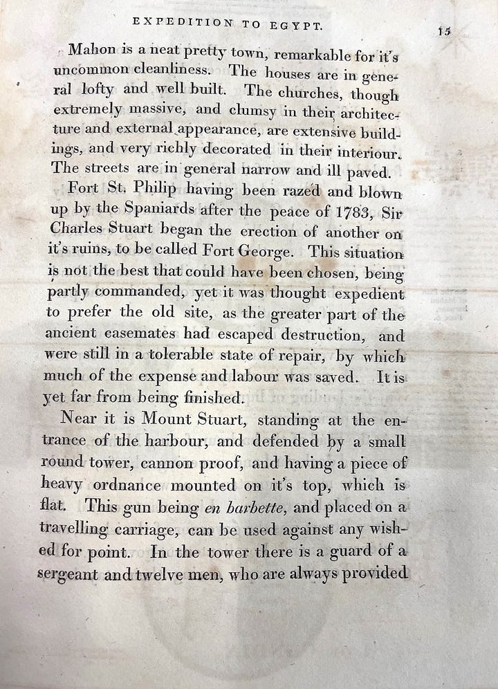

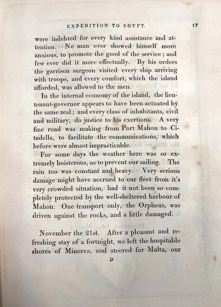
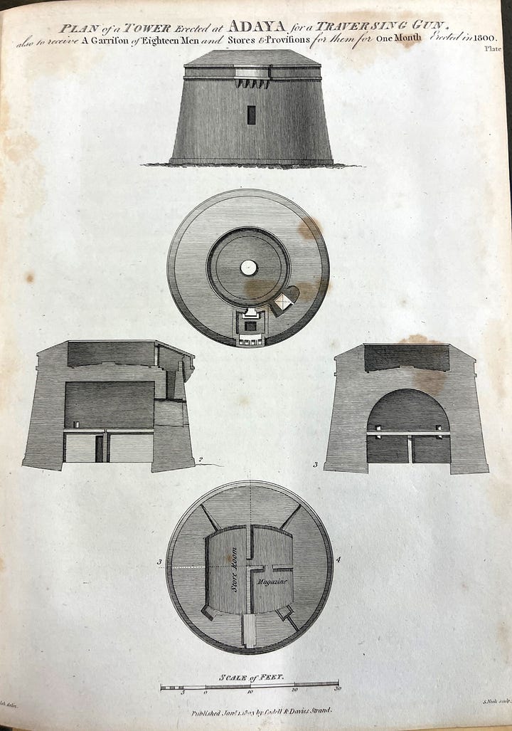
For final production of the endpapers – as well as the giclée print we offer – we are making extremely high-resolution scans that will allow all of the original detail of the map shine to through.
So, what started as a journey across the world (wide web) – with stops in galleries and museum – had me return to my desert home, where the solution to the endpaper conundrum was solved.
From Maps to Text
As we shall see in an upcoming post, Georgian era maps inspire more than the endpapers of our edition of Master and Commander. They also drive much of our unique typographic design. Stay tuned to learn more!


Pretty cool!