
Going Viral
More on the Illustrations for "A Pamflyt Compiled of Cheese"
There has been so much progress to report… and yet, so little energy for writing. A mysterious virus has laid me low for nearly three weeks, including about ten days during which getting out of bed to make coffee seemed to be the height of ambition.
In my next missive, I will share more about the revivification of my 70-year-old Miehle Vertical press in preparation for printing. I will also explore the incredibly exhaustive process of researching, transcribing and proofreading of the Latin passages in the Pamflyt. All of that, however, must await higher energy levels.
In the meantime, here is a quick update from Andy English, who is finishing up the illustrations this week. Here, Andy explores the evolution of his illustration for the section entitled “Of the Difference in Makinge Cheese”:


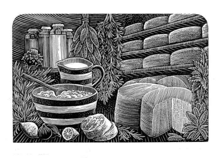
My drawings often start as words in a sketchbook and I draw round them, working out the elements in sketchy pencil. Eventually, I draw over these in ink, adding texture and light. In this case, I was not drawing a single thing - the soft cheeses and hard, matured cheeses are separated and I played with light and surface to keep them from reading as a straightforward view. I often use watercolour washes to separate parts of the design as I did here.
As always, I loved Andy’s design. My only addition was to suggest replacing some of the herbs in the first sketch with thistle. Not only is it a distinctive plant, it has been used throughout history as a plant-based alternative to animal rennet in the making of cheese. Andy continues:


I used the same ink pen to draw on the block, which had already been darkened with diluted fountain pen ink and burnished smooth. The idea is that the block is light enough for me to draw on in ink, but dark enough for me to see the cuts I am making.


You will notice that the engraved lines are guided by the ink lines but do not follow them slavishly. This is where I create - rather than reproduce the drawing exactly. I find that this gives the finished image more life. I proof early so that what I see in the print informs the rest of the engraving. In this case, I only needed three “states” before I was happy with the work, although it sits in the studio so that I can review it before printing final copies and sending the block to the printer.
Here is Andy’s final illustration…


In addition to this illustration, Andy has nearly completed the other illustrations. I am particularly fond of the one for the section on “Of the diversitie of milke used in making cheese in this contreye.” A one-word clue… Camels! However, I think I will keep the remaining illustrations under wraps until the book is complete. There should be a few surprises for the reader.
As my energy is returning, I will share more updates soon…
Happy to have found your article. I love Andy’s work and have a small collection of his books and prints.
I’m sorry to hear about your illness. What a drag. Lovely to see the process of this book as it evolves. Also, I like cheese.