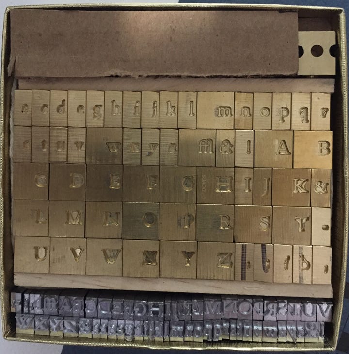
Note: This is the first in a series of posts previously shared on the Ampersand Book Studio Patreon page. This post was originally posted on August 16, 2022. Look for a brand new essay – “The” Fine Press Essay: "The Ideal Book" as Imagined by the Fine Press Movement – on Wednesday, September 7.
Perhaps no single element of the book as physical object – as opposed to the words that make up its content – defines the reader experience more than the typeface. In The Ideal Book or Book Beautiful, T.J. Cobden-Sanderson set forth his theory and practice of type. On the one hand, it was to subordinate itself to the word – "the thing thought" – using its beauty and clarity to simply be a vehicle for effectively and aesthetically conveying the author's words. Yes, as we have discussed in his use of decorative calligraphy, there was a place for "characteristic & restful beauty" in titles and headings. However, text was to be beautiful, yet self-effacing, allowing the words themselves center stage.
For Cobden-Sanderson, this was more than a theoretical exercise. Rather, in establishing his Doves Press, he also sought to create a typeface that was beautiful in and of itself, yet would not overwhelm the text with assertive design. As we shall see, the story of his Doves Roman – created in collaboration with master punch cutter Edward Prince – is one that combines deep historical roots, clear aesthetic vision, conflict, destruction, and, ultimately, a contemporary passion for reclaiming this important part of publishing history.
The First Type: Gutenberg and Blackletter Gothic
When Johannes Gutenberg printed the Bible using the first moveable type, it was an information revolution. His technological innovation was, perhaps, the most important development since the written words appeared in Mesopotamia more than 5,000 years ago. With his press, the word – the book – suddenly became, for the first time, accessible to a much larger audience.
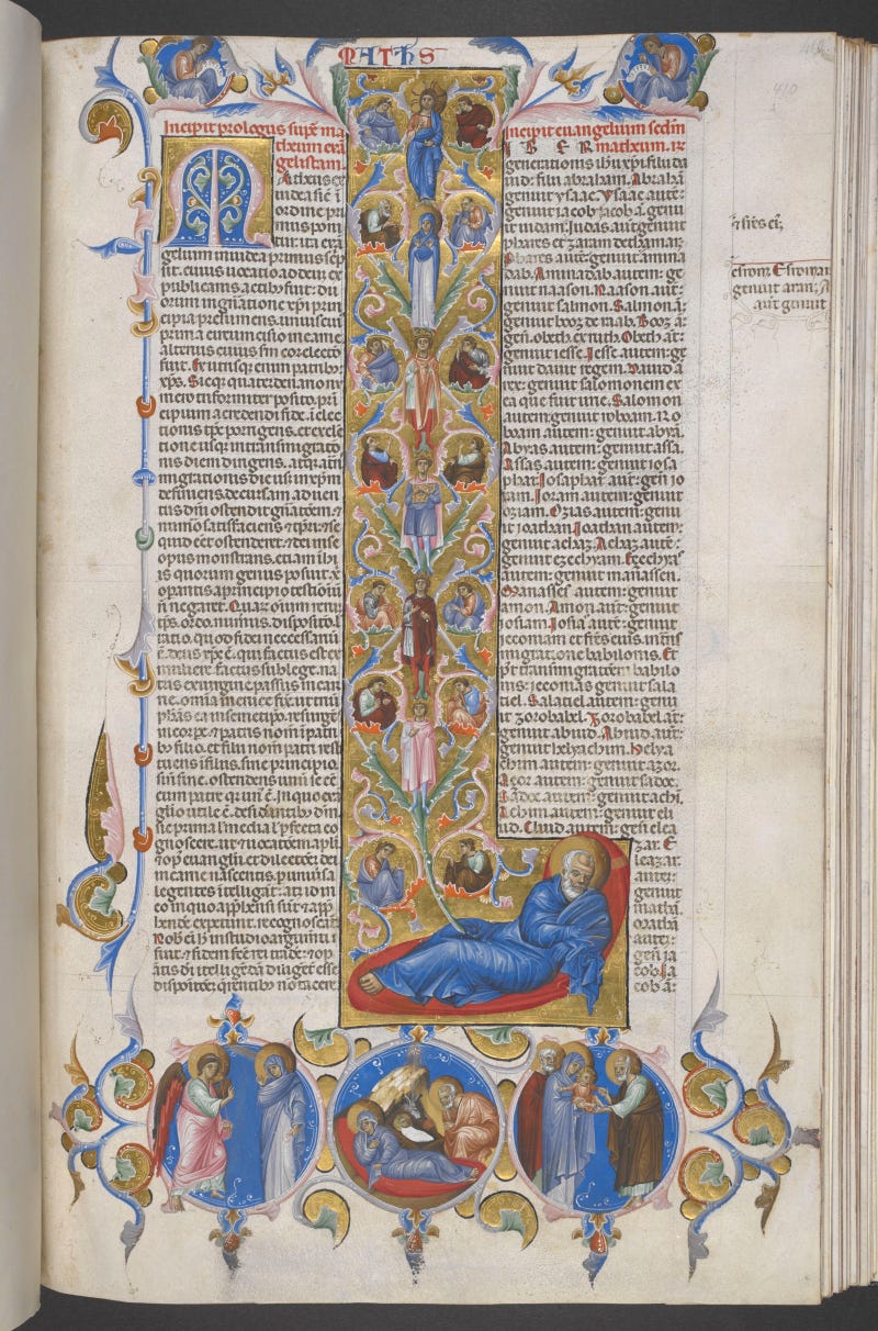
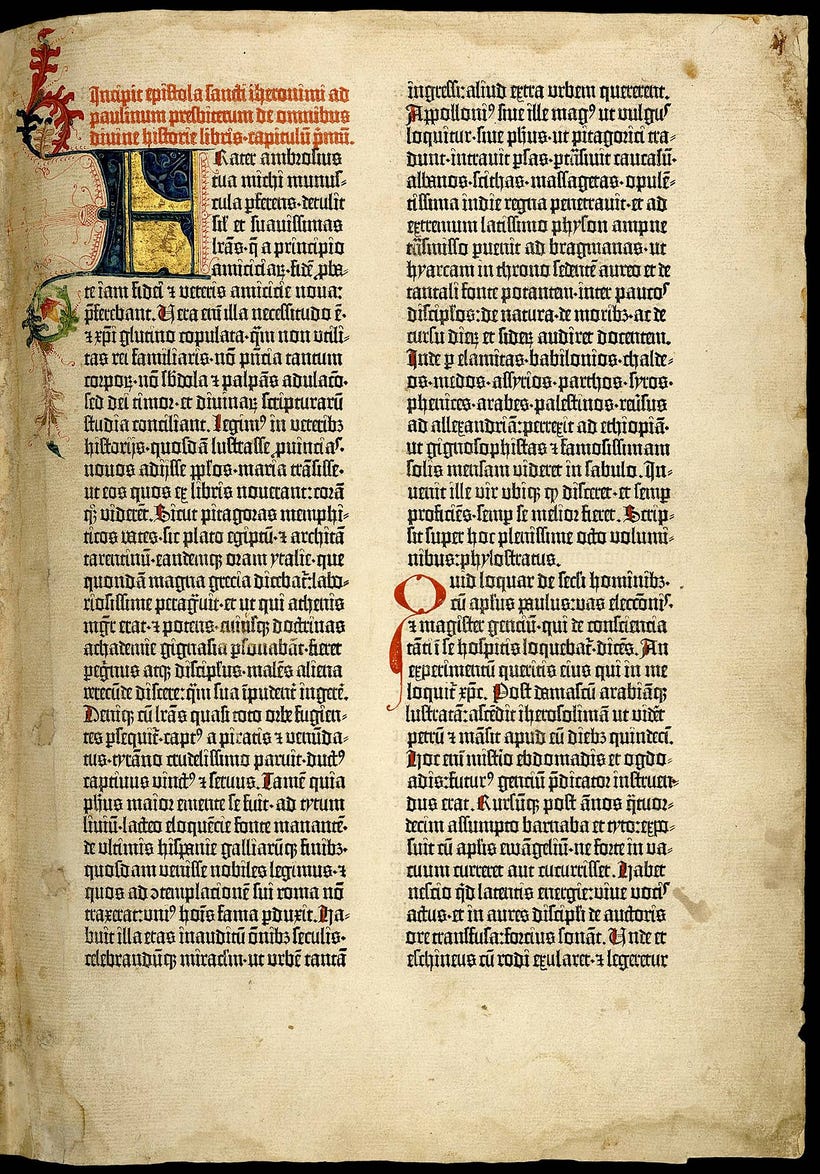
However, Gutenberg's was very much a technical – rather than aesthetic – revolution. As these images of his Bible demonstrate, Gutenberg's moveable type very much resembled that of its hand copied predecessors:
A page from a hand-copied 13th century bible.British Library: https://www.bl.uk/manuscripts/Viewer.aspx?ref=add_ms_18720!2_fs001r
A page from the Gutenberg Bible, produced with moveable type. https://en.wikipedia.org/wiki/Gutenberg_Bible#/media/File:Gutenberg_bible_Old_Testament_Epistle_of_St_Jerome.jpg
In these two examples, the letterforms are very much of the same aesthetic language, what we know as blackletter or gothic type. Both the hand-written and the Gutenberg's printed versions use letterforms that are tall, heavy, sharp, and angular, features common in almost all versions of blackletter forms (see below), features that made hand-copying more uniform and easier to replicate.
https://en.wikipedia.org/wiki/Blackletter#/media/File:Gebrochene_Schriften.svg
While technically revolutionary, Gutenberg's moveable type was aesthetically within a long history of hand-lettered manuscripts. In essence, the earliest metal type was an imitation of handwritten letterforms. However, to our contemporary eye – used to roman rather than gothic letterforms – reading text printed using gothic type is a chore. Within 25 years, that would change with Nicolas Jenson and a few other Italian printers.
Roman Letterforms: Nicolas Jenson’s Aesthetic Revolution
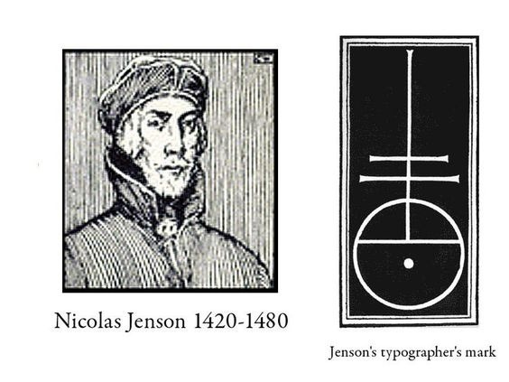
In 1458, just 18 years after Gutenberg's invention of the printing press, the Master of the French Royal Mint, Nicolas Jenson (c. 1420-1480) was sent by King Charles Vii to Mainz, Germany to study the art of metal moveable type. Jenson spent three years learning the technical aspects of creating and printing metal moveable type.
By 1468, Jenson moved to Venice, opening his own printshop in 1470 where he developed and used roman typeforms, based on those of the ancient Roman ruins throughout the region. Although not the first printer to use what we now recognize as roman type, Jenson's letterforms were considered – and still are – among the most proportionate and well-shaped letterforms ever: roman type.
Roman typeforms were originally inspired by those used in ancient Rome and its empire.
Marked by thin lines, contrasts between rounded and linear elements, and serifs (the little projections at the top or bottom of a stroke), Roman inscriptions became the inspiration for Jenson and others. In contrast to gothic type, roman typeforms were balanced, rounded, aesthetically pleasing, and easier to read. They also had the distinct advantage of being more efficient than their blackletter counterparts, allowing the printer to fit many more words onto the page
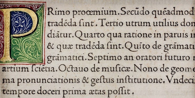
Nicolas Jenson's roman typeface, from a translation 'in Fiorentina' (in Italian) of Pliny the Elder, published in Venice in 1476.
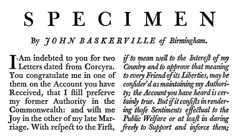
Rather than going into greater depth about Jenson (something done well by others, including Riccardo Olocco), for our purposes, it is sufficient to note that the roman typeforms of Janson would serve as the foundation for most type in subsequent centuries. It was refined, improved and adapted most famously by William Caslon in 1734, John Baskerville (1757), and Giambattista Bodoni (1780s). It also served as the inspiration for the two luminaries of English Arts and Crafts printing: William Morris and his Kelmscott Press, and T.J. Cobden-Sanderson and his Doves Press.
(Re)Creating Roman Type: Kelmscott and Doves
With the Arts and Crafts Movement's emphasis on perfect simplicity, it is not surprising that its major printers would seek to reexamine type. Over the 450 years since Jenson, roman type had become somewhat more ornate, especially in its italic forms:
Morris and Cobden-Sanderson both sought to return to the original source of roman type, Jenson, and create typefaces that would accomplish their aesthetic goals. In 1890, Morris introduced his Golden typeface (see sample below), having closely examined enlarged photos of some of Jenson's original publications. His design was cut into metal by Edward Prince, and it was used in over 100 publications by his Kelmscott Press.
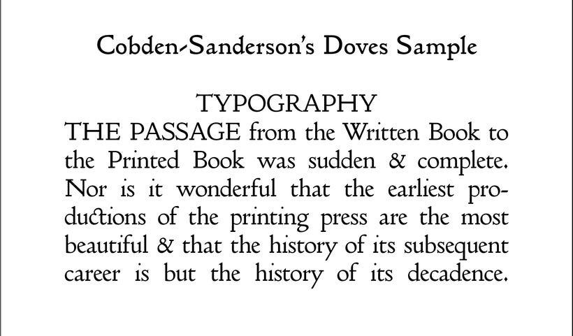
As noted in a previous Patreon post, Cobden-Sanderson viewed Morris' publications as overly ornate and heavy. He even viewed the simplicity of Morris' Golden typeface to be heavy, dark, and unfaithful to Jenson's original. So, in 1899, he commissioned Percy Tiffin to draw and Edward Prince to cut a new typeface that was more faithful to Jenson's original Venetian letterforms. It is lighter and more elegant than the Morris' version, leading to more white space on the page and a pleasing clarity.
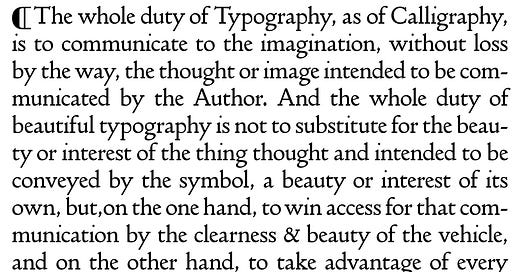
Produced in only one size (16pt.) and without italics or other ornaments (as in Jenson's original), this Doves Roman typeface was used exclusively in publications by the Doves Press, including some of the most iconic editions of the 20th century. In Doves Roman, Cobden-Sanderson achieved his goal of creating a typeface that could "win access for that communication by the clearness & beauty of the vehicle."
The Watery Death & Resurrection of Doves Roman
Despite being used in some of the most important volumes published in the 20th century, Doves Roman was almost lost to history. Between 1913 and 1917 – while embroiled in a bitter dispute with his partner in The Doves Press, Emery Walker – Cobden-Sanderson sought to destroy the typeface entirely. Over the course of dozens of clandestine trips, the aged publisher carried more than a ton of the metal type from the press to Hammersmith Bridge from which he “bequeathed to the river” all of the type used by Doves Press. Dropping the type into the waters of the Thames River was an act that, without original engraved matrices, was irreversible. (For a full accounting of the creation and loss of Doves Roman, I highly recommend Robert Green's Typespec article on the subject). One of the great typefaces of all time was lost forever. Or so we thought.
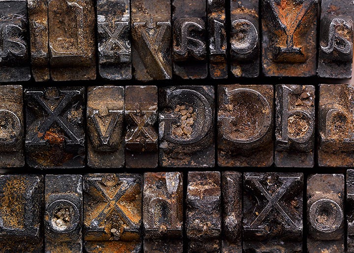
A century later, typographer Robert Green worked with salvage divers from London’s Port Authority to secure 151 of the original metal sorts of Doves Roman. This salvaged type served as the basis for Green's 2015 digitized version of Doves Roman, used in Ampersand Book Studio's art print and facscimile of The Ideal Book or Book Beautiful. Green tells some of the story of the recovery in a second Typespec article. He also offers a detailed specimen sheet for the electronic version of Doves Roman.
Addendum: From Electronic Back to Metal Type
From the time of Gutenberg through the end of letterpress as the principle form of printing, metal type was cast using relatively a relatively soft alloy of lead, antimony and tin. This alloy is melted down and placed in matrices – hard, metal moulds that were finely engraved by skilled craftspeople. Although the process of casting the type was sped up by technology (e.g., the creation of the first automatic type casting machine in 1837, and the invention of the monotype mechanical typesetting machine fifty years later), the process of creating metal type remains the same today: melted metal flows into fine matrices (moulds) where it cools and hardens. It is then used for layout and printing.
Even with Robert Green's tremendous work to recreate the electronic version of Doves Roman, it largely remains in use in digital printing. Even when using letterpress techniques – such as those of Ampersand Book Studio – we have to rely on the creation of photopolymer plates printed from digital files.
Photopolymer plates of "The Ideal Book or Book Beautiful" being prepared for printing at Betts Printing in Tucson, Arizona. They were produced using the electronic version of Dove Roman type made by Robert Green.
Personally, I would love to obtain a set of Doves Roman type in metal, allowing for a fully hand typeset version of The Ideal Book or Book Beautiful or other editions. Unfortunately, none is available, although there is hope.
Ed Rayher of Swamp Press in Northfield, Massachusetts recently created new matrices of Doves Roman type.
Although he is not producing the type currently, he leaves us with the tantalizing statement: "Perhaps at some point some type may emerge for you... Then again, maybe not." If it does, rest assured, I will let you know. And hopefully, I will be able to obtain enough to print using cast metal type. Until then, however, I am proud of the Ampersand Book Studio's facsimile copy of The Ideal Book or Book Beautiful. It is as faithful to the original Doves Press version as humanly possible. At least for now.

