It is not too much of an exaggeration to say that without William Morris' Kelmscott Press and T.J. Cobden-Sanderson's Doves Press, the Fine Press movement might not have occurred. Cobden-Sanderson's lecture (1892) and essay (1900), The Ideal Book or Book Beautiful: A Tract on Calligraphy, Printing and Illustration & on the Book Beautiful as a Whole, provided a philosophical, aesthetic, and practical guide that would help guide the Fine Press movement in the UK and US for more than a century.
My goal in creating this edition is a modest one: to make available a facsimile edition of one of the most perfect works of book arts ever created… to allow readers to have the material experience of reading Cobden-Sanderson’s words in the form in which they were intended. In a world where so many of us have only had access information electronically, we miss out on the total experience of The Ideal Book as he intended. Personally, I have never seen one of the original copies of The Ideal Book in person, never mind having the opportunity to sit in a comfy chair and read it. The Ampersand Book Studio edition is aimed at making this experience possible for myself and other lovers of the book.
It is an ode. And an opportunity to experience The Idea Book as intended.
The Need for New Editions
The original Doves Press edition was limited to just 310 copies (including ten on vellum), many fewer than the number of people who wished to read it. From the start, interest in the essay was high. A glowing review in The New York Times in May of 1901 noted that demand for copies in England was so high that, just a few months after its publication, copies of the Doves Press edition were commanding prices three times the original price.
One of just a few copies of The Ideal Book bound in leather by the Doves Press (http://uncgpreservation.blogspot.com/2015/05/the-dove-bindery-and-ideal-book.html)
With interest high, other presses began to reprint Cobden-Sanderson's essay almost immediately, especially in the United States where original copies were few and far between and where the Arts and Crafts Movement was at its height. Such Fine Press reprints continued throughout the 20th century. Despite the appreciation of the text, all of these presses faced one critical limitation: no access to the Doves Roman typeface of the original edition – what some have called the greatest typeface of the 20th century. It was this design element that helped make the original essay such a perfect balance of content and design. Today, thanks to the critical work of typographer Robert Green, we now have the ability to recreate – line-by-line – the perfect composition of the original Doves Press edition, its size, its type, its binding.
In planning a new edition facsimile edition for Ampersand Book Studio, I was interested in how others have addressed this limitation, how they have sought to create their own vision of the Book Beautiful. In the process, I learned a great deal about the history of fine printing in the U.S.
The Original Edition
There can be no doubt that the original edition of The Ideal Book was a masterpiece of design and printing. However, what makes the original so powerful is the fact that its form (i.e. design, printing and binding) so wonderfully exemplified its content. After all, as Cobden-Sanderson points out, the book should be primarily about the content.
"The whole duty of [the book]... is to communicate to the imagination, without loss by the way, the thought or image intended to be communicated by the Author. And the whole duty of beautiful typography is not to substitute for the beauty or interest of the thing thought and intended to be conveyed by the symbol, a beauty or interest of its own, but, on the one hand, to win access for that communication by the clearness & beauty of the vehicle."
He understood that, while the words of the author were to remain the focus, the physical book – its design, typography, paper, printing, binding, etc. – all contribute to the "book beautiful." Thus, the original edition of "The Ideal Book" was, as The New York Times wrote at the time, "one of the most beautiful specimens of perfectly unadorned typography – indeed, one is tempted to say, one of the finest specimens of modern printing" (May 25, 1901).
It was the unity of typography, printing, and binding with the actual content – form and content operating in complete unity – that made it, to my mind and in some important ways, an even more masterful work than the later publications for which the Doves Press would become renowned.
The original vellum binding used for The Ideal Book and most other Doves press publications.
So, in embarking on a new edition of The Ideal Book, the bar is set extremely high. Yes, the goal is to make the inspiring and insightful words of T.J. Cobden-Sanderson once again available in print form. But it is to do so in a manner consistent with the essay's content.
A History of Editions
In order to understand how Cobden-Sanderson's words had been reproduced by fine presses throughout the 20th century, I embarked on research both online and in archives. I am certain that this history misses editions – an oversight of access whose shortcomings I would happily have remedied by others. I do not intend a comprehensive review here. Rather, I wish to highlight some important releases, sharing what I think works in furthering the vision of Cobden-Sanderson and what may fall short of the goal. I have found the process of reviewing these editions helpful in thinking about my own work to create a new facsimile edition of the original.
I have been in touch with archives across the U.S. seeking scans of early editions. And a couple of weeks ago, I spent some time in the Special Collections of the University of Arizona Library, looking at a few of these fine press editions in person. My goal was to explore what they shared with the Doves Press original, what they lacked, and what we could learn that would drive the creation of the Ampersand Book Studio edition.
The Cornhill Edition (1905)
The earliest reprinting of The Ideal Book that I have been able to locate appeared in the Winter 1905 edition of The Cornhill Booklet, one of several very interesting small literary magazines that proliferated in the U.S. at the start of the 20th century.
As Ellen Mazur Thomson has written,
The Cornhill Booklet is an exemplar of these little magazines with artistic and literary ambitions. In its yearly review, the New York Times saluted its debut as "a monthly, [which] for remarkably small sums, reprints some of the scarcer editions of the best books in our language."… The editor announced that "each number of the Cornhill Booklet will consist of choice and little known material likely to be of interest to booklovers and friends of literature, and, so far as convenient, will be complete in itself."
The Booklet's choice of material now appears both high-minded and quixotic, although well within the Anglo-American tradition. English writers and poets were well represented. The work of popular writers like Robert Louis Stevenson, Rudyard Kipling, and Oscar Wilde was featured, with T. J. Cobden-Sanderson's essay on "The Book Beautiful" reprinted in full. (Thomson, Ellen Mazur. "The Cornhill Booklet, 1900-1914." Printing History, no. 9, Jan. 2011, pp. 31+.)
There is no doubt that The Ideal Book message of simple beauty struck a deep cord with the publisher of The Cornhill Booklet, Alfred Bartlett, who saw his work closely tied to that of the Arts and Crafts Movement. He was a founding member of the Society of Printers in Boston – an organization whose mission was to “raise standards of workmanship and encourage an appreciation of the printing arts, following the ideological example of Morris, Cobden-Sanderson and others in the English printing renaissance” – as well as the Craftsman Guild whose mission was to “to do much in bringing again the day when a book shall represent a personality and show the loving care of an artist's hand; when every detail shall reveal the beauty of the human touch” (Thomson). Indeed, the Roycroft Press – the most important Arts and Crafts press of the era – advertised in the same issue of the Cornhill Booklet in which The Ideal Book appeared, demonstrating that both publishers perceived a common audience and, perhaps, a common mission.
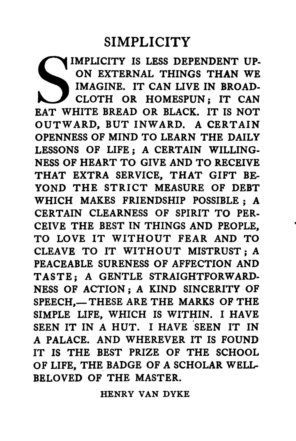
Clearly, in publishing The Ideal Book, Barlett’s goal appears to be a part of his broader mission of promoting the ideals of Arts and Crafts printing. Thus, in the Winter 1905 issue of the Cornhill Booklet, Cobden-Sanderson’s essay – preceded by a quote from Princeton professor of English literature, Henry Van Dyke – is presented in its entirety. With an estimated circulation of 5,000 copies (Thomson), it brought Cobden-Sanderson’s ideas and ideals to a relatively large audience in the U.S.
Although lacking in the simple perfection of the Doves Press edition, (for example, I find the very heavy drop capital to be particularly out of balance), the Cornhill Booklet reprint is, in some ways, reminiscent of the original in its simplicity. As Ellen Mazur Thomson notes,
The Cornhill Booklet is disarmingly tiny: 4 1/4 wide by 6 3/4 inches tall (a sextodecimo) and approximately 32 pages in length… The finely-laid paper, of cream-colored stock, was heavily deckled, and the pages were left uncut. These touches lent it an imprimatur of class.
The attractive simplicity of the magazine was no accident. Indeed, three of the most important book designers and typographers of the 20th century – Thomas Maitland Cleland, Theodore Brown Hapgood, Jr. and William A. Dwiggins – all worked on the Cornhill Booklet early in their careers, and every element of it helped build a clear aesthetic viewpoint that, I suspect, Cobden-Sanderson would have both appreciated in the abstract, and – given his personality – criticized in the specific.
What is less clear, however, is whether Cobden-Sanderson actually approved of this reprinting of his essay. As we shall see, some later editions contained statements that they were produced with the author’s permission. Yet, no such statement appears in the Cornhill Booklet. However, there are indications that Bartlett took copyright seriously in the case of other works, so although we may never know for sure, it is quite possible that Cobden-Sanderson approved of this early reprinting of The Ideal Book.
There can be no doubt that the Cornhill Booklet edition brought Cobden-Sanderson’s ideas to a wider U.S. audience, and that it did so with a sympathetic publisher, designers, and printers. It appears to be both the earliest reprinting of The Ideal Book in the U.S., as well as the largest of those we might consider to be within the fold of – if not the Fine Press Movement – certainly the Arts and Crafts Movement.
Nash Editions (1916, 1929, 1933 and 1939)
No single printer did more for the spread of The Ideal Book – and, perhaps, for the reputation of the Doves Press in the U.S. – than John Henry Nash (1871-1947). Over three decades he produced several fine art editions of the essay, including a remarkable 1929 book in which he not only reprints the essay, but relates the story of its history of the Doves Press from the perspective of people who knew and worked with Cobden-Sanderson.
Nash was one of the most influential printers on the West Coast in the first half of the 20th century. Having arrived in the Bay Area from Canada in 1895, Nash established himself as one of the top designers and printers in the U.S. From 1903 until 1911, Nash ran Tomoye Press, owned by renowned San Francisco bookseller Paul Elder.
https://paulelder.org/wp-content/uploads/2020/10/Nash-Harlan-plate-01d.jpg
The Nash/Elder relationship, however, was rancorous. While Elder was focused on producing books for a broad audience, Nash – a brilliant designer and compositor – was drawn to what he called "fine printing" in the spirit of the Morris' Kelmscott Press and the Doves Press. Eventually, this dispute – not dissimilar to that between visionary Cobden-Sanderson and business-minded Emery Walker – led Nash to quit in 1911.
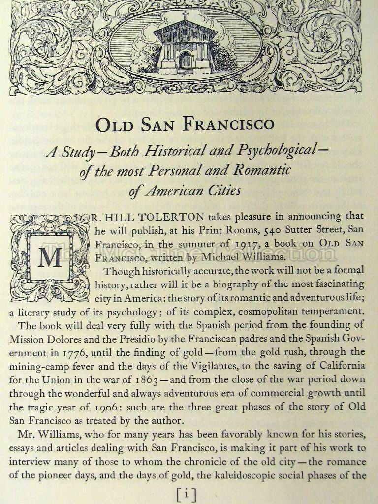
In 1916, Nash began producing fine press books under his own name. The following examples of his early work are from the remarkable McCune Art and Books Collection Foundation in Vallejo, CA.
Old San Francisco by Michael Williams (1916)
Barney MCGee by Richard Hovey (1917)
Ecclesiastes (1920)
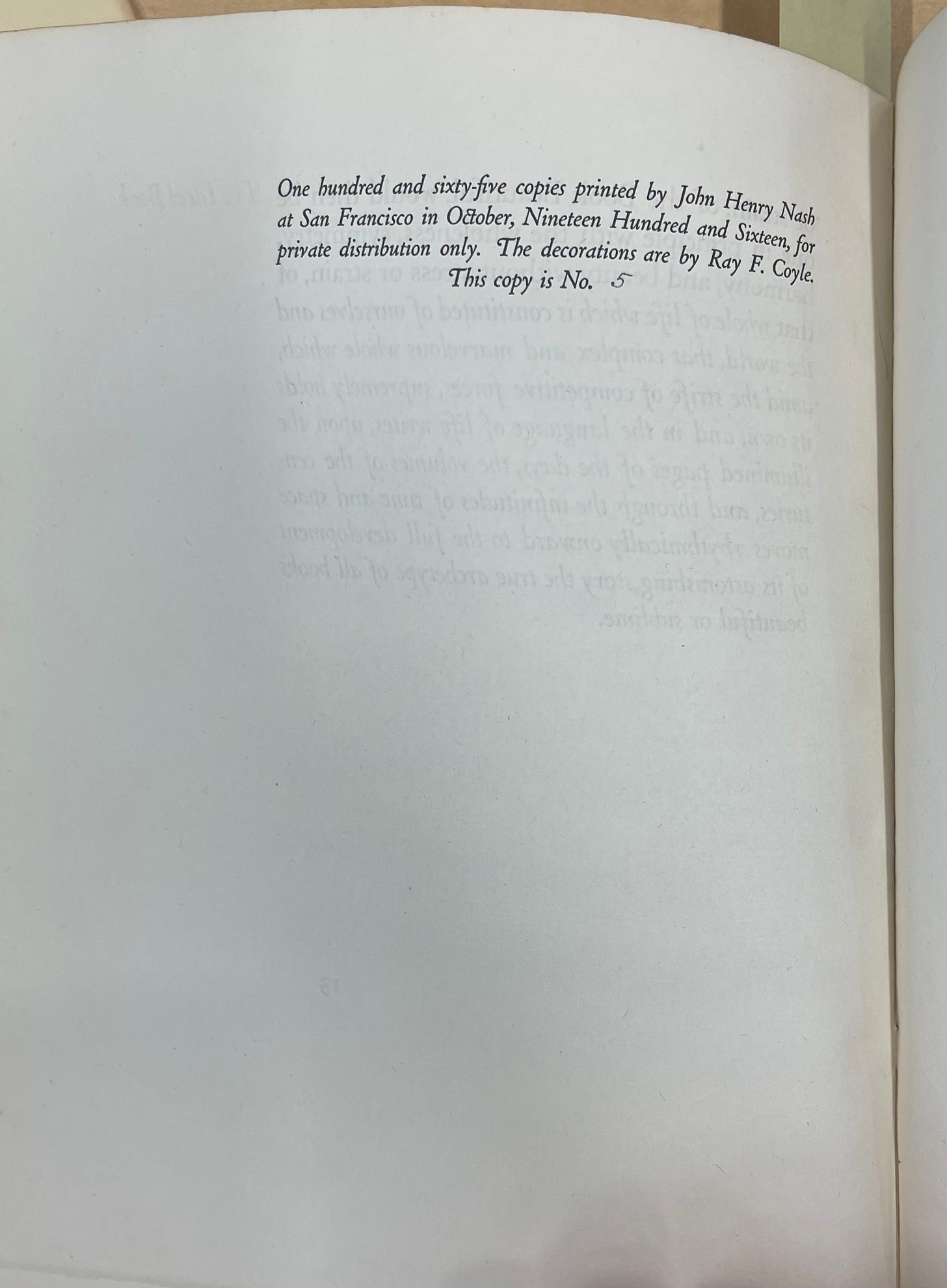
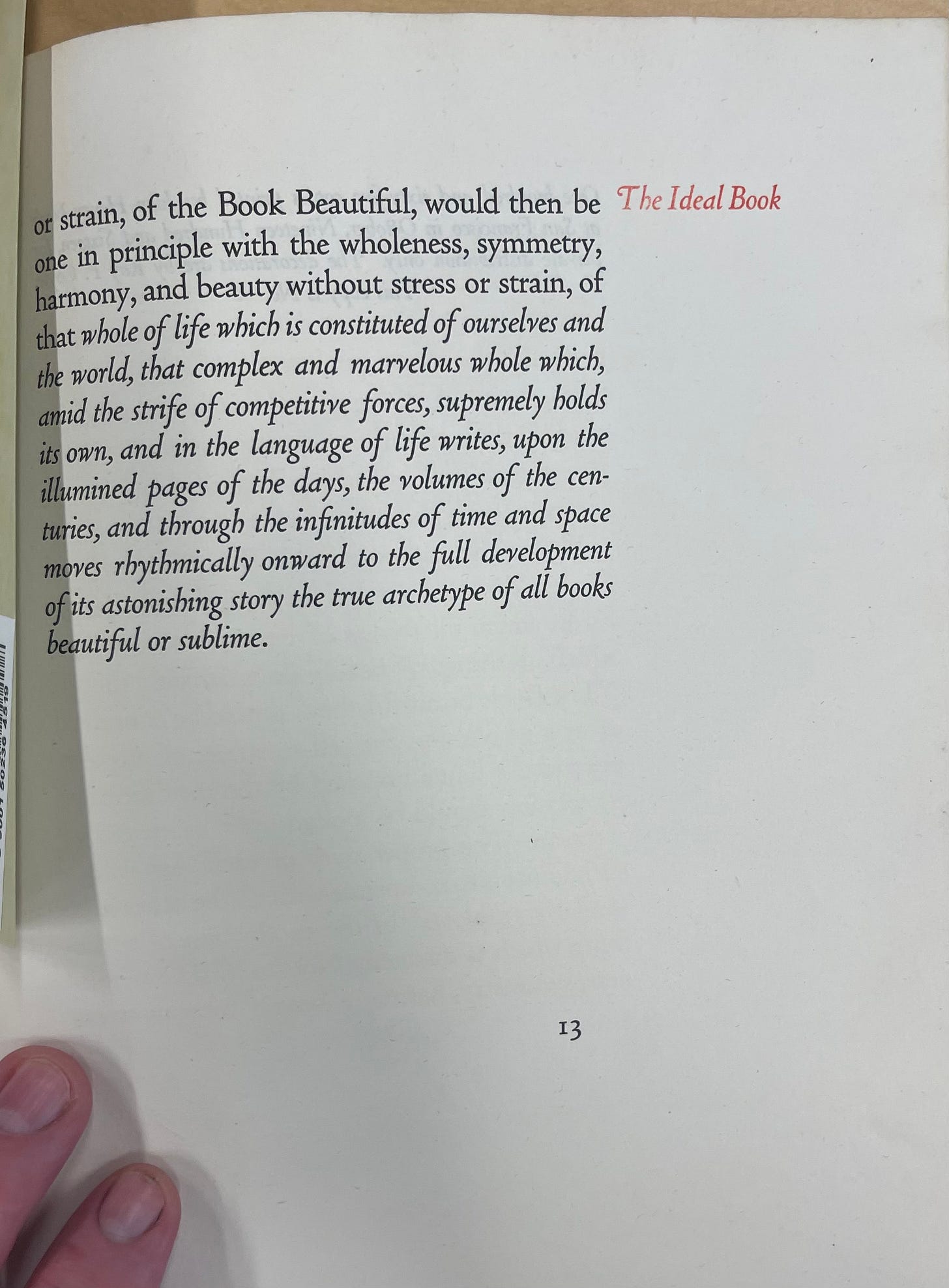
Nash’s 1916 edition of The Ideal Book was among the very first things he printed in what would become a 22-year career as a fine press printer in San Francisco, and later, as an instructor at the University of Oregon. In it, you can see some of the elements of the Doves Press design such as the generous outside and bottom margins and the section headings outside of the text block. It even makes use of the secondary text color that became a hallmark of Doves Press editions not long after the publication of The Ideal Book.
Despite the undeniable quality of the 1916 Nash edition, what is lacking to my eye is the elegance and simplicity of the original. Of course, by now, we know all about the near perfection of the Doves typeface that would not have been unavailable to Nash. In many ways, the limitations of the Doves typeface led to the clarity of design vision and execution of the original Doves Press publications. The typeface was available in only one size, and there was no italic, bold, or small caps version. This meant that proportion and perfect simplicity drove the entire design language. This was even before Cobden-Sanderson began to collaborate with Edward Johnston to hand-letter titles and section headings. In the original, a single size and style of print, composed to perfection lead to great balance.
By the first Nash edition, however, the utterly perfect simplicity of this design language began to be lost. The use of a floral design is more reminiscent of Morris' Kelmscott Press, a design choice that Cobden-Sanderson might have disdained. The drop cap at the start of the essay seem out of place, especially since it is not repeated at the start of later sections of the essay. But for me, most jarring of all, is the choice to use italics for emphasis in place of the capitals of the original.
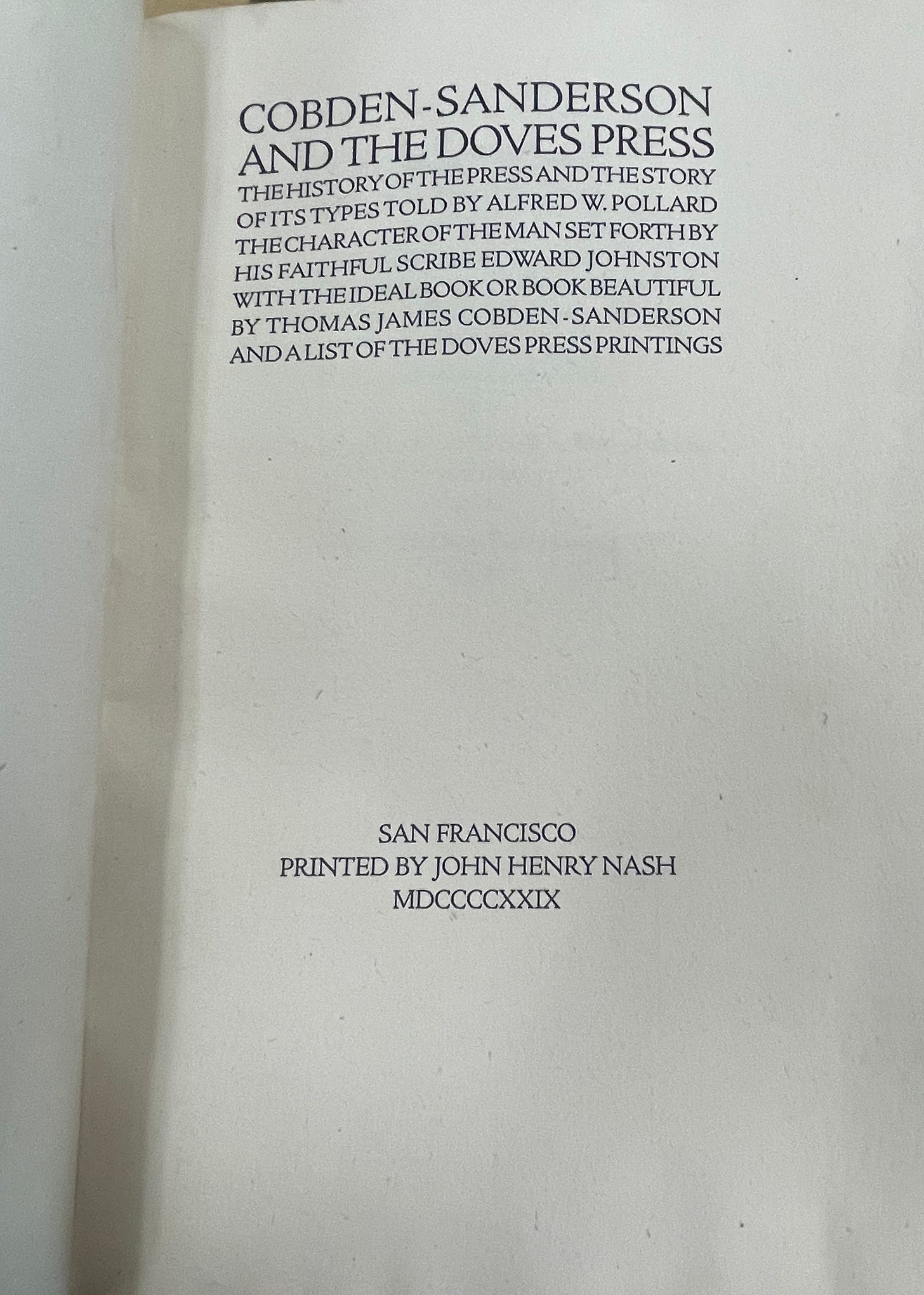
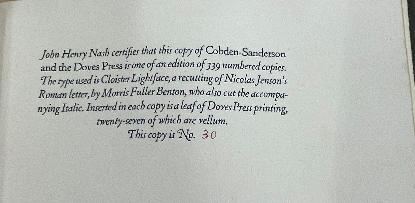
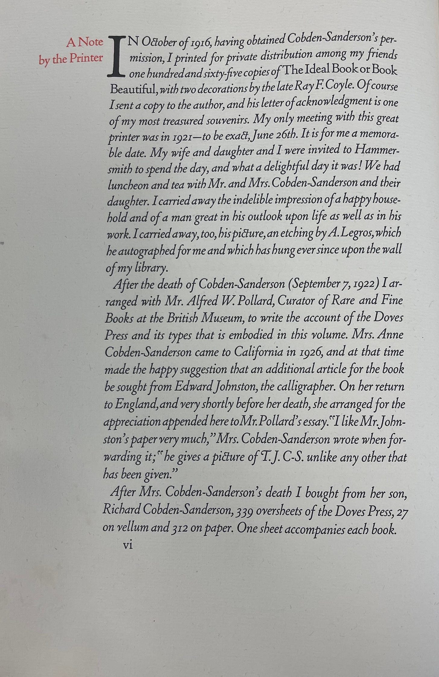
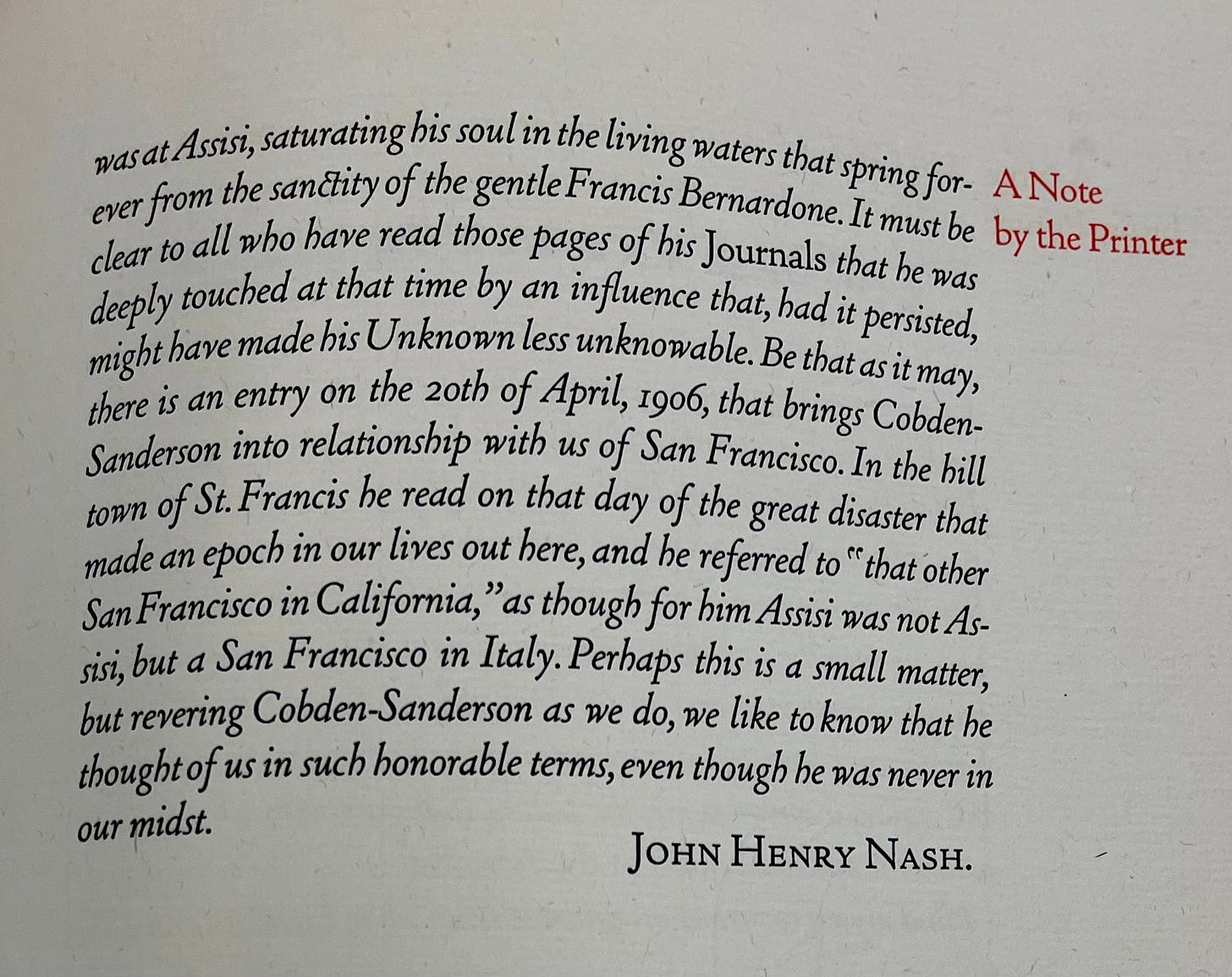
Nash was not finished with The Ideal Book – or, perhaps, it was not finished with him. Over and over, throughout his career, Nash returned to the text, releasing a new edition in 1929 as part of his remarkable publication, Cobden-Sanderson and the Doves Press: The History of the Press and the Story of Its Type Told by Alfred W. Pollard, the Character of the Man Set Forth by His Faithful Scribe Edward Johnston with the Ideal Book or Book Beautiful by Thomas James Cobden-Sanderson and a List of the Doves Press Printings. Although the type and internal design of this version of The Ideal Book suffers from some of the same issues as the 1916 edition, it is a sympathetic – albeit oversized – facsimile of the original, bound in limp vellum in the Doves Press style. The title page, in particular, presents to be a lovely ode to the Doves Press designs.
In many ways, this edition is a particularly personal ode to Cobden-Sanderson, featuring not only an essay by Doves Press calligrapher and designer Edward Johnston, but also Nash’s own recollections and reflections. He shares about his visit with Cobden-Sanderson in London, the visit of Cobden-Sanderson’s widow, Anne, to San Francisco, and a moving story about how – during his 1906 visit to the Assisi, Italy home of St. Francis – Cobden-Sanderson learned of the San Francisco earthquake. Given that we know that Cobden-Sanderson could be difficult, recalcitrant, and vindictive at times, Nash’s perspectives on – indeed, his reverence for – Cobden-Sanderson the man may seem unwarranted. Yet, like Nash, I share a reverence for his vision and works.
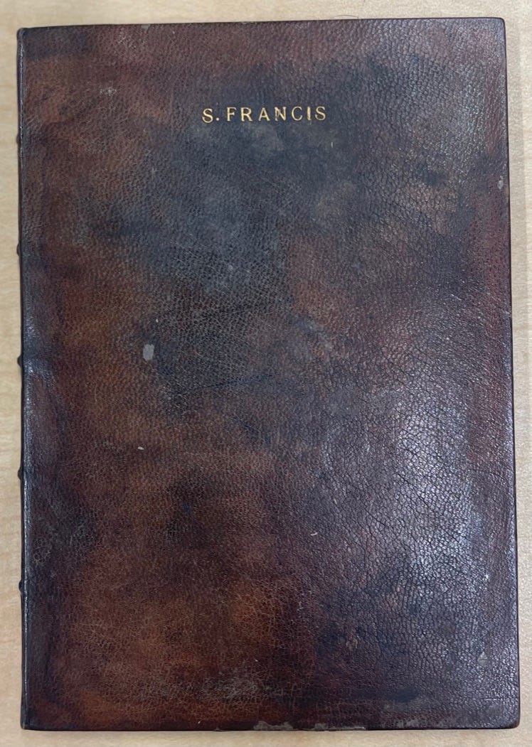
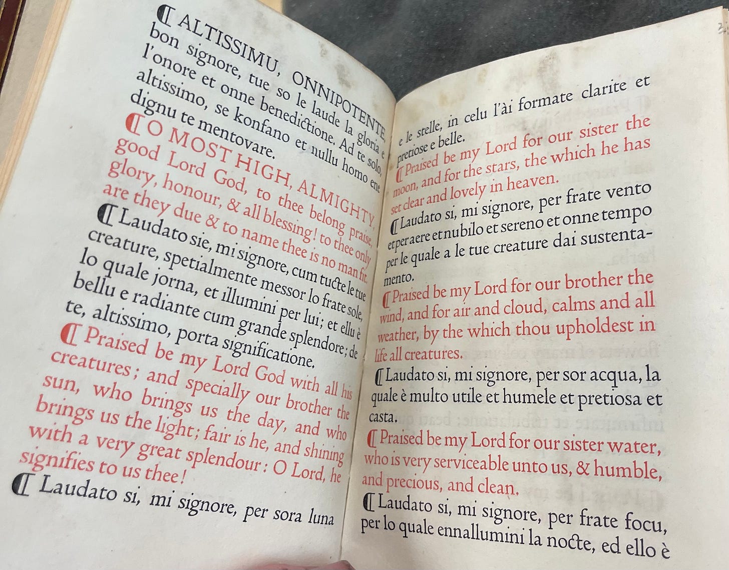
Top two images: From Nash’s 1929 Cobden-Sanderson and the Doves Press. Bottom to images: The 1905 Doves Press Laudes Creaturarum by St. Francis of Assisi.
Cobden-Sanderson’s essay not only inspired Nash, he used it as a pedagogical tool while teaching a new generation of printers as a member of the faculty of the University of Oregon School of Journalism. There, he and his students printed at least two more editions in 1933 and 1939, as well as works by William Morris of Kelmscott Press.
Although important for making the content of Cobden-Sanderson's vision available to a new audience, it is hard not to feel Nash's design execution fell just short of the Doves Press original. Perhaps it is the complexity of the typography and the use of italics in place of the Doves typeface that was unavailable to him. Certainly, the 1929 edition feels more in keeping with the Doves Press edition. That said, the practice of Nash – his many remarkable fine press editions over the course of decades – makes him one of the most important figures in the development of the Fine Press Movement in the U.S. His incredibly important and beautiful work places him well within the tradition of Cobden-Sanderson, making his publications among the most important printings in the U.S. in the 20th century. Moreover, it continues to inspire the work of fine presses today.
Plimpton Press Edition – Unknown Date prior to 1922
The history of the Plimpton Press in Norwood, MA spans nearly a century (1882-1973). Although not a "fine press" – indeed, it was one of the largest printers in the eastern U.S. for much of its history – it did engage in the printing of fine editions throughout its history.
Norwood Historical Society
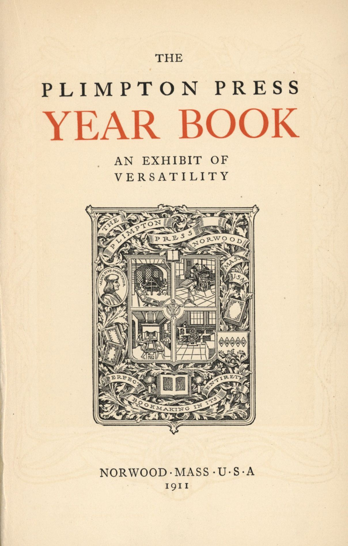
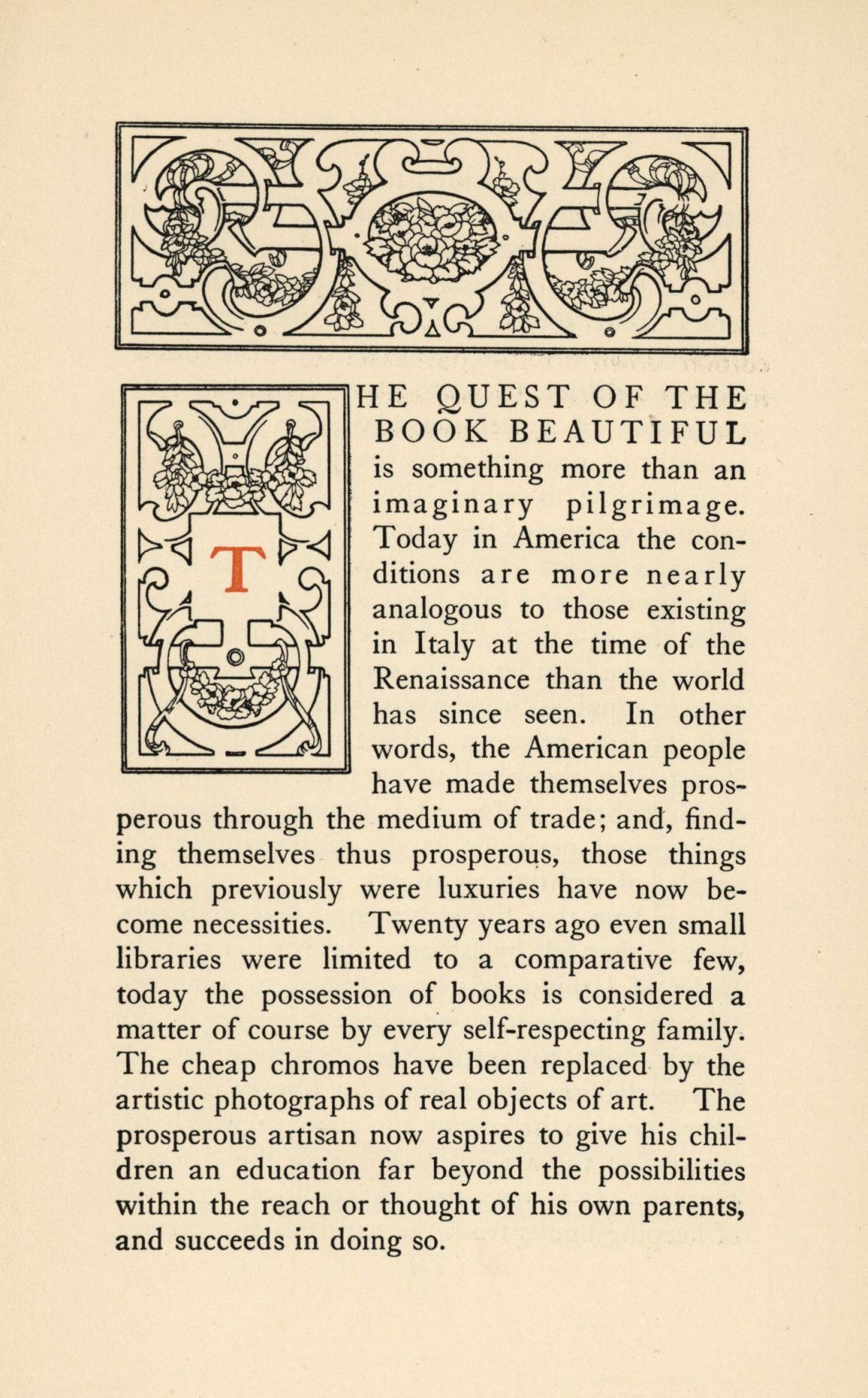
As these pages from The Plimpton Press Year Book: An Exhibit of Versatility (1911) show, the enterprise valued design and sought to live up to its motto, “Perfect Book Making in its Entirety.” Indeed, they even set forth the Plimpton Press' own vision of "the book beautiful."
Image from University of Wisconsin Milwaukee: https://liblamp.uwm.edu/omeka/spcdi/exhibits/show/typography-tuesday/item/341#?c=&m=&s=&cv=&xywh=444%2C310%2C1094%2C846
This vision of "the beautiful book," however, seems to have been more focused on how improving technologies in printing – rather than the artisanal work of Cobden-Sanderson's vision – were making quality books available to a wide audience.
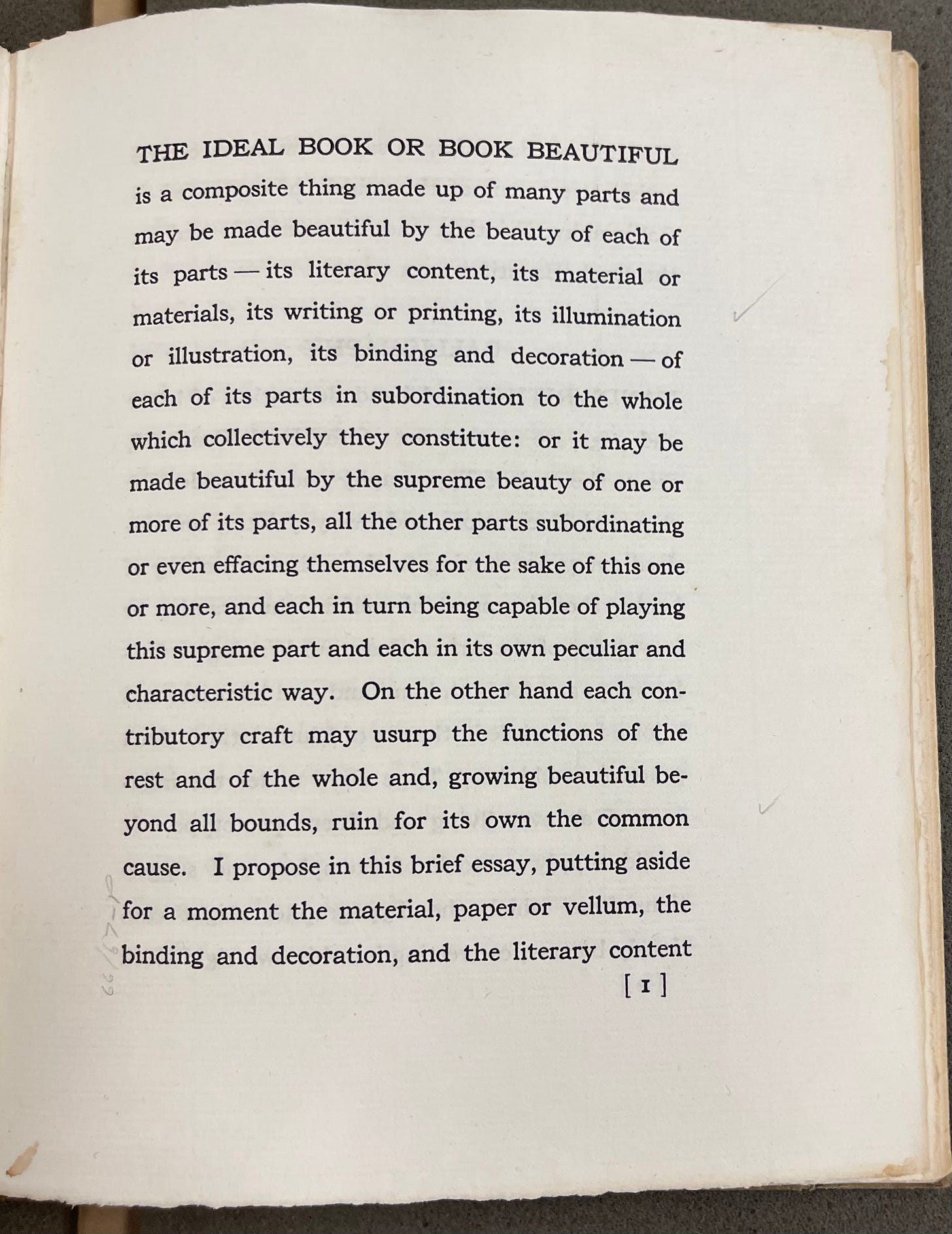
That said, the Plimpton Press – apparently with Cobden-Sanderson's blessing –printed an edition of The Ideal Book for private, rather than commercial, distribution to its friends.
Interestingly, despite the clear capacity of the Plimpton Press to produce books with a strong aesthetic point of view and high-quality design, this edition is the least "designed" of the editions I was able to review. In my view, it completely fails to apply the lessons its content advocates.
Ārif Press (1972 and 1981)
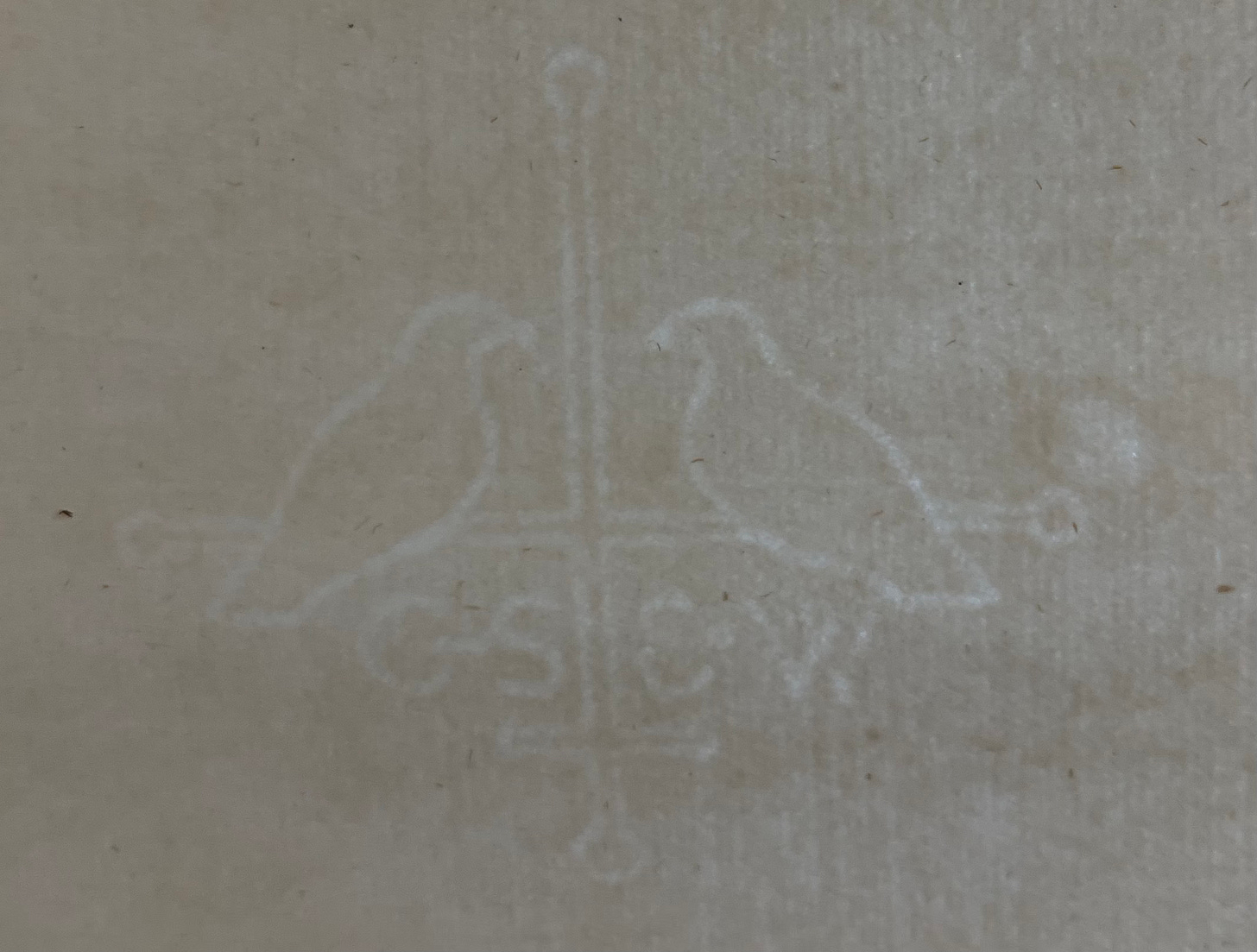
For the 1972 Ārif Press edition, Wesley Tanner – one of the most important figures in the Fine Press Movement over the last fifty years – built upon the "doves" theme found in the original watermark of the paper used by the Doves Press.
I find Tanner’s simple line-illustrations and cover design to be entirely in keeping with and inspired by the principles of the essay. Not only does the use of the doves motif refer to the press of that name, but they are symbolic of the peace and harmony advocated by The Ideal Book. While Tanner's design almost certainly reflected its social setting in Berkeley, California of the early 1970s – something that would probably have resonated politically with Cobden-Sanderson – there is also a timeless beauty in its simplicity. I have been unable to find any photos of the text itself. I hope that it achieves something close to the simple elegance of its cover.
Top: The watermark from the custom-made paper used by the Doves Press. Bottom: The cover of the 1972 Ārif Press edition.
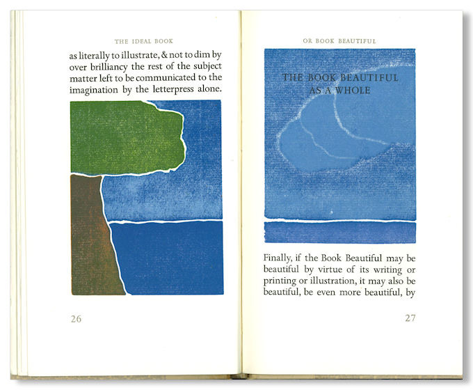
Certainly, by 1981, however, Tanner’s vision was much more focused on illustration than on the text itself, featuring several large, color prints throughout the book.
It is hard to overlook what seems to me to be the irony of these pages from this edition. The portion of the text that reads "as literally to illustrate, & not to dim by over brilliancy the rest of the subject matter left to be communicated to the imagination by the letterpress alone" is completely overwhelmed by the – albeit lovely – images. Here, the execution seems to have missed the mark of perfect balance advocated by Cobden-Sanderson. Indeed, the the text – the words themselves – seem to be an afterthought.
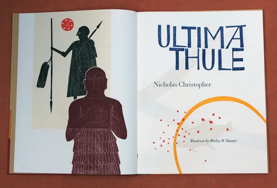
That said, Wesley Tanner continues to create remarkable letterpress books today, often producing small editions that feature hand-calligraphed titles (in the tradition of Johnston at the Doves Press), woodcuts, and hand-set type.
Cadenza Press (1987)
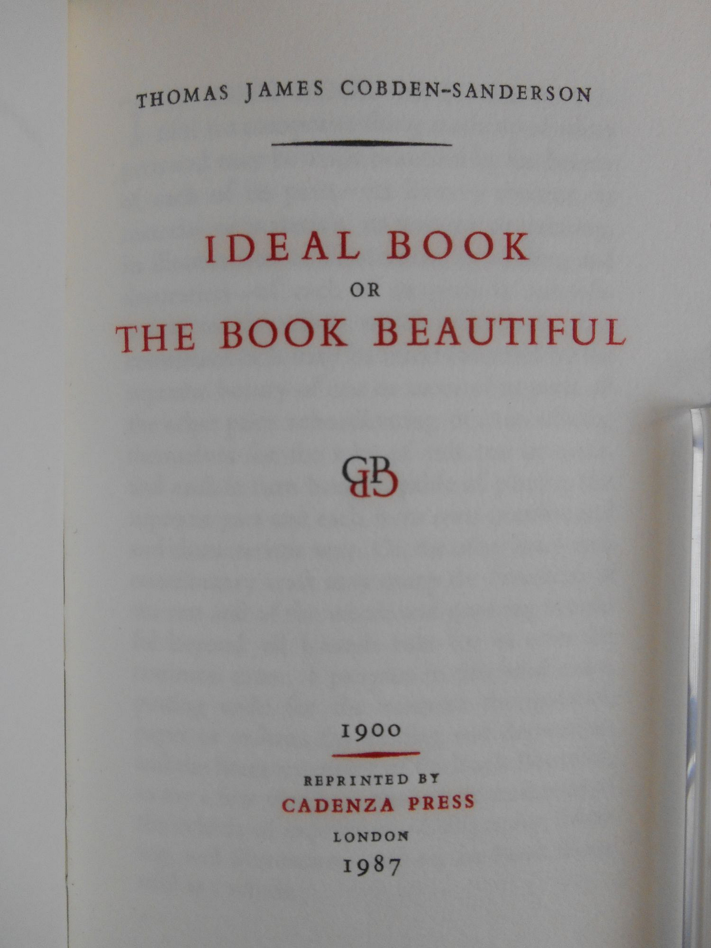
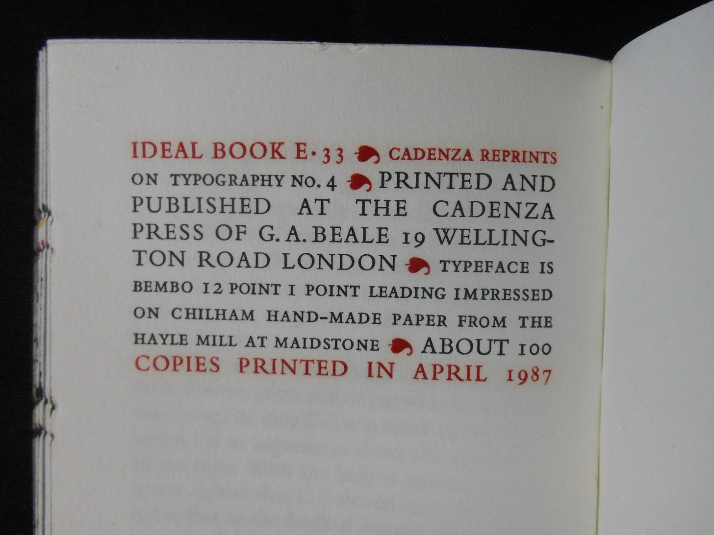
In 1987, Cadenza Press in London produced "about 100" copies of the essay. Although a bit more ornate than Cobden-Sanderson might have preferred, there can be absolutely no doubt about the lovely printing and typographical work of this edition. The title page and colophon demonstrate typography with a clear and precise design language; unfortunately, I have been unable to locate any images of the text of the essay itself. The use of capitals – as opposed to italics – seems more in keeping with the design language of the Doves Press than the use of italics in many other editions. Certainly the use of various sizes makes it somewhat more complex than that of the single size of the Doves typeface. However, it just feels like it is within the same tradition of design; it shares and design language that speaks to the original. It is, for me, one of the most inspiring reprints of The Idea Book.
However, I find the leather binding to be disconnected with the rest of the book. Although unquestionably artisanal and well-done, the harmony between the binding and the text itself seems to be lacking.
From the pictures, at least, I am left wondering how this fine binding relates to the content of The Ideal Book. Of illustration, Cobden-Sanderson wrote:
ILLUSTRATION, the other expressive constituent of the Book Beautiful, is a part of the whole subject matter, in process of symbolical communication, picked out, isolated, & presented pictorially.
I contend that the fine binding must play a similar role. It must be in balance with the whole of the material book beautiful – its endpapers, typography, paper, printing, illustration – as well as the content as penned by the author. We experience the binding of the book first – visually, tactilely, and even olfactorily (with leather bindings). For me, there are two approaches to the creation of what I consider to be a successful binding. In the first – that employed at the Doves Press – the binding is simple and (to the degree it is not designed with the content specifically in mind) generic. In such cases, the binding is almost purely functional, albeit with a tactile quality of vellum. A second successful approach accomplishes the same goal of illustration: “symbolical communication [of a portion of the text], picked out, isolated, & presented pictorially.” It is unclear that the Cadenza edition binding succeeds in this later goal.
Indeed, the Cadenza Press edition raises what is, for me, one of the greatest questions with which I struggle as a book creator: to what degree should the binding of a book be an artistic statement in and of itself. On the one hand, the craft and artistic vision of the bookbinder is to be deeply valued. Yet, in modern fine bookbinding I wonder if the balance advocated by Cobden-Sanderson – in which each element subordinates itself to the text and to the book as a whole – has been lost. When looking at stunning award-winning bookbindings of today, there can be no doubt about their beauty and artistry. Yet, as they are often presented in isolation from the rest of the book. Images often feature the bindings alone, isolated from the text. I am left wondering how well they further the project of the author. I am absolutely certain that many of these designs succeed in doing exactly that. However, they are rarely presented in such a way, making it impossible to discern the degree to which an artistic binding is “successful” at contributing to the larger “Book Beautiful” project.
Perhaps this is the result of the ongoing process of division of labor against which Cobden-Sanderson, John Ruskin, and other social critics argued. After all, most fine bookbinders are just that: bookbinders with little or no input into the creation of the book as a whole (i.e., the design of the text, the paper on which it is printed, the printing process, etc.). Indeed, it is not uncommon for today’s bookbinders to strip original bindings from a quality copy of book in order to create a new, artistic binding. In such cases, the creation of the book as a whole is lost, becoming merely a canvas for the bookbinder’s artistry.
This separation is not new; for centuries composing text, printing, bookbinding, and decorating and finishing have tended to be handled by different people. Yet, Cobden-Sanderson sought to reverse this separation between the author, the typographer, the illustrator, and the binder. Indeed, in the very first page printed by the Doves Press, he advocated for the creation of workshops in which all craftspeople share “a common and well understood notion of what work is or ought to be, & that there shall be a common & energetic desire to contribute to the completion of that work, each in due degree, for the work's sake.”
It is this vision of the creation of the complete physical book – every element that transforms the author’s words into the materiality of a book – that was the vision of Cobden-Sanderson’s Doves Press. And it is in this spirit that I have found myself drawn to the creation of completely new editions of books. It is not about bookbinding per se. Rather, the vision of Ampersand Book Studio that has driven me from the start is the view of the material book as a whole as being in service to the author’s words and the reader’s pleasure.
This is where, from my aesthetic point of view, many of these previous editions of The Ideal Book have failed. Some – the Plimpton Press edition, for example – seem to be concerned only with the distribution of the author’s words. In these cases, there is almost no consideration of aesthetics, typography, or design, nor how they might somehow complement the author’s intent.
In others, like the 1981 Ārif Press edition, we see the opposite problem: design, typography, and/or illustration threaten to “steal the spotlight,” taking the focus from “the thought or image intended to be communicated by the Author.” When illustration or typography or binding become more important than the words themselves – as expressed by the author and experienced by the reader – I think the entire gist of Cobden-Sanderson’s conception “the wholeness, symmetry, harmony, beauty without stress or strain, of the Book Beautiful” has been lost.
The Upshot: A Facsimile Edition
There can be no doubt of the love for and inspiration derived from The Ideal Book or Book Beautiful. Its reproduction by fine presses over the past 120 years – indeed the very existence of the Fine Press Movement – is a testament to its impact. However, despite the goal of creating new editions and designs of the essay, in my view, none come close to unity of form and content presented by the original. It is, in many ways, a work of simple perfection. Thus, rather than trying to create a new design – I have decided to focus on creating as close a facsimile of the original as possible. Perhaps I cannot achieve the perfection of the original. But at least we can try to get as close as possible. And unlike the copies that reside in the archives of libraries and museums, we will be able to settle into a comfortable chair, sip a cup of coffee (or something stronger), and enjoy reading Cobden-Sanderson’s words as they were intended.
Addendum: A Working List of Editions of The Ideal Book
This is a working list of previous editions of The Ideal Book. Additions welcome!
The Cornhill booklet. -- vol. 3, no. 6 (Winter 1905)
John Henry Nash editions (165 copies; 1916)
J.H. Nash for the Zellerbach Paper Co. (1919)
John Henry Nash editions (339 copies; 1929)
Plimpton Press Edition (not sure of date or number; somewhere between 1901 and 1922)
Printing House of William Edwin Rudge (215 copies; 1929)
Roxburghe Club edition (85 copies; 1930)
Stratford Press – American Book Bindery (350 copies; 1930)
Laboratory Press (1934)
John Henry Nash Fine Arts Press, University of Oregon (50 copies; 1938 or 1933 or both?)
Ecusta Paper Co. (1947?)
Gallery 303 – Photocopy of original (1960?)
Senior Graphic Arts Class at Los Angeles State College (100 copies; 1963)
Ārif Press edition (350[?] copies; 1972); illustrated?
Wesley Tanner/ Ārif Press second edition (150 copies; illustrated; 1981)
Cadenza Press (“about 100”; 1987)
Aquando Press (50 copies; 2013) in Work & Beauty: Selected Works of Thomas James Cobden-Sanderson


