What is the book without paper? Sure, it is just a medium for carrying the words of the author. However, when considering the materiality of the book, perhaps nothing is more important. As readers, our eyes stare at it. Our fingers run across it. We hear the swoosh of the turning page. From hand-marbled decorative endpapers to the cheap, wood-fiber pages of “pulp” fiction, paper shapes our experience of the book. Sometimes we even [*gasp*] write our annotations on it or fold its corners down to mark our place. Its visual appearance, texture, weight, drape… all contribute to the joy of the printed page. Yet, at its best, it should hardly be noticed, allowing the reader to become immersed in the content of the book.
As a creator, one has to consider things like how hard or soft is it, how it takes ink, grain direction, how much shadowing it exhibits. And it provides the canvas for the book arts that T.J. Cobden-Sanderson discusses – calligraphy, typography, illustration, and the entire “Book Beautiful.”
Although I am tempted to explore this role of paper in the development of the book – the evolution from papyrus to vellum to paper – I will leave that to authors such as Keith Houston and his highly recommended The Book: A Cover-to-Cover Exploration of the Most Powerful Object of Our Time.
Suffice it to say that paper really matters to the book. And in creating this edition of The Ideal Book, I obsessed over which paper to use.
The Original Doves Press Paper
In their 1901 review of The Ideal Book, The New York Times wrote:
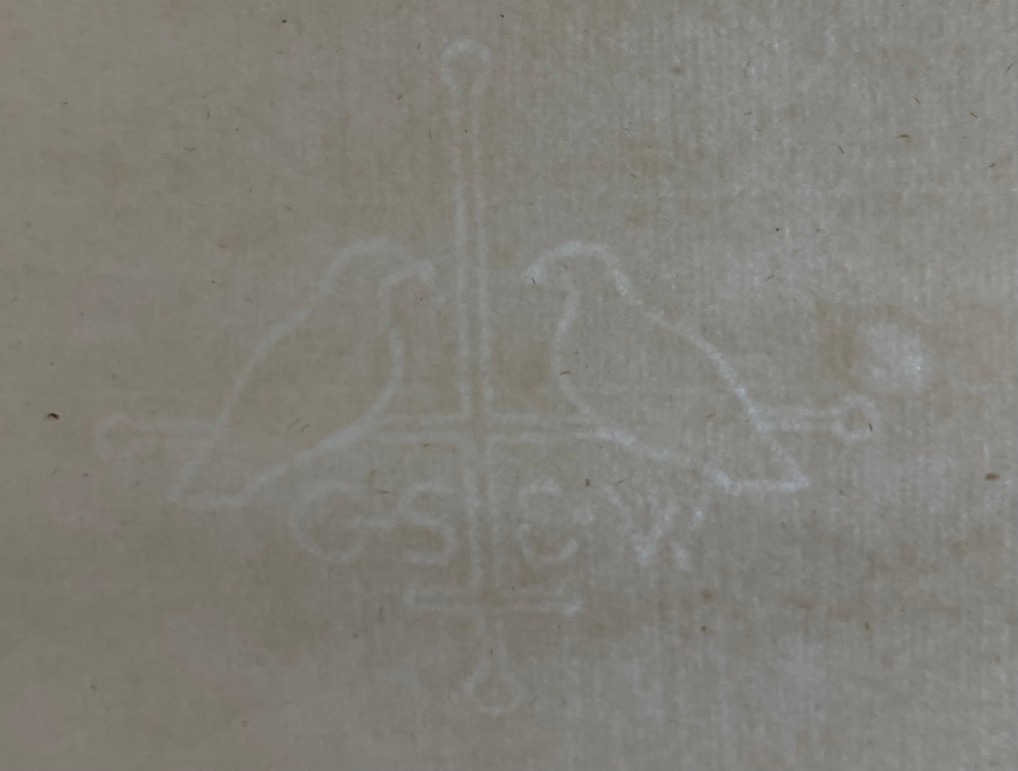
The paper, presumably made by the Bachelors of Little Chart, is exquisite in quality and finish, soft in tone and to the touch, the flyleaves being of a thinner texture than the body of the book, the paper bearing the attractive mark of the press, two doves on a nest facing each other above the initials of the owners of the press.
Although I have not been able to handle an original copy of The Ideal Book, this is a photo I took of the paper used in another Doves Press publication.
Featuring the Doves watermark, this paper exhibits the telltale horizontal and vertical lines (hard to see in this picture) of a mould-made laid paper, a traditional technique that is rare today.
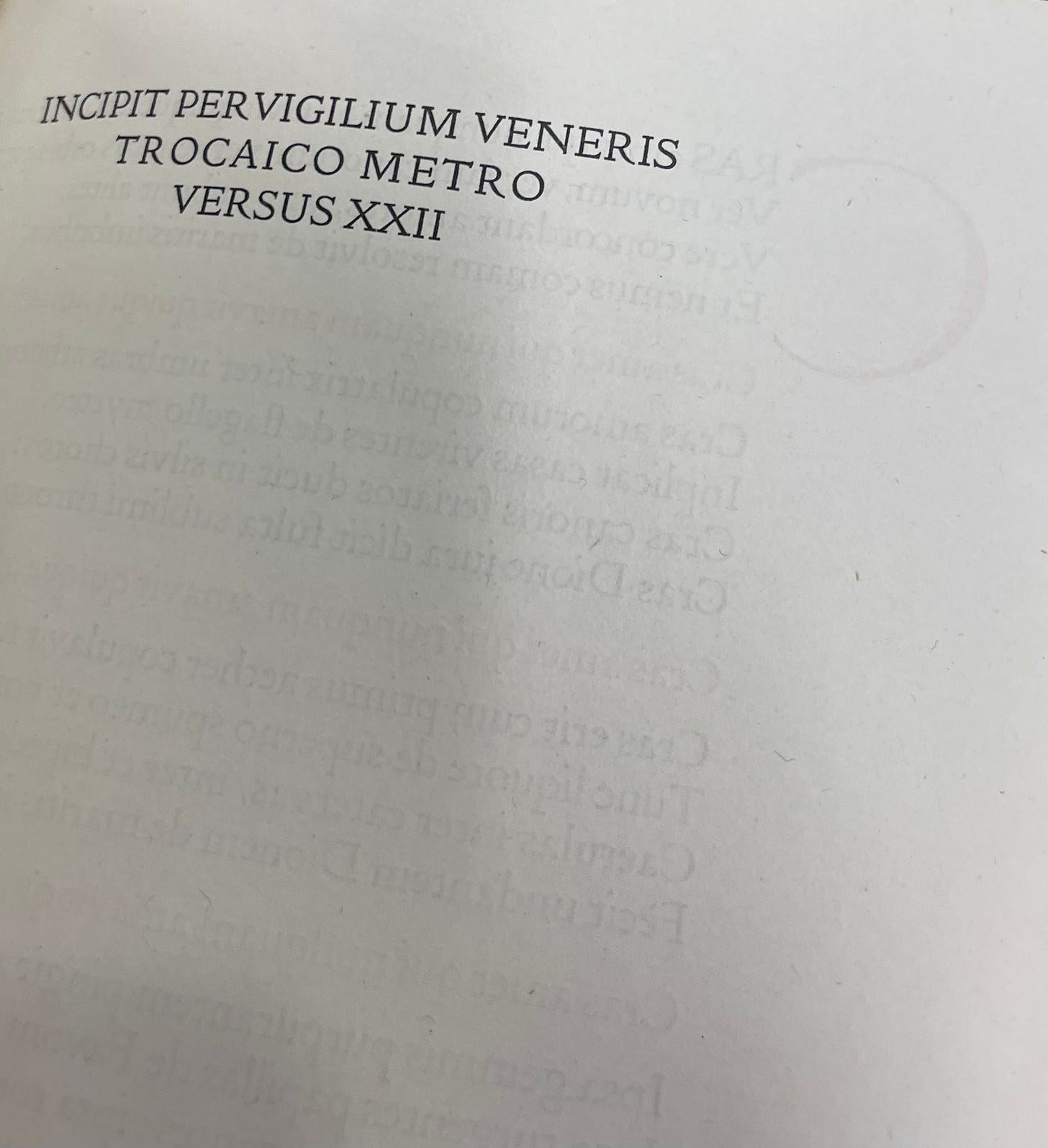
The paper used by the Doves Press was relatively light in weight, revealing significant shadowing; that is, it is possible to see the printing on the other side through the paper:
Of course, the “best” choice for our facsimile would be to commission a handmade paper mill to recreate the original Doves Paper. However, that is not a realistic option. Even if one could find a producer willing and able to undertake the project – a far from certain proposition – it would be a hugely expensive and lengthy process. I estimate that doing so would increase the cost of producing each book ten-fold, as well as adding many months to the production process. And that for a short essay. Imagine the cost of such paper for a much longer book!
What I Want in the Paper
Given all of this, I have been asking myself what I want in a paper for The Ideal Book.
Do I want it to be lightweight? Well, not really. Although the original Doves Press edition exhibits significant shadowing of the text on the reverse side of the page, I would prefer to keep it to a minimum. Perhaps I am spoiled by modern commercial printing, but to my eye, less shadowing is better. And a thicker paper helps reduce it. It will also lead to a slightly thicker text block, providing a somewhat more substantial feel and balance to the book.
Is it possible to go too thick? Absolutely. The original test pages I printed for the prototype of our edition used Somerset 175gsm paper from the centuries-old St. Cuthbert’s Mill in England. A luxurious, soft paper, it did an admirable job at reducing shadowing and allowed for a nice, deep letterpress impression. However, the pages feel as thought they are verging on being more like card stock than text paper. Not quite, but close.
I am, then, seeking the Goldilocks of paper weight: heavy enough to give a nice, tactile feel, as well as reduce shadowing; but not so heavy that it stops feeling like pages of a book and starts feeling like a bunch of card stock sewn together.
Although The Ideal Book – including the original and the added historical note and colophon – is only 16 pages, the finished facsimile will have 40 pages. Cobden-Sanderson was a huge fan of endpapers, writing “I like plain endsheets and plenty of them.” In the various editions of Doves Press books that I have personally handled, there are between five and eight blank leaves (ten to sixteen pages!) at both the front and end of the book. This is true even for short pieces, such as Pervigilium Veneris (1910) which features just nine printed pages in between ten blank pages at the front and back. So, even with a short essay such as this, there is no need to go too heavy on the paper in order to create sufficient bulk for the simple limp vellum binding.
Do I want a laid paper? Ideally, yes. I think so. However, this presents some very real challenges. There are relatively few paper mills today that make laid paper, and even fewer that make laid paper that can be used for double-sided letterpress printing of a book. You see, the distinctive lines on laid paper come from the screen on which the fibers have been lain (hence “laid"). This process makes the side that contacts the screen relatively smooth, while the opposite side is the “felt” side which, as you might surmise, tends to be softer, more textured, and velvety. This can make letterpress printing a bit more challenging, although with care, it can work. However, in a book, too much of a difference between the laid side and the felt side can be distracting. These differences can be reduced in the production of the paper, but that tends to be a process used by more industrial, rather than artisanal, mills. And that, from a design perspective, seems to run counter to the principles of The Ideal Book. So, I started my search for a laid paper that would be “right” for this project. Here are some I have considered.
*** Warning! Extra geeky and detailed analysis below. Feel free to skip to “The Upshot” (below). YOU HAVE BEEN WARNED! ***
Okay… now that all but the paper zealots among us are gone, let me share my perspectives on several papers that I have been considering.
Zerkall Frankfurt
Ahhhh… With my samples from fine paper distributor Legion Paper in hand, I thought this was going to be easy. The Zerkall Mill in Germany has been in existence since the late 15th century, producing fine mould-made paper since at least 1903. For me, that in itself makes me want to like this paper. The laid pattern is uniquely interesting and attractive – the horizontal laid lines are more wavy than straight – without calling attention to itself. It is a great weight, 120gsm, which is right at the top of my preferred range. And the smooth texture – reminding me of the paper Doves Press used – is almost identical on both sides.
https://www.flickr.com/photos/nuancejournals/6948250225/in/photostream/ by Nuance Journals
Zerkall papers, in general, and Frankfurt, in particular have a wonderful reputation within the fine and private press world. Among the many volumes which have used this particular paper are the Arion Press edition of The Sea of Cortez (2020) and some of the lettered and roman numeral editions by Suntup Editions.
So, confident that I have made quick work of this, I go to the Legion Paper website. It is not there. I have a sample in my hand, complete with the Legion Paper logo, and yet it is nowhere to be found. “No worries,” I think. “I’ll email Ashley [the super helpful, responsive sales rep]. She can surely help.” Well, no.
Unfortunately, no. Climate change, you see, impacts even the world of fine paper. In July 2021, unprecedented flooding hit western Germany. It destroyed entire villages and killed 185 people.
Top: https://www.cnn.com/2021/08/23/europe/germany-floods-belgium-climate-change-intl/index.html. Bottom: https://www.vox.com/22577431/germany-flooding-europe-climate-change
Certainly least devastating from a human and humane perspective – but most relevant to our project – is the impact the floods had on the Zerkall Mill which was destroyed. Having been under economic stress from decreased demand during the COVID-19 pandemic, the flood was the last straw. Rather than rebuild, the owners decided to close the mill for good. After more than 500 years, the Zerkall Mill is no longer. And I was back at square one.
St. Cuthbert’s Somerset
Okay… It is not laid, but it is fantastic paper. St. Cuthbert’s Mill in Wells, England has been making fine paper since the 1700s. Their Somerset line is one of the most respected papers for both books and (at heavier weights) art prints. Indeed, it was used by Arion Press in producing their remarkable Bible.
Arion Press Bible on Somerset paper. Image: https://legionpaper.com/somerset-book/
Compared to the relatively hard, smooth finish of the original Doves Press papers, however, it has a soft, velvety texture. It also is not laid, so lacks the textural and visual interest I am seeking. It is wonderful. But wrong for this particular project. Which is too bad, as I actually have enough on hand to complete this project. But, as my friends at Onyx Coffee Lab (my drug of choice) say, “never settle for good enough” – which is hard when “good enough” is as great as Somerset.
Ingres Papers – Ingres D’Arches MBM, Hahnemühle Ingres, and Canson Ingres
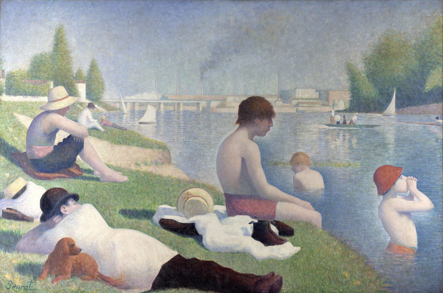
Ingres is a laid paper that was designed, primarily, to be used by artists, particularly those working in charcoal, pastel, and graphite. Today, there are three mills making excellent ingres paper: Arches (France), Hahnemühle (Germany), and Canson (France); the late, great Zerkall Mill also made a version. Arches claim that Georges Seurat did many of his drawings on Ingres D’Arches MBM, although most museum pieces seem to be on a very similar paper made by the now-defunct Michallet paper mill. Many were studies for large paintings such as A Sunday on La Grande Jatte (1884) and Bathers at Asnières (1887). The paper was essential to the success of these “sketches” (i.e., brilliant, self-contained masterpieces). Writing for the Getty Museum, Emily R. Anderson notes,
Madame Seurat, the Artist’s Mother [below] demonstrates how Seurat used black Conté crayon and the rough texture of paper to create nearly imperceptible tonal gradients that build form. He made Madame Seurat around 1882–83 at the height of his career.
Top: Madame Seurat, the Artist’s Mother, about 1882–83, Georges Seurat. Conté crayon on Michallet paper, 12 x 9 3/16 in. The J. Paul Getty Museum, 2002.51. Middle: 6-41 Georges Seurat, Seated Boy with a Straw Hat, 1882 [Sketch for the famous Bathers at Asnières]. Conté crayon, 24.1 x 31.1. New Haven, Yale University Art Gallery. Bottom: Bathers at Asnières, 1887. Oil on canvas. National Gallery, London.
Although made for artists, Ingres D’Arches MBM comes in two good weights for text (85gsm and 105gsm) which made it an option to consider for this project. Making paper in France since 1492, some of the world’s greatest books have been printed on other Arches paper: the Nuremberg Chronicle (1493) by Dürer, the works of Voltaire, Napoleon Bonaparte’s commissioned Description de L’Égypte (1807), and the first edition of Joyce’s Ulysses are but examples. Matisse, Picasso, and Dalí all used Arches paper. Arches must have the right paper! And their laid Ingres D’Arches MBM paper comes really, really close to what I needed.
The ever-helpful Ashley from Legion Paper rushed samples my way. And at first, I was sold. It has almost everything I was seeking. But it was just missing… something. I think it is its pronounced rough texture of Ingres papers. This is perfect for charcoal, pastel and graphite drawing in which the paper is able to grab and hold the medium, allowing for rich saturation and tonal variety. When compared to the Doves Press paper and the silky smooth Zerkall Frankfurt, it was just not “right.” It is excellent in all respects. But my Goldilocks alter-ego said “no.”
“Industrial” Laid Paper & Supply Chain Issues
A few of the largest paper companies in the U.S. and abroad make laid paper. In the U.S. Neenah Paper and Strathmore (Mohawk) offer perfectly fine laid papers, primarily used for stationary, as does UK paper giant Arjowiggins. There are two problems, however, in considering these for our project.
The first is that it is hard to get paper right now. Like, really hard. The supply chain issues I have heard about in the news have certainly impacted the paper industry. There seem to be several socio-economic – and even public health – factors that have contributed to current shortages. It seems that when COVID-19 sent us all home, we simply stopped using as much paper: memos at the office were not being printed… kids did homework online eschewing the traditional spiral notebook… tickets and programs for theaters and concert venues were not needed… even junk mail declined. And we all started ordering things online. Like, everything. And each of those Amazon (and Onyx Coffee) shipments required packaging and boxes. So, many paper mills switched their production to meet the needs of the new, stay-at-home economy.
Then, at some point in the last year, things “returned to normal.” [Personally, I hoped that we would take COVID as an opportunity to create a “new, different, better normal,” but, alas, it seems not.] And paper demand spiked to levels above those in 2019, before the pandemic. Yet, paper manufacturers did not necessarily shift back to making paper instead of cardboard boxes. This means that there is now a shortage of paper. In fact, the shortage is so acute that it threatens democracy itself! Okay, perhaps that is hyperbolic, but both the Bipartisan Policy Center and Politico report that local election officials are having a hard time securing enough paper to print enough ballots and voter registration forms.
So, what hope does a small private press have of getting its hands on large sheets of laid paper? Not much. Every regional and national distributor that I contacted reports that they have none available in their warehouses, and they have no idea when – or if – it will become available again. It is simply not available anywhere.
Which is, really, just fine. Because the second issue with these papers is that they are just too perfect. They have no texture, no variation, no interest. They are cold. They have been made with inkjet and laser printers in mind. They just feel “industrial.” And I cannot help feel that using such a paper for The Ideal Book would betray everything that Cobden-Sanderson stood for.
Twinrocker (and Other) Handmade Paper
The ideal paper for The Ideal Book would, certainly, be handmade by craftspeople who care about the same artisan values as Cobden-Sanderson (and, modestly, me). Just as the Doves Press turned to the Bachelors of Little Chart to make its paper, I was excited by the idea of, similarly, turning to one of the few handmade paper companies with which I am familiar.
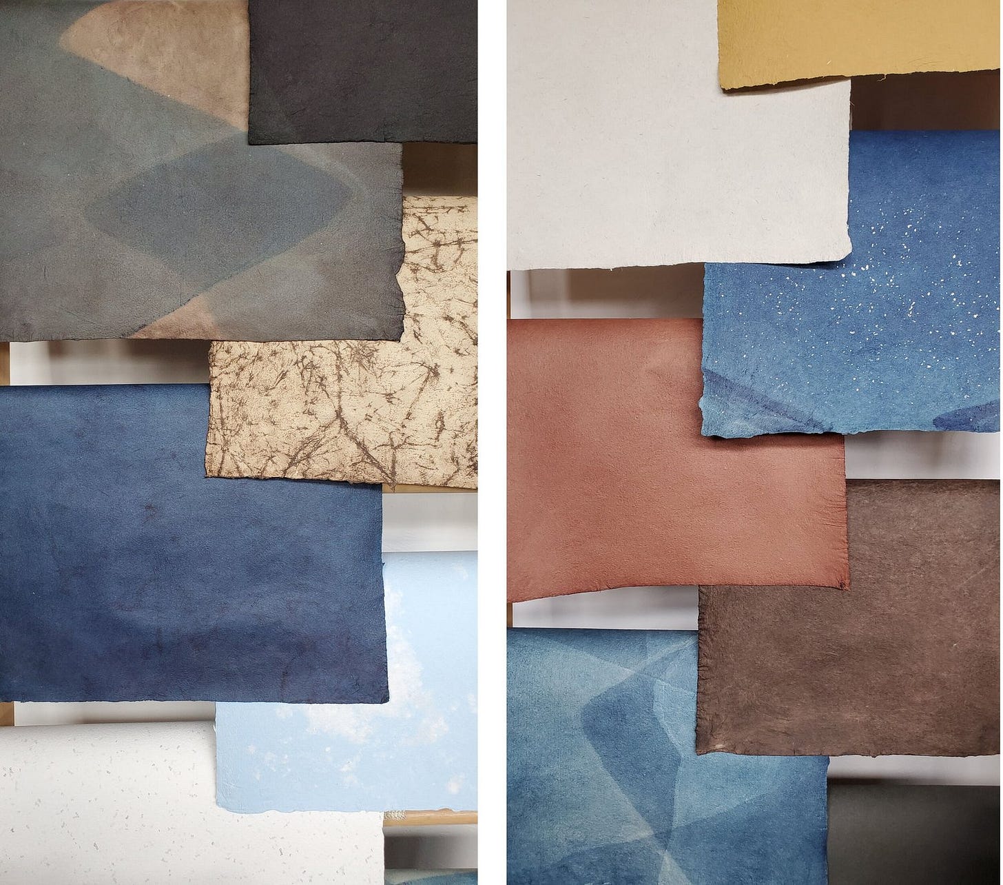
Many of these artisan papermakers – such as the remarkable and local-to-me Cave Paper – make wonderful decorative paper. And even when not decorative, per se, it tends to be heavy, for use by artists and printers who are seeking substantial papers, rather than used for a book’s text. For example, I have used Cave Papers – I love their use of natural dyes made from persimmons, pomegranates, walnuts, and real indigo –on the covers of books. They are beautiful and hard-wearing. But at what I would estimate to be 300gsm, they are not for the inside of a book such as ours.
Some of the remarkably beautiful papers made in Tucson, AZ by Zoë Goehring of Cave Paper.
I turned, with some hope to La Papeterie Saint-Armand in Montreal and Twinrocker Handmade Paper in Brookston, Indiana. I love the samples of papers I have from Saint-Armand, and I eagerly await some sheets with which to play from Twinrocker. Other remarkable hand-made paper producers – such as Ruscombe Paper Mill (France) and Velké Losiny Paper Mill (Czech Republic) – also have excellent reputations. Although many of their papers are simply too heavy for our project, each makes at least one that I considered using.
The issue here is not one of quality or appreciation, but, quite honestly, of cost. As a new private press – one which operates on passion and hope – it is hard to commit to using paper that is 500% to 1200% more expensive than some of the best papers I am considering, papers from remarkable paper mills like St. Cuthbert’s, Arches, and (maybe?) Zerkall. To do so would more mean huge financial commitment and risk, more than quintupling the budget for the entire project.
Please do not get me wrong. Would I love to use one of these remarkable hand-made paper for this project? Yes! Do I in any way begrudge the pricing of these papers or think they are overpriced? Absolutely not! I understand the incredible amount of time, skill, resources, passion, inspiration, and damn hard work that go into the process of making such paper. It would be an honor – and very much in keeping with the spirit of The Ideal Book – to use such paper. But even the Doves Press used a mechanically-produced paper in its books. Hopefully, at some point in the not too distant future, I will be able to partner with one of these remarkable handmade paper companies. In the meantime, I admire their beautiful artisanal paper and dream.
The Upshot: NOS to the Rescue
Just as I resigned myself to using the wonderful – but not perfect – Ingres D’Arches MBM, I decided to do one last search for the Zerkall paper for which I pined. Yes, it is no longer made, and the U.S. importer had none left. But maybe, just maybe, I could find some elsewhere. That is when new old stock – items that are no longer made but were never sold when they were – came to the rescue. I was able to identify four U.S. retailers who still listed Zerkall Frankfurt paper on their websites. Three had between 25 and 100 large sheets. Even if sourced from all three, they had far fewer than the 500 I need for this project. One, however, had 1035 sheets left! Although tempted to purchase it all, my fiscal conscience kicked in and, instead, I immediately ordered the 500 sheets needed for The Ideal Book.
So… within the next week, about half of the last remaining stock of Zerkall Frankfurt paper in the U.S. should arrive. I am excited that I yet one more obsessive detail in creating a facsimile of The Ideal Book has been settled. Next up… printing!
The Ampersand Book Studio Facsimile Edition of “The Ideal Book”
For those interested in reserving a copy of our edition of The Ideal Book, you can reserve your copy in our shop.


Thank you for the excellent note on paper problems. Having used Canson Ingres in my bookbinding efforts, I can see why you would reject it for printing. Great for endsheets and bindings, not so great for printing. Good job! I look forward to my copy of The Ideal Book.