Mapping Typography
The Making of "Master and Commander" – Chapter Two
As I started to create a new design for Master and Commander, I found myself thinking about maps. The world of Jack Aubrey and Stephen Maturin is “charted territory,” indeed, situated in the reader’s imagination through Patrick O’Brian’s brilliant writing. But how to reimagine it for this edition?
Without being pedantic (for all love!), I am trying to let the text guide my decision-making. Look, for instance, at Jack’s approach of sea-faring. In The Far Side of the World, we are told that “wise captains avoided innovation at all costs.” Yet Jack was not above creative rigging if it could squeeze an extra half-knot out of Surprise. I take this to mean that this edition ought to echo publications of the historical era, but it should not be a slavish imitation. Neither an ersatz antique nor obviously anachronistic.
Perhaps it is trying to square the circle, but ultimately, this line of thinking has led me to choose a classically modern typographical design. It is influenced by Georgian typography, and some of the sources for this approach are — no surprise — maps of the era. Maps in Napoleon’s time were hand-lettered or hand-engraved, using ornamental and calligraphic lettering for the legend and place names. But they could not be too “artsy.” Maps had to be clear and compelling, not innovative and obscure.
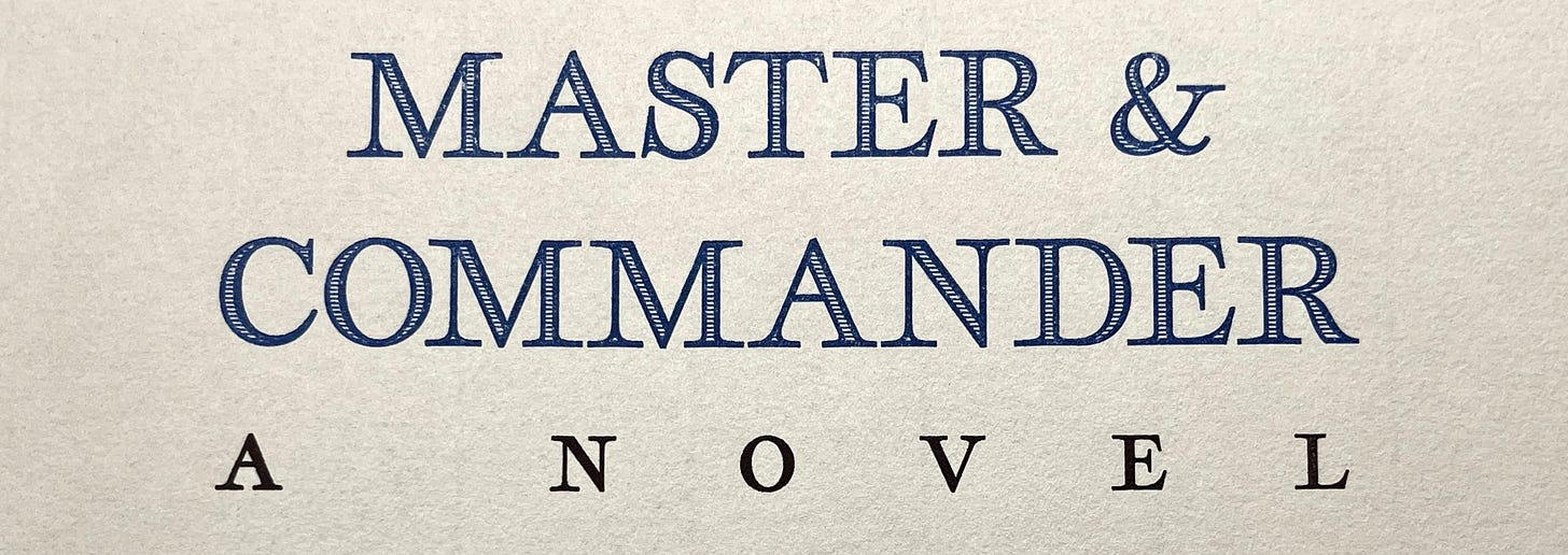
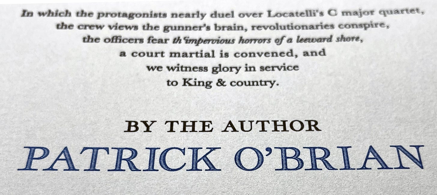
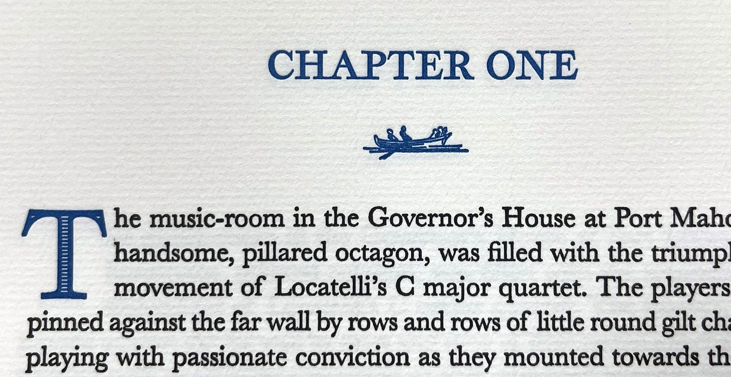
This chapter will dive into the typography of Georgian maps and show how they contribute to the design of the our title page, chapter headings, drop capitals, and typographic ornaments.


Titles, Initials & Ornaments – Returning to Georgian Maps
Fortunately, I am not alone in being inspired by the typography of 18th-century maps. In 2016, typographer Brian Willson of Three Island Press set out to create a series of fonts based on Georgian maps. Willson writes:
You might’ve noticed we have three typefaces with “Geographica” in their titles: our four-style Geographica text-type family, and two vintage replications, Geographica Script and Geographica Hand. They’re related not only by name, but by source matter—i.e., the 18th-century British map engravings of Emanuel Bowen and Thomas Jefferys—and all come with exhaustive sets of vintage cartographic ornaments.
Two of Willson’s three typefaces – Geographica Hand and Geographica Script – are quite accurate recreations of the type and penmanship found on period maps, including that of our endpapers:
Although lovingly created and true to map typography of the era, these two fonts just felt a bit too much of the period – too much of Georgian mapmaking and not enough of modern book design – for use in our edition of Master and Commander. I feared that they would end up looking antiquated, as if it were “ye olde booke” rather than a book that could still appeal to the modern eye.
Willson’s third font option, however, was different. Rather than a literal recreation of type of the era, Geographica is “inspired” by it. What does that mean? Well, I cannot speak on Mr. Willson’s behalf, but it struck me as being a modern interpretation of map typefaces rather than an facsimile of them. It is like a sly wink at the Georgian style:
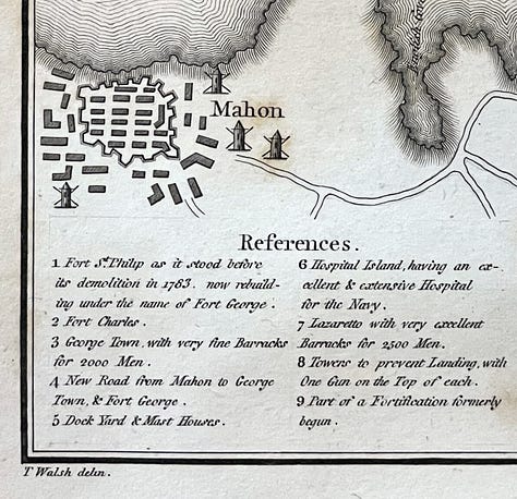
The place where one can see this distinction between inspiration and imitation most clearly is in some of the alternative letterforms created by Mr. Wilson. Take, for example, his interpretation of the type used to entitle many maps of the era – exemplified by our own map of Mahón:

The hand-wrought original exhibits an exaggerated contrast between the thin and thick lines, highlighted even further by the horizontal shading of the latter. While maintaining high contrast, Willson’s version exhibits heavier outlines than the original… its letterforms are more vertical and less blocky… and it has a greater consistency than its hand-lettered inspiration. Although there can be no doubt about the historical inspiration behind it, I find Geographica to have just the right amount of modern character. It is an ode, rather than a reproduction. As such, I found it to be ideal for use on our title page, chapter headings, and drop capitals.
“Here Be Dragons” – Map Ornaments
One of the distinctive elements of early maps is their use of ornamental illustrations ranging from the useful (e.g., compasses, ships, and the direction of prevailing winds) to the fantastical (e.g., mermaids and dragons inhabiting unknown waters).
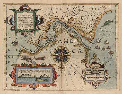
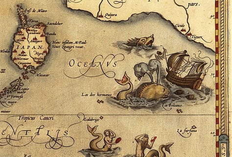
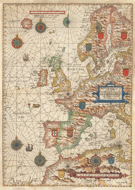
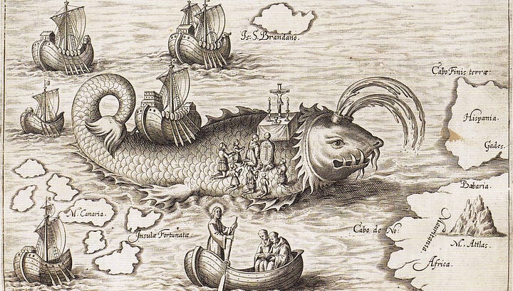
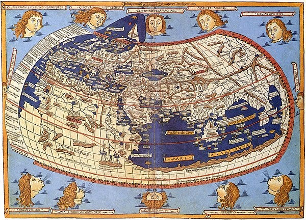
Although the number of monsters inhabiting maps had declined by 1800, cartographic ornaments and symbols were still widely used. Fortunately, in addition to the typeface itself, the Geographica family offers dozens of cartographic ornaments – everything from compasses to whales.
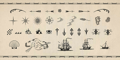
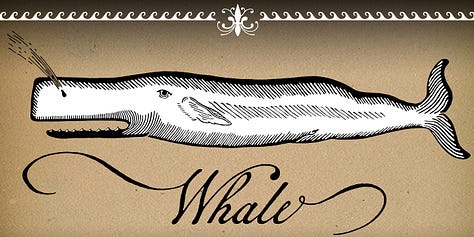
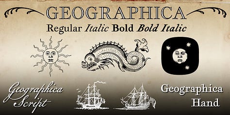
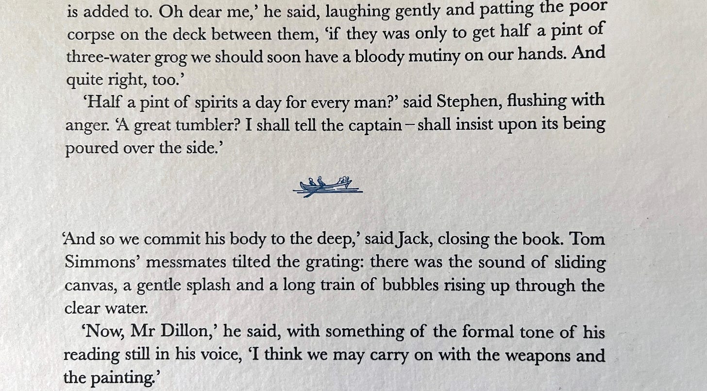
For our design, I resisted the temptation to overuse these wonderful ornaments, limiting myself to a single ship on the title page and a small image of a row boat as a separator of sections within chapters. For text, a little bit of ornament goes a long way.
Our judicious use of cartographic elements adds character without being kitschy. That being said, we have secret plans for their profligate and flamboyant use in the final packaging of the book! (But that is just between you and me for now.)
Next Time: The Text Design
Of course, the most essential typographic choice is that of the text itself. In our next chapter, I will explore the history of 18th-century type and the revolution that emerged from the Birmingham workshop of John Baskerville.
Our Map of Mahón
Do not forget… As part of our Kickstarter campaign, our giclée print of the 1803 map that appears in Thomas Walsh's Journal of the Late Campaign in Egypt. It depicts Mahón harbor as it would have appeared during the events of Master and Commander. It has been color-enhanced in blue and red in a manner reminiscent of hand-colored maps of the Georgian Era. 13"x20" in size, it is printed using archival inks on 100% cotton BFK Rives paper from the Arches mill which has been producing mould-made paper in France for over 500 years.



Nice overview of why Geographica typeface is chosen. Will the Clamshell Box use the same typeface?
Wonderful! Thank you so much for these background conversations. They're adding so much to my anticipation and will (no doubt) equally add to my delight in the finished article!
You said "I am trying to let the text guide my decision-making... this edition ought to echo publications of the historical era, but it should not be a slavish imitation. Neither an ersatz antique nor obviously anachronistic." That, of course, is equally true of O'Brian's writing style - it feels completely 'of the period', while being a million miles away from reading like the Naval Chronicle.