At first glance, the process of creating a facsimile of The Ideal Book may appear to leave little room for creativity. However, at every stage of the process, I have found myself with choices. How faithful can I be to the original? How faithful do I want to be? For me – I have an alter ego in academia, after all – the answers to these questions must always start with research. Without a full understanding of the books of the Doves Press – their aesthetic, typeface, printing, and binding – it is impossible to know which “rules” to follow and which ones require breaking (and why).
As I move from the printing to the binding of The Ideal Book, I wanted to share some of my process… the research done, the original vision and choices made by Cobden-Sanderson and the artisans of the Doves Press, and the decisions I have made in creating our edition.
Revisiting Design Decisions in the Printing
I have written previously about the process of printing The Ideal Book and the challenge of trying to live up to the work of a master. Before moving on to exploring the binding process, I wanted to make one additional observation about the printing of the text.
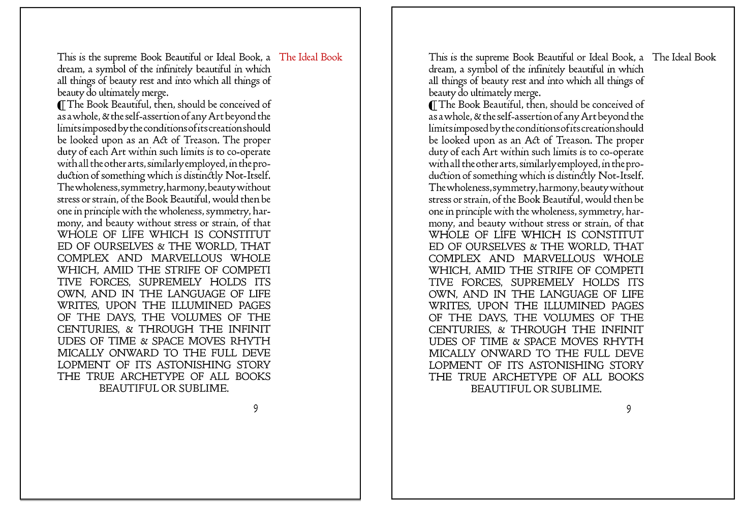
The use of distinctive red section headings became a hallmark of Doves Press books. It is, without a doubt in my own mind, one the those small, simple changes that has a remarkably wonderful impact on the overall design of the page. These two renderings of The Ideal Book – one in all black and one with the section headings in red – show how big of an impact such a small change can have.
I admit to being tempted to use the design element of color in our facsimile of The Idea Book. Indeed, in an early press proof, I printed a few pages this way. Yet, as one of the very first things printed by the new press, the use of a secondary color had not yet entered into the Doves Press design vernacular when The Ideal Book was printed. So, despite the temptation to “improve” on the original, our edition follows the original in using only black ink.
Doves Press Vellum Bindings: A Note of Thanks to a True Artist
Karen Hanmer is one of the most knowledgeable and talented bookbinders in the world today. Her artist books and design bindings are spectacular. Over the last three decades, her books have been added to the collection of the British Library, the Library of Congress, as well as private collections. She has had her work in solo and group exhibitions across North America.
Fortunately for those of us in the book world, Karen does not only create incredible books. She also does extensive research on historical binding structures, and she shares her knowledge with generosity, teaching what she has learned along the way.
Shortly after deciding to create the facsimile edition of The Ideal Book, I discovered that Karen had researched the structures and construction of Doves Press books. Indeed, she had developed a set of notes and instructions on the construction of vellum bindings as created by William Morris’ Kelmscott Press and the Doves Press, as well as for other historical book structures.
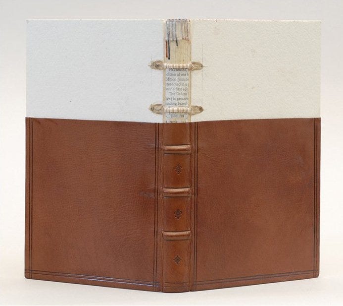
Karen has been extremely generous with offering her time, expertise, and guidance to me as I have worked on this project. Could I have pulled this off without her? Possibly. However, I can say with certainty that this edition of The Ideal Book is infinitely better and more historically correct, as well as much more timely – her work saved me countless hours of my own research and experimentation – thanks to her expertise and generosity. I encourage you, dear reader, to get to know Karen and her work.
Limp Vellum Bindings of the Doves Press
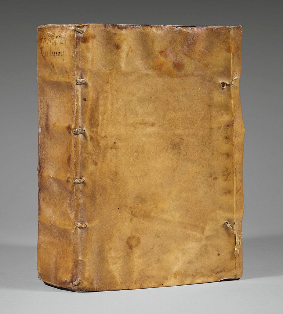
The binding of Doves Press books reflected T.J. Cobden-Sanderson’s preference for simplicity. As discussed in a previous post, his aesthetic was a direct response to the Gothic style of another Arts and Crafts publisher, William Morris’ Kelmscott Press. Given the remarkable attention – to an almost obsessive degree – exhibited in the design and printing of the text of Doves Press books, it is hard to imagine that a similar level of attention was not devoted to the binding of the books. The bindings of the Doves Press (with some exceptions noted below) were almost rustic in nature – relying on the beauty of materials and revealing the structures of the book. With no ornamentation to hide behind, each and every design element – no matter how small – must have been carefully considered.
The vast majority of Doves Press books were bound very simply, using calf vellum covers supported by a piece of paper or a thin card. The idea was – as was common with many Arts and Crafts designers – to let the beauty of the material speak for itself. With vellum, natural variations in tone and texture create a simple yet rich sensory experience. Over time, use and handling will add additional “life” to the vellum. The only “decoration” on these vellum bindings is the gold tooled titles on the spine (see below for more on titling).

This vellum binding style remained consistent throughout the history of the Doves Press, including their remarkable editions of The Bible and Paradise Lost.

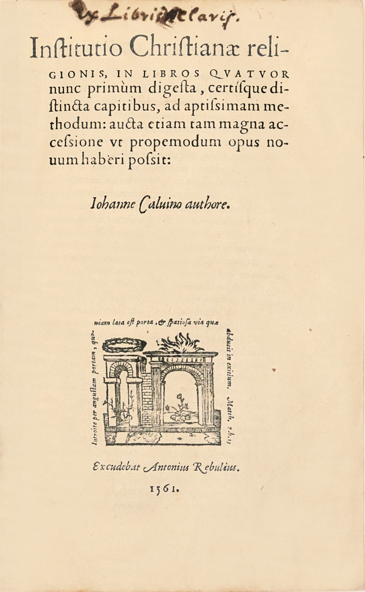
In The Ideal Book, Cobden-Sanderson says that the elements of the ideal book should “communicate to the imagination, without loss by the way, the thought or image intended to be communicated by the Author. And the whole duty of beautiful [books] is not to substitute for the beauty or interest of the thing thought and intended to be conveyed.” In arguing that the content of the book should always be the focus, it is unsurprising then that he would have sought simplicity of design when it came to the binding of his volumes. For such simplicity, Doves Press vellum bindings drew their inspiration from and harken back to the European vellum bindings of the 14th-17th centuries in which the “cover” was exactly that: merely a wrapping for the protection of the much more valuable (and valued) text.
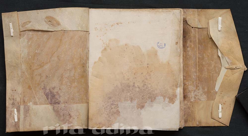
As simple and “undecorated” as these bindings were, the book’s structural elements – such as the supports and the cords which secure the folds of the vellum – are exposed, making the structure itself an aesthetic element. Beauty is derived from function.
Although Doves Press bindings forego highlighting these structural elements on the outside of the book, they are subtly revealed inside the covers where it is possible to see the impression of the linen supports onto which the pages were sewn, as well as the turn-ins where the vellum cover is folded over.

The choice to reveal these structural elements was very clearly a conscious one. In the much rarer leather-bound editions issued by the Doves Press, these structural elements are hidden in a manner more in keeping with 20th-century fine binding conventions.

What may or may not have been intentional is the degree of bubbling, puckering, and lack of adhesion between the vellum cover and the pasted-down endpapers.
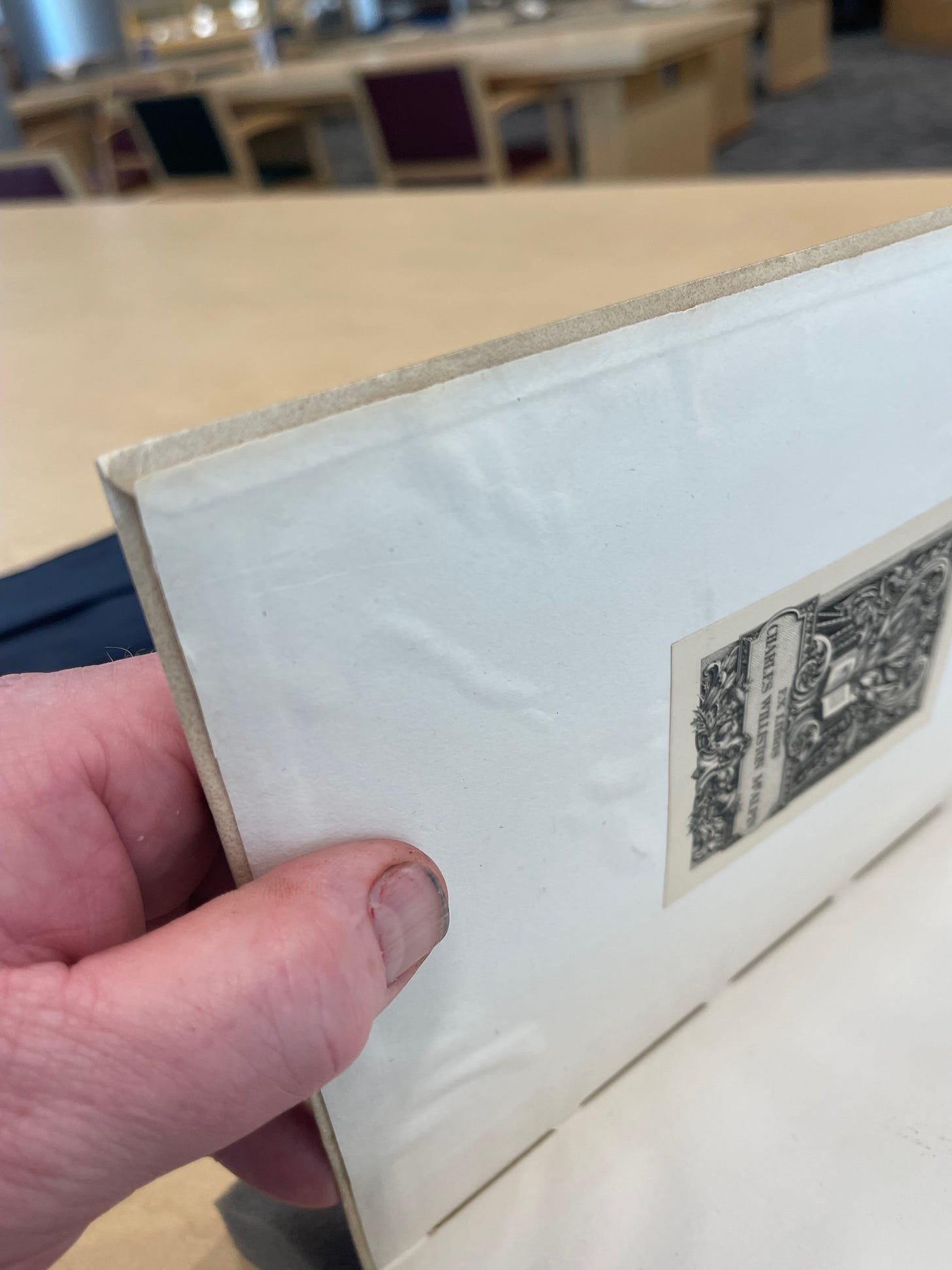
It is unclear to me when this developed - over time or when Doves Press was releasing its books? At the Doves Press, there was always a tension between Emery Walker’s mercantile attitudes in which “good enough” was good enough, and Cobden-Sanderson’s more highly aesthetic priorities. Perhaps this was one of those areas where Walker’s views carried the day. However, I would not put it past Cobden-Sanderson to have included this as a “design element” reminiscent of medieval vellum bindings. Either way, in creating the facsimile, I have been working very hard to ensure smoothly adhered paste downs. However, I suppose this means that if such “imperfections” develop over time (or slip my attention in the binding process), that it would just make our edition more authentic.
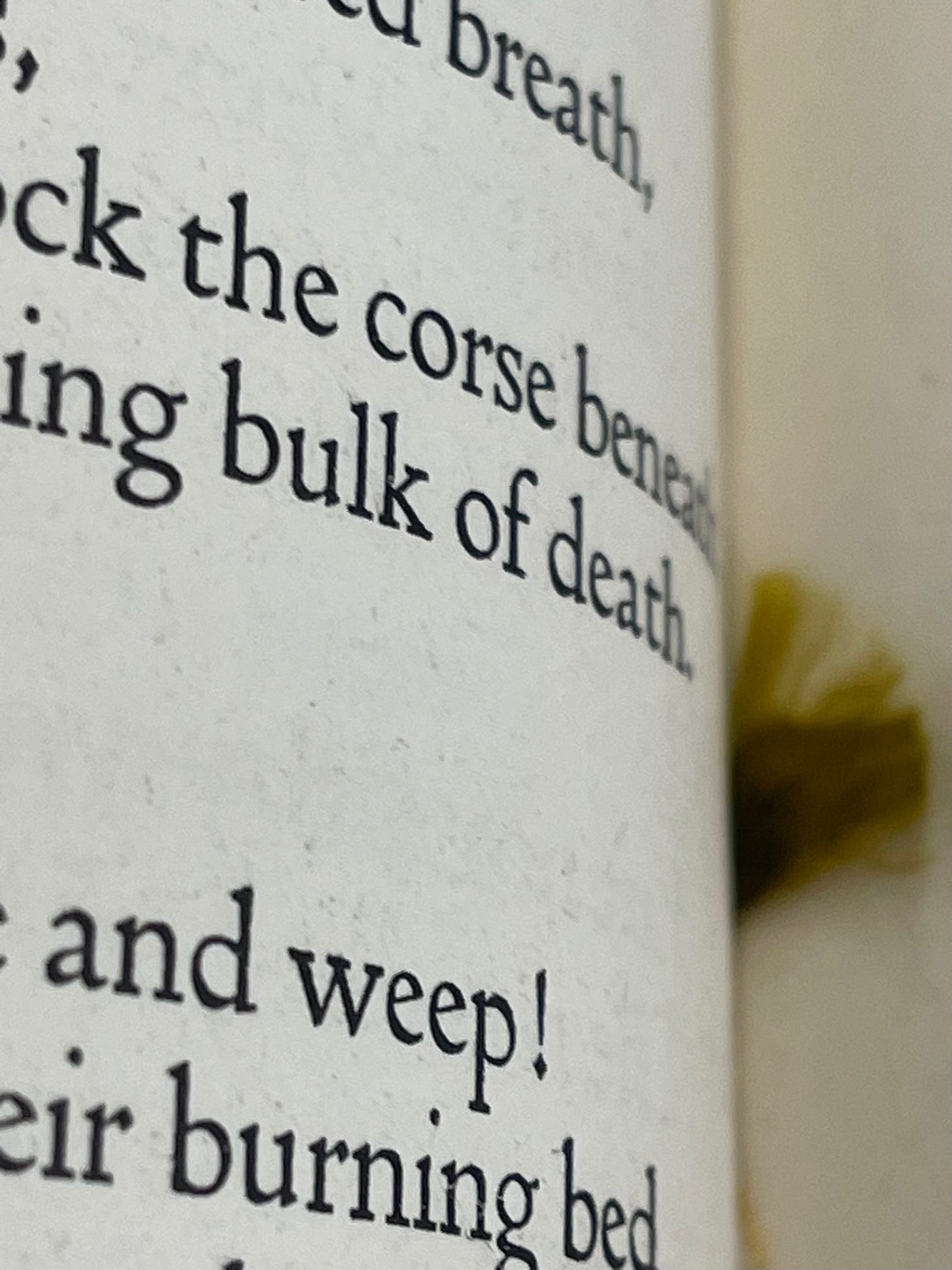
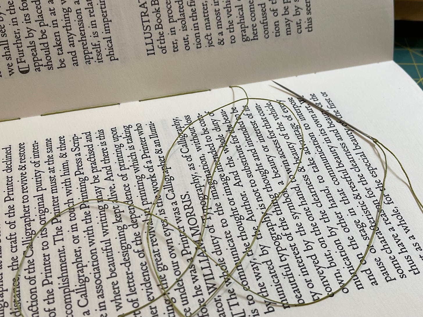
The photo of Pervigilium Veneris (above) also reveals another key design element common to all Doves Press limp vellum bindings: the use of a distinctive green thread for the sewing of the book sections, the first of which are always visible when the book is opened and throughout the bound sections.
Although the Doves Press used silk sewing thread, its tendency to fray can be seen in the close-up of the 1914 Tennyson. For our facsimile edition, we have used a fine “Dandelion Green” Londonderry linen thread from France in its stead. Linen is the gold standard for the sewing of books, and the color is as close a match to the original as possible (although it is ever so slightly lighter than the original).
“I like plain endsheets and plenty of them.”
Whereas many Fine Press books feature decorative paper inside the front and back covers, Cobden-Sanderson’s aesthetic of simplicity was carried over to this design element as well. Karen Hanmer quotes him as saying, “I like plain endsheets and plenty of them.” An examination of Doves Press books shows him to be a man of his word. Each of their volumes use between four and seven blank leaves (8-14 pages!) at both the start and end of the book.
For our edition of The Ideal Book, we have followed this convention, inserting six leaves (12 pages) of plain endsheets front and back. In addition to matching the aesthetic of original Doves Press volumes, it also provided a degree of substance to what is, essentially, a nine-page essay.
Gold Tooled Titles
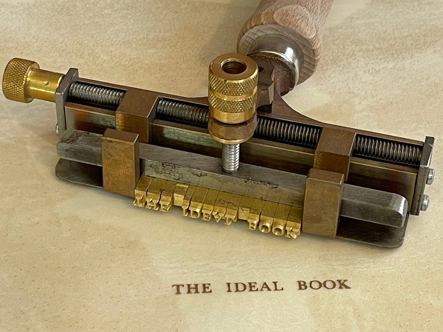
There was a moment of panic after I titled all of the vellum for the Lettered Edition. Had I titled the spine upside down?!? My gut said that it looked wrong. To my modern eye, it was topsy turvy. Today, titles tend to run from the head to the tail of the book with the top of the letters along the front cover. Why in the world would I have done the opposite? The simple answer is because this is how the Doves Press titled their books. As a facsimile, my “eye” is less important than accuracy. So, the title of The Ideal Book runs from bottom to top. That said, over time and across places, this convention has changed.

For our edition, I have applied the title in 22K gold using traditional brass type heated in brass type holder.
To trim or not to trim…
Original Doves Press books were printed on custom-made paper that met the specific design requirements of Cobden-Sanderson, including the size of the parent sheet (the large sheet of paper from with the smaller, printed pages are created). These large sheets were then printed “eight-up” – with eight pages printed on each side of the paper – and folded into octavos before being sew into sections.
Once sewn into a book block, the folds at the fore edge, head and/or tails of the octavos would then be slit open to create freely-turning pages. If you have ever been lucky enough to find an old book that no one had read, you may have had the joy of cutting such uncut pages yourself.
Given the simplicity – perhaps even austerity – of the Doves Press binding design, the slightly uneven, somewhat organic texture of the slit pages became a design feature on many of their books.
This proved a bit of a challenge for our facsimile. Not only did we not have access the the custom-made and sized paper used by the Doves Press, printing 8-up would require a very large press – one which could print on a 19” x 26” parent sheet. Such presses do, of course, exist. My personal dream press would be an Original Heidelberg Cylinder Press – thought by many to be the finest letterpress machine ever made – which can print up to 21” x 28”. However, in the meantime, I was limited to printing 2-up (i.e., a folio in which a single piece of paper is printed on both sides and folded once to create four pages of the finished book). As a result, there were no un-cut pages.
I settled on a bit of a compromise here. For the Lettered Vellum edition, the top and fore edge of the book have been left untrimmed after the book block is sewn; for the paper-bound version, just the top edge has been left untrimmed. This creates a degree of intentional unevenness and simulates the effect of cut pages. This is one of the few ways – along with paper choice and sewing thread material – in which there is divergence from the original.
Project Progress
All of these decisions have guided the creation of our edition of The Ideal Book, and binding continues apace. All pre-orders of both the Lettered Vellum Edition and the Paper Edition should be ready and in the post by the end of the month.
We are offering two versions of The Ideal Book. The Lettered Vellum Edition – limited to 27 copies – is as close to the original Doves Press version as we can make it. It features…
A vellum cover which uses calfskin vellum produced by William Cowley Parchment & Vellum, a fourth-generation family business in England who makes the parchment on which all laws passed by Parliament are written.
A line-by-line recreation of the original text using an electronic version of the typeface developed for the exclusive use of the Doves Press.
Pages letterpress printed on some of the last Frankfurt laid paper produced by the Zerkall Mill in Germany before it ceased production in 2021.
Hand-sewn using Londonderry linen thread on four linen supports.
Title tooled in 22K gold on the spine.
As of this posting, nine of the 27 copies are still available for pre-order. We are still on track to ship this edition at the end of November.
Our Paper Edition features almost all of the same elements with the following differences:
The cover is made of “vellum” paper from the now defunct German mill, Zanders, rather than calfskin vellum.
The fore edge is trimmed, rather than left rough.
In all other respects – printing, paper, design, etc. – it is the same as the Lettered Vellum Edition.

