Revolution and Typography in the 18th Century
The Continuing Story of the Making of "Master and Commander"
We live in an era in which we can change the look of a document on a computer screen with a few button clicks. The aesthetics of type is both more noticeable than ever, yet, perhaps, less considered. Ease, ubiquity, and low cost have made ours both a golden age of typography and a veritable tower of typographic babble. Finding the right font – or, at least, a right font – remains one of the most important factors in designing text.
The first and foremost job of typography is to serve the text. As T.J. Cobden-Sanderson wrote in his seminal essay, “The Ideal Book or Book Beautiful: A Tract on Calligraphy, Printing, and Illustration and on the Book Beautiful as a Whole,”
The whole duty of Typography… is to communicate to the imagination, without loss by the way, the thought or image intended to be communicated by the Author. And the whole duty of beautiful typography is not to substitute for the beauty or interest of the thing thought and intended to be conveyed by the symbol, a beauty or interest of its own, but, on the one hand, to win access for that communication by the clearness & beauty of the vehicle, and on the other hand, to take advantage of every pause or stage in that communication to interpose some characteristic & restful beauty in its own art.
In other words, typography must play a supporting role, allowing for the prominence of the author’s voice. It is the backup singer, not the lead (pun intended). That being said, although Gladys Knight is wonderful alone, with the Pips behind her, she shines!
So, how to make Patrick O’Brian’s literary voice shine typographically? For our edition of Master and Commander, I started with the premise that using a typeface available and in use in England during the Georgian era would do the trick. However, rather than presenting a clear design direction, it led to a historic struggle, as two views of typography came into conflict during the era. Printers in the 1700s were simply not all on the same page, embroiled in conflicts over tradition versus innovation, just as others were having parallel debates related to science, politics, religion, economics, and art. In order, then, to decide the best typeface for Master and Commander, it was necessary to dive into this history.
Caslon and the “Old Style”Classics
Our easy, computer-driven times can lead us to forget how time-consuming and expensive publishing has been historically. In the 18th century, type was made of metal that was cast using hand-engraved matrices. With as many as 2000 characters on a single page, a printer needed many thousands of individual sorts (single metal letters) for each typeface, size and style. A period printer would have literally tons of metal type separated into drawers ready for use in laboriously laying out pages by hand. Thousands of pieces of metal type was a long-term investment and the daily tool of the printer. Often, printers would invest in just one typeface for text and use that for the entirety of their careers.
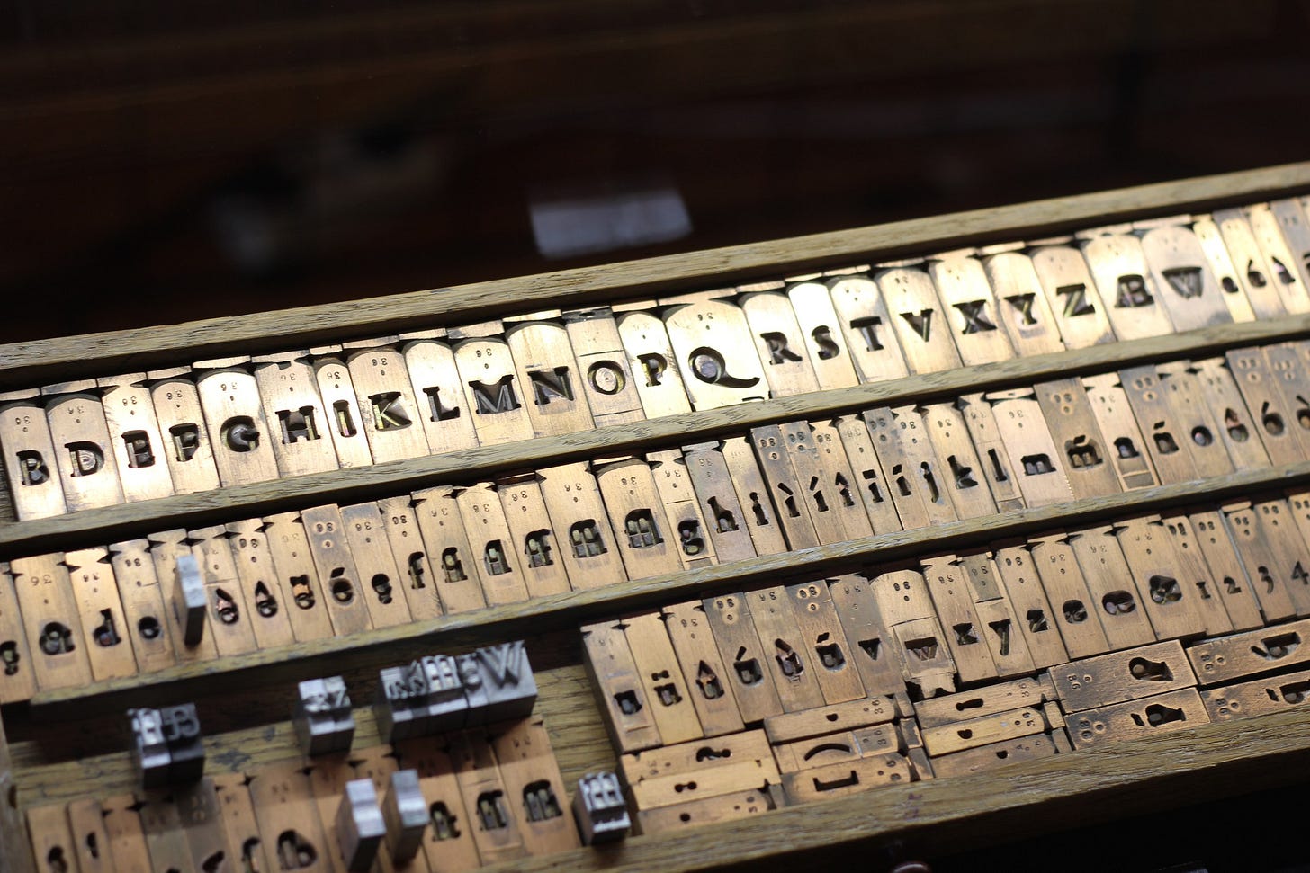
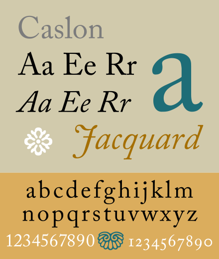
Thus, for the early drafts of Master and Commander, I started with one of the great typefaces of all time: Caslon. Created by master engraver William Caslon (c. 1692–1766) in London, was “the” type of 18th century England, as well as in a certain upstart of a nation, the United States of America. Benjamin Franklin (to whom we shall return shortly) used Caslon in his workshop since at least the 1750s, and on the night of July 4, 1776, the first 200 printed copies of the Declaration of Independence – produced by Philadelphia printer John Dunlap – also used the font.
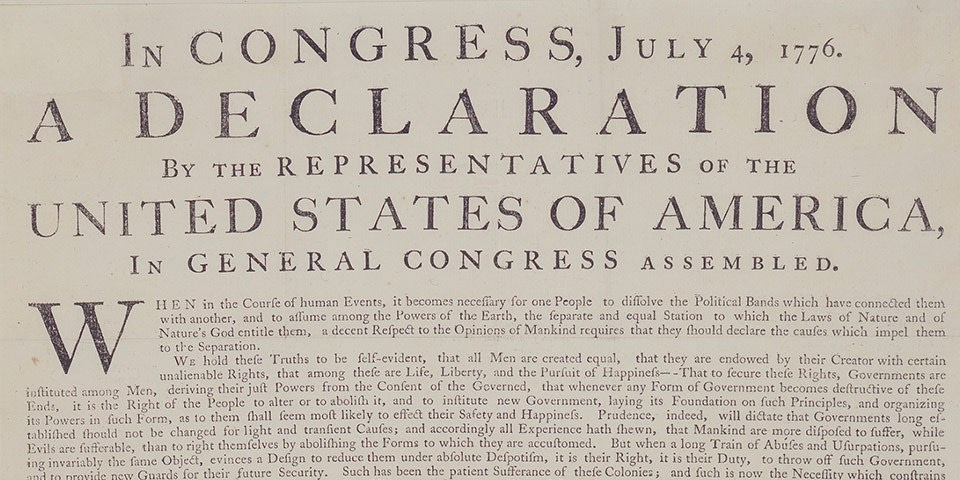
It is easy to understand the popularity of Caslon, one of a family of “old style” typefaces that dominated English printing from the late 15th through the mid 18th centuries. Based largely upon the the typeforms of the Roman empire, they feature curved strokes whose axis inclines to the left, and little contrast between thick and thin lines in the letters.
On the face of it, using Caslon for Master and Commander seemed like a good idea. However, when I examined the initial proofs, the text felt a bit too old style, as though emerging from a world prior to that of our intrepid heroes. So, it was back to history… Perhaps the use of Caslon and other “old style” fonts began to decline for a reason.
18th Century Transitional Type
By the mid-18th century, the principles of Enlightenment thought had taken over. Rather than celebrating tradition, this emerging world looked toward rationality, progress, and scientific knowledge. In his work, Patrick O’Brian tracks these ongoing trends of post-Enlightenment thought on the worldviews of our protagonists. To illustrate, I offer a very few examples of the conflict between these old and new sensibilities that appear throughout his work:
Stephen asks of his wool onesie, “Have you ever seen anything so deeply rational?”.
Jack adamantly opposes the supposed progress and efficiency that would be brought about by the enclosure of the commons.
Emerging scientific knowledge appears everywhere from Stephen’s naturalizing to Jack’s transition from “intuitive” to “scientific sailor.” Even the Polychrest is based on “Scientific Principles” (and we all know how that worked out!).
One theme of Patrick O’Brian’s work, then, is how old worldviews and the modern come into conflict, are embraced and rejected, and shape everything from how we understand nature to our social structures.
It should come as no surprise, then, that there was a similar conflict between tradition and innovation in the typography of the era. The man who took on the old ways was John Baskerville (1706-1775).
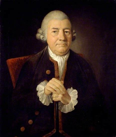
Baskerville was the most important proponent and practitioner of “progress” in printing in the 18th century. Having begun his career as a “writing master” and carver of headstones, Baskerville made his fortune producing and selling affordable “japanned” lacquerwork in Birmingham. He used this fortune to finance his passion: the perfection of the printed book. His innovative mind saw him make improvements to virtually every aspect of the printing process: the casting of type, presses, paper, ink, and most lastingly, typography. As he wrote in the preface to his edition of Paradise Lost:
Having been an early admirer of the beauty of Letters, I became insensibly desirous of contributing to the perfection of them. I formed to myself ideas of greater accuracy than had yet appeared, and had endeavoured to produce a Set of Types according to what I conceived to be their true proportion... It is not my desire to print many books, but such only as are books of Consequence, of intrinsic merit or established Reputation, and which the public may be pleased to see in an elegant dress, and to purchase at such a price as will repay the extraordinary care and expense that must necessarily be bestowed upon them. [5]
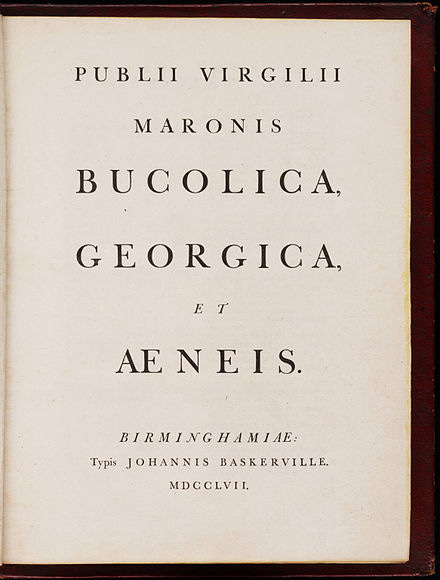
Baskerville’s type was revolutionary for its time. Taking advantage of the improvements in printing offered by his other innovations, he realized that he possessed the capacity to print with finer detail, even at the small size of text. Thus, he could – and did – develop letterforms with greater variability of line weight. That is, his letterforms saw greater contrast between heavy and light lines, as well as finer serifs. He also sought to modernize the feel of the type, making letterforms more vertical when compared to the old style forms that were based on hand-wrought Roman letters.
Although these differences – shown below – may seem subtle, they make a huge difference in how text appears on the page.
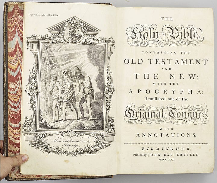
Bringing together his new type with his improvements to paper, ink and presses, he printed his first full book in 1757, an edition of Virgil. Within a year, he was appointed University Printer at Cambridge University where he released his magnum opus, a folio edition of the Bible, in 1763.
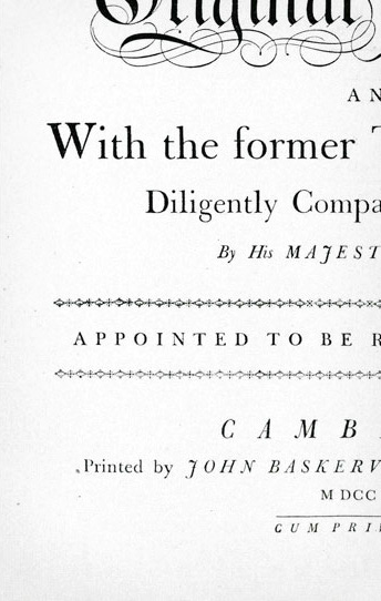

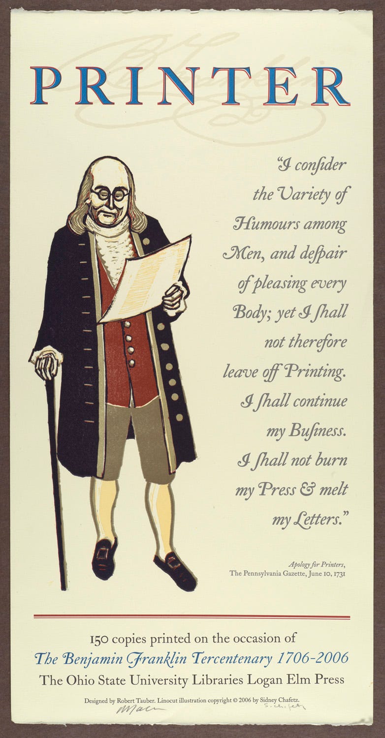
Despite his accomplishments, however, Baskerville’s work was not without its critics at the time. Some critics thought that the high contrast between thin and thick strokes on his type caused headaches for the reader, a claim rebutted by none other than printer Benjamin Franklin, one of Baskerville’s admirers. In an c. 1760 letter to Baskerville, Franklin wrote:
Dear Sir,
Let me give you a pleasant Instance of the Prejudice some have entertained against your Work. Soon after I returned, discoursing with a Gentleman concerning the Artists of Birmingham, he said you would be a Means of blinding all the Readers in the Nation, for the Strokes of your Letters being too thin and narrow, hurt the Eye, and he could never read a Line of them without Pain. I thought, said I, you were going to complain of the Gloss on the Paper, some object to: No, no, says he, I have heard that mentioned, but it is not that; ’tis in the Form and Cut of the Letters themselves; they have not that natural and easy Proportion between the Height and Thickness of the Stroke, which makes the common Printing so much more comfortable to the Eye. You see this Gentleman was a Connoisseur. In vain I endeavoured to support your Character against the Charge; he knew what he felt, he could see the Reason of it, and several other Gentlemen among his Friends had made the same Observation, &c. Yesterday he called to visit me, when, mischievously bent to try his Judgment, I stept into my Closet, tore off the Top of Mr. Caslon’s Specimen, and produced it to him as yours brought with me from Birmingham, saying, I had been examining it since he spoke to me, and could not for my Life perceive the Disproportion he mentioned, desiring him to point it out to me. He readily undertook it, and went over the several Founts, shewing me every-where what he thought Instances of that Disproportion; and declared, that he could not then read the Specimen without feeling very strongly the Pain he had mentioned to me. I spared him that Time the Confusion of being told, that these were the Types he had been reading all his Life with so much Ease to his Eyes; the Types his adored Newton is printed with, on which he has pored not a little; nay, the very Types his own Book is printed with, for he is himself an Author; and yet never discovered this painful Disproportion in them, till he thought they were yours.
I am, &c.
Today, there is little doubt of Baskerville’s brilliance and contributions to typography and printing.
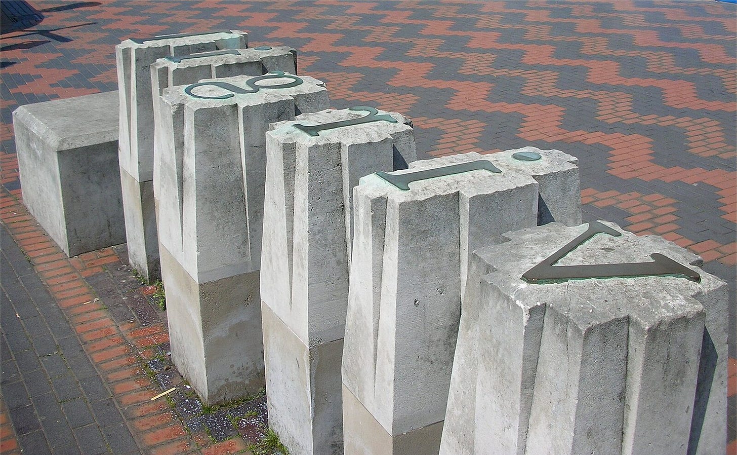
As radical as Baskerville’s typography may have seemed at the time, today, it is considered more of a “transitional” typeface. While it moves away from the Roman forms of the previous three centuries, it barely anticipates the changes in typography that would come in the 19th and 20th centuries. In the end, it is this very fact that made it a natural choice for our edition of Master and Commander. Just and Stephen and Jack stand in between the old world and modernity, the Baskerville typeface does as well. Plus it is one of the most pleasing fonts to actually read, a classic still used widely today.
Unifying Text and Titles
While using Baskerville for the title page, headings, and capitals of our edition would have been “period accurate,” Baskerville, himself, strayed from the use of his own typeface in, for example, the title page of his Bible (see above). And, as important as simplicity and clarity of type were to Cobden-Sanderson, he too recognized the need to create “the especial beauty of the first or introductory page and of the title, and… the especial beauty of the headings of chapters, capital or initial letters, & so on.” The design choices for those elements were discussed in a previous essay here. For now, suffice it to say that the design for our edition seeks to unify Baskerville’s transitional text font with Geographica, a more decorative font that harkens to the era without giving in to kitsch.
If you enjoy reading about typography, you may be interested in my previous posts on the subject in which there is intrigue, night-time theft of type, scuba diving, and more.
Production Updates and Other Happenings
As of this writing, we are gearing up for full production of our edition of Master and Commander. The custom handmade paper from Velké Losiny in the Czech Republic (used in the HMS Victory edition) arrived in Tucson (but not yet at the shop) on Friday.
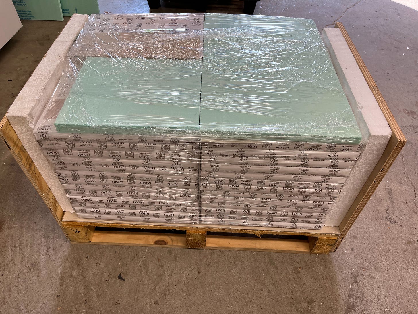
The Arches MBM paper should be being off-loaded in the port of New York this week. Our friends at Crown Flexo are finishing up production of the printing plates. And we have hired a wonderful production associate (whom I will introduce to you all in my next missive) who will help during the printing process. We are on schedule to begin printing during the first full week of June, and I anticipate it will take approximately eight to ten weeks of full-time work to complete the printing process. After so much planning and coordinating of supplies and resources, I am really excited to get ink on my hands (and, of course, on the page!).
Also coming up this week will be an open studio time for those attending the Amalgamated Printers’ Association’s 2023 Wayzgoose.
If you are like me, you may not have been familiar with the term “wayzgoose” until now. A wayzgoose was originally a celebration hosted by a master printer for his workers on or about St. Bartholomew’s Day. Historically, it marked the end of summer and a return to working by candlelight in the workshop. According to World Wide Words, the first use of the “wayzgoose” was in 1683:
The Master Printer gives them a Way-goose; that is, he makes them a good Feast, and not only entertains them at his own House, but besides, gives them Money to spend at the Ale-house or Tavern at Night. ... These Way-gooses, are always kept about Bartholomew-tide. And till the Master-Printer have given this Way-goose, the Journey-men do not use to Work by Candle Light.
Today, however, wayzgoose has come to mean a gathering and celebration by printers (and even publishers). This year’s APA Wayzgoose is hosted by the wonderful Book Arts and Letterpress Lab at the University of Arizona. If you happen to be in town for the Wayzgoose (of for any other reason), feel free to stop by and visit us as we undertake the final preparations for printing. We will welcome all visitors on Thursday, June 1 from 10am until 3pm at Betts Printing (the home for all of our printing work) in Tucson. Stop by for conversation, a tour, and free espresso!





Lovely article, as a big O'Brian fan, I found your research and development for a suitable typeface superb!
Fascinating. Thank you again for another great article. I am really enjoying each one of these.