For our edition of Master and Commander, we are delighted to be working with Brazilian maritime artist Carls Kirovsky.
Carlos’ work focuses on maritime and railroad subject matter. He has mastered various techniques to capture the dynamic movement of these classic forms of transportaion. Using techniques ranging from pen-and-ink illustration to watercolor and oil painting, his work is featured in collections worldwide, as well as in institutions such as the Brazilian Maritime Museum in Rio de Janeiro.
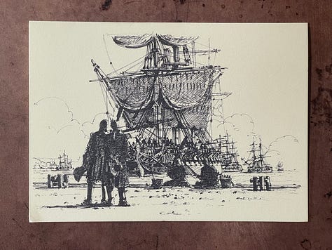
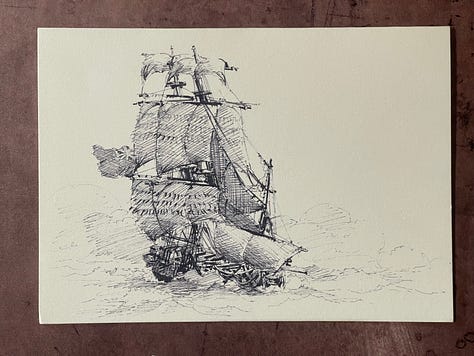
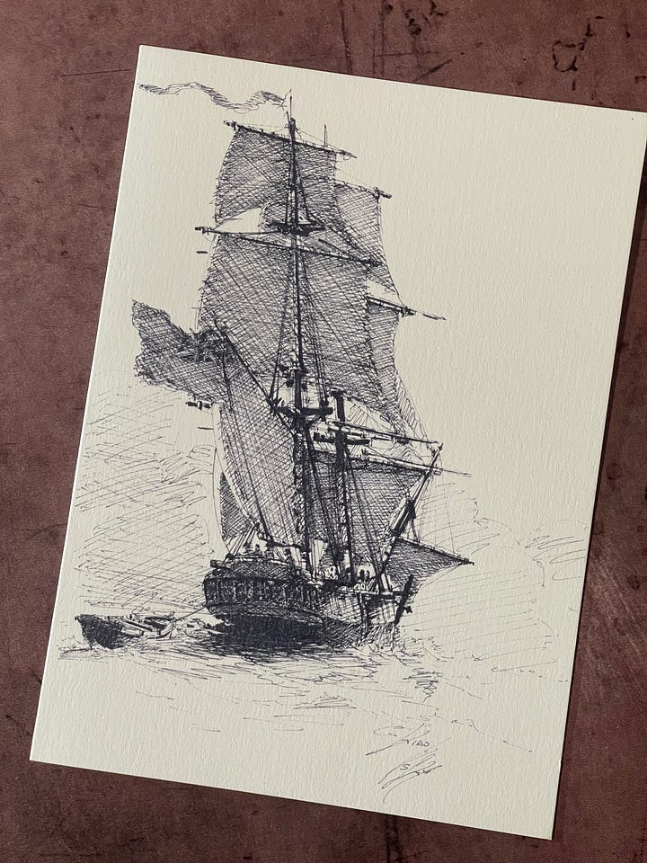
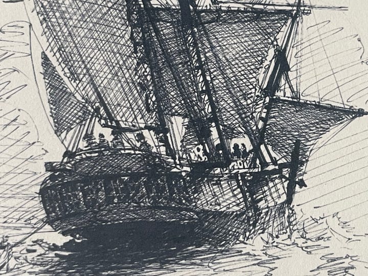
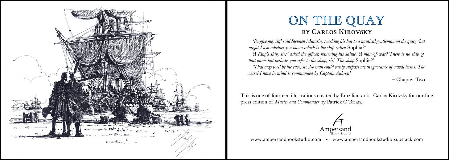
For our edition, Carlos has created fourteen new pen-and-ink illustrations. Each chapter features an image evocative of the events relayed therein. Without revealing each illustration, here are a few of the new images created by Carlos…

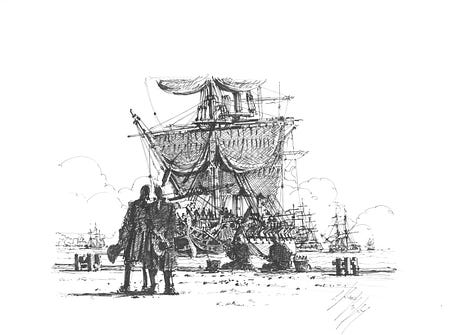

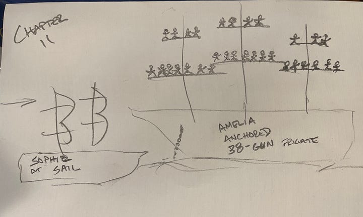
The process of working with Carlos has been wonderful… and quite often funny given the fact that, although his English is quite a bit better than my (non-existent) Portuguese, sometimes things were lost in translation. This meant that, at times, he asked me to sketch my idea for a particular illustration. To say I am not an artist is… well… generous. Stick figures? Check. No sense of perspective or scale? Check. But somehow, with the help of a copy of Master and Commander in Portuguese, WhatsApp, and good will on both of our parts, Carlos came through with a wonderful set of images to accompany our text.

Printing the Illustrations
With Carlos’ wonderful illustrations in hand, the question of how to best reproduce them arose. Once again, we turned to history on how to faithfully reproduce great art.
For thousands of years – from the stenciled Neanderthal symbols in caves to the art installations of Ai Weiwei – artwork has been a series of unique creations. Each work of art remained a one-of-a-kind expression. However, there has been an equally strong desire for re-creation. Whether for educational, political, economic or aesthetic reasons, the desire to share artwork widely has driven the development of printing technologies aimed at creating multiple copies of a single image.
Woodcut Prints
Originating in China nearly 2000 years ago, woodblock printing of images is among the first printing technologies developed. An image – or even text – is carved in relief into a piece of wood which it then inked and pressed against a piece of paper (or in the earliest examples, from the second century CE, cloth). By 1200CE, such woodcut printing had spread throughout Asia, eventually reaching its apex in Edo period Japan (1603-1867) when multiple woodblocks were used to create images so iconic that they remain a part of popular culture today.


It was not until about 1400 – a few short decades before Gutenberg’s printing press – that woodcuts took root in Europe. Often combining text and images, they continued to be used to print books throughout the century; it was seen as a cheaper alternative to those printed using the innovative – and expensive – printing press of Gutenberg (1440). Woodcuts were used for the Biblia Pauperum (“Paupers’ Bible) of the 15th century. Featuring simplified line illustrations, both the text and the image were carved into a single block for printing each page.

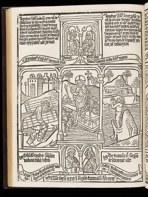

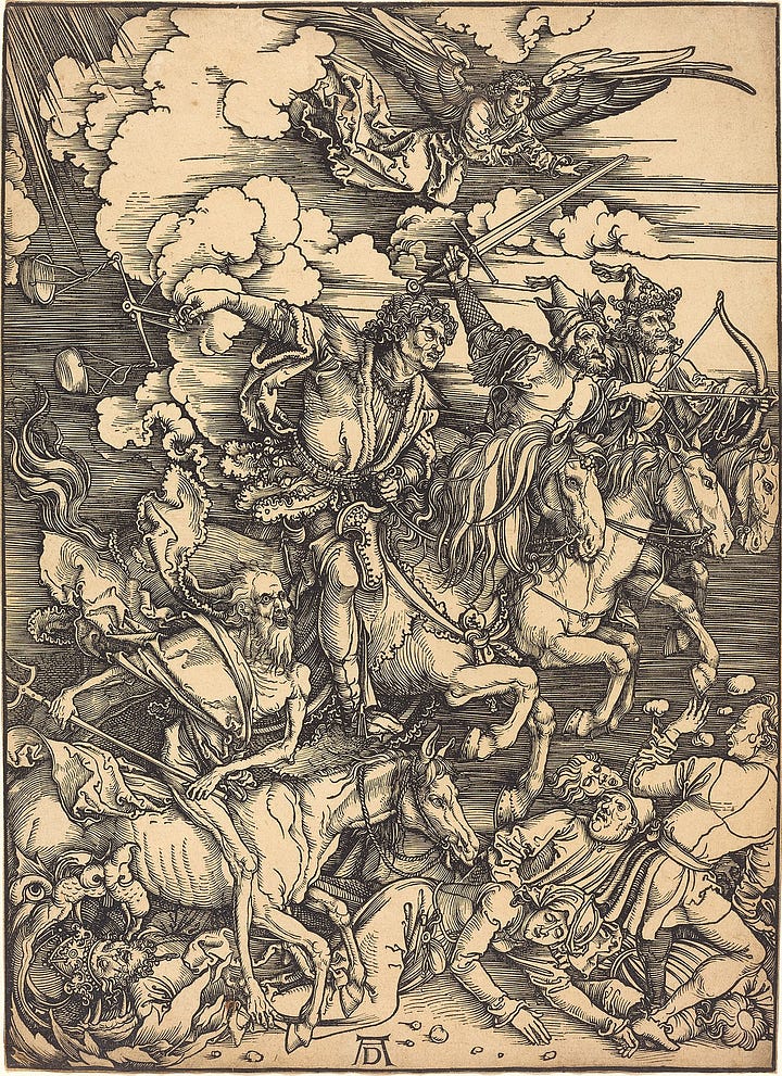
The use of woodcuts for book production was short-lived as the printing press – with its moveable type – spread. However, as a Western art form, woodcuts were just beginning to take off. Albrecht Dürer raised the quality of woodcut illustrations in the West, offering them as “single leafs” or images designed and sold as individual images rather than as elements of a book.
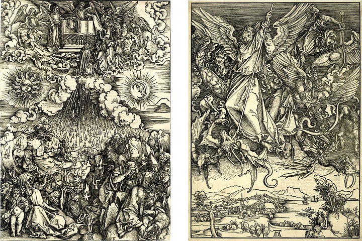
As will be unsurprising to readers of my previous post on The Arts and Crafts Movement and the Fine Press, the simple, refined, and artisanal nature of woodcuts became a key medium for book illustration and stand-alone artwork in England and the United States. William Morris’ Kelmscott Press used full-page woodcuts to illuminate its edition of the works of Geoffrey Chaucer (1896). And some of my favorite Arts and Crafts artists, particularly Gustave Baumann (1881-1971), utilized multiple woodbooks to create evocative images that captured the forms and colors of the Southwestern U.S.
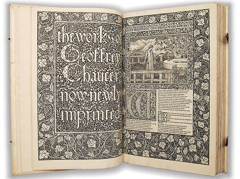


In the hands of a masters such as Dürer, Hokusai and Baumann woodcut illustrations evolved into a remarkable art form in and of itself. However, it is extremely limited for reproducing anything but a derivative and simplified version of other works of art. Therefore, woodcuts are not an option for reproducing Carlos’ illustrations.
Intaglio Prints
Intaglio prints – etchings and engravings – were the next iteration of printing multiple copies of artwork. In some ways, intaglio printing is the opposite of woodcuts. Whereas woodcuts were a form of relief printing (wherein the raised parts of the image are covered with ink and then transferred to the paper), intaglio print uses a plate into which the image carved (for engravings) into or removed by acid (for etching) from a plate. Ink then fills the resulting grooves and the paper is pressed under high pressure to transfer the ink from the grooves to the page.

Old Masters such as Rembrandt and Albrecht Dürer took intaglio printing to new heights.
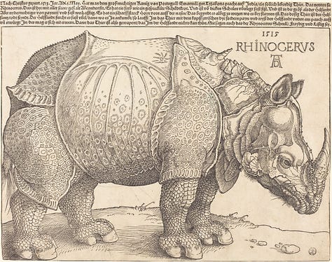
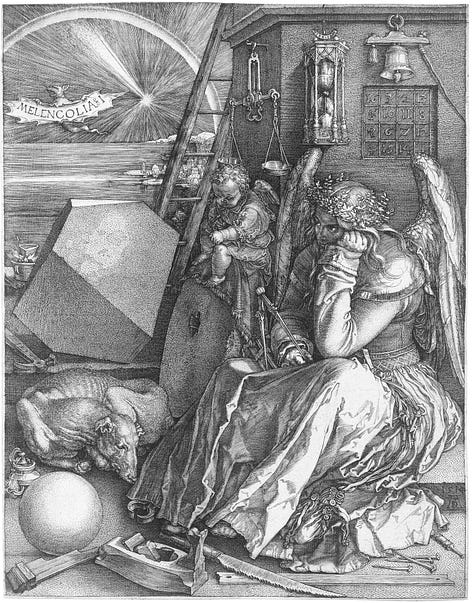

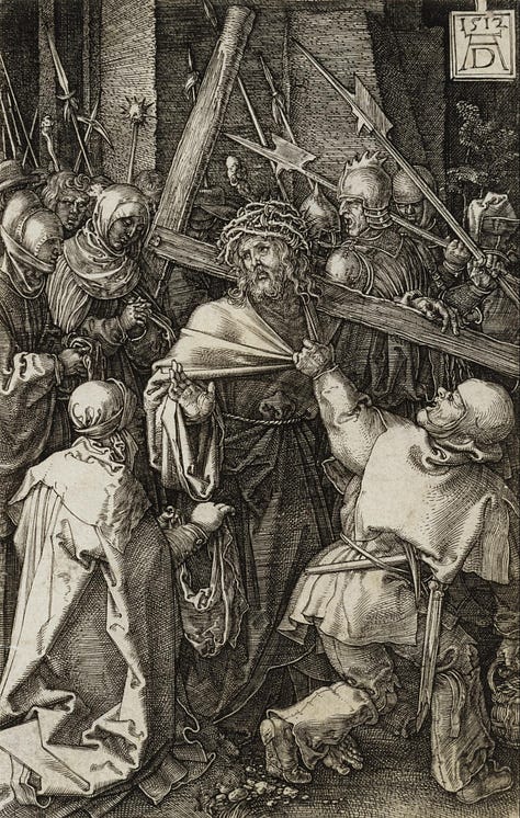

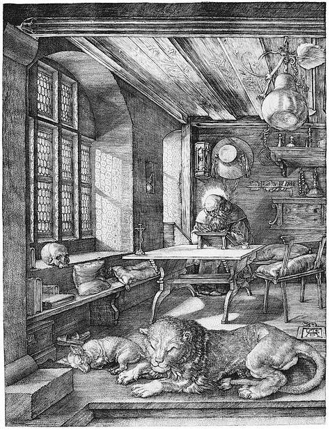

The process of creating intaglio prints is complex and satisfying, as seen in this wonderful video from the Rhode Island School of Design.
Throughout the 18th and 19th centuries, intaglio printing was used extensively in the printing of images in books, including maps such as the one that appears in the endpapers of our edition of Master and Commander. However, as we have discussed in an earlier post, these maps were only able to be printed in a single color, almost always black. The colors on period maps were added by hand after the printing process was complete. Moreover, we would need the original engraved plates from which the map was made.
Intaglio is a remarkable process and art form in and of itself. However, as with woodcuts, it has limitations for our purposes. It is excellent for original artwork or as a new work based upon another work. But it is not a good technique for faithful reproduction of an existing artwork. As we saw in the RISD video, engravings of other works are made by tracing and artistic interpretation. This is not a critique of it as a medium. However, when used for reproduction, it is, at its best, a new work of art based on an another, and at its worst, a poor copy. Faithful reproduction is not its strong suit. Once again, for the illustrations of our book, intaglio printing was not the answer.
Stone Lithography
As we all know, oil and water do not mix. With this in mind, Alois Senefelder invented a new printing process in 1796 in Bavaria: stone lithography. In lithography, an image is drawn onto a very flat piece of limestone using an oil-based medium (e.g., a wax crayon). A solution of gum arabic is then applied to the stone, and it adheres to all the areas not covered by the image. The areas of the stone that are not covered by the illustration (i.e., the negative space) becomes hydrophilic, while the oil-based illustration repels water. In printing, water is placed on the lithography stone followed by an oil-based ink. The hydrophilic areas that have absorbed water resist the ink – remember, oil and water do not mix – while the areas with the illustration retain the ink. A piece of paper is then pressed against the stone under heavy pressure, and the ink is transferred to the page.
Lithography was, in many ways, a cheaper and easier form of image printing than intaglio prints. It quickly became popular for the creation of things like inexpensive maps used in the military.
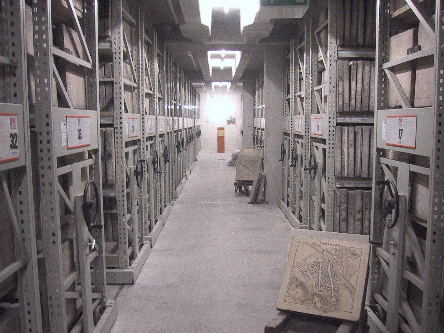
The industrialization of printing in the 19th century saw techniques and technology improve. Presses used heavy stones, so the plates were very stable — ideal for achieving very tight registration. That is, it was possible to do detailed multicolored prints using a separate stone to print each hue. For the first time, the color image became relatively easy to produce at scale. Books – particularly natural histories, ethnographies, and histories – began to contain images filled with color.


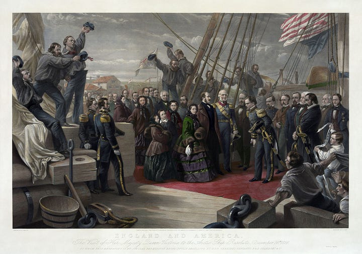
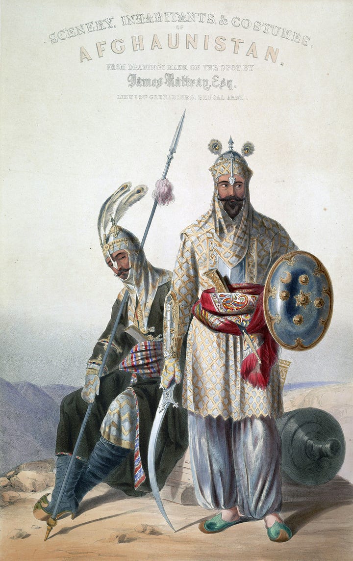
Perhaps the height of color lithography arrived in advertising posters in the late 19th and early 20th century. Large presses – such as this rare 1860 Marinoni Voirin lithography press at Landfall Press in Santa Fe, New Mexico – created stunning posters that helped define the era.
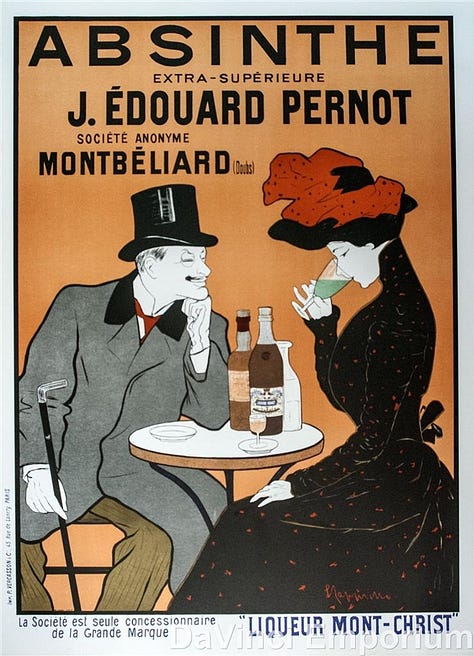
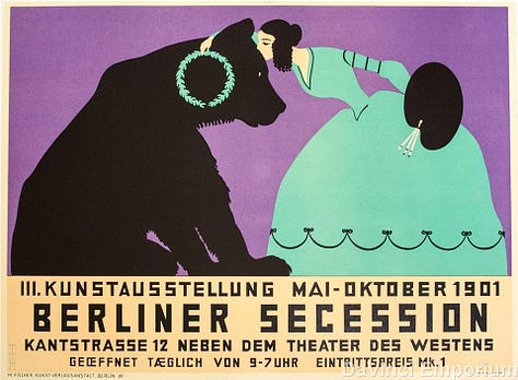
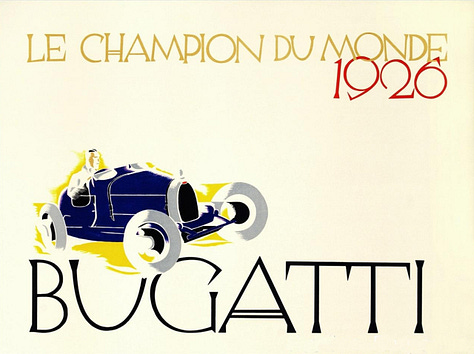
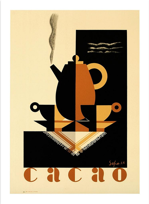
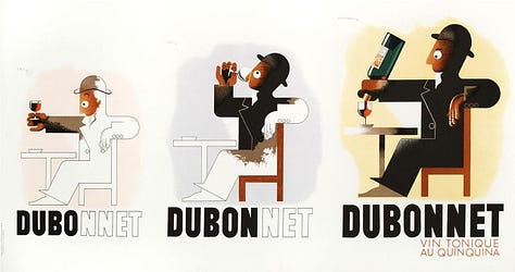
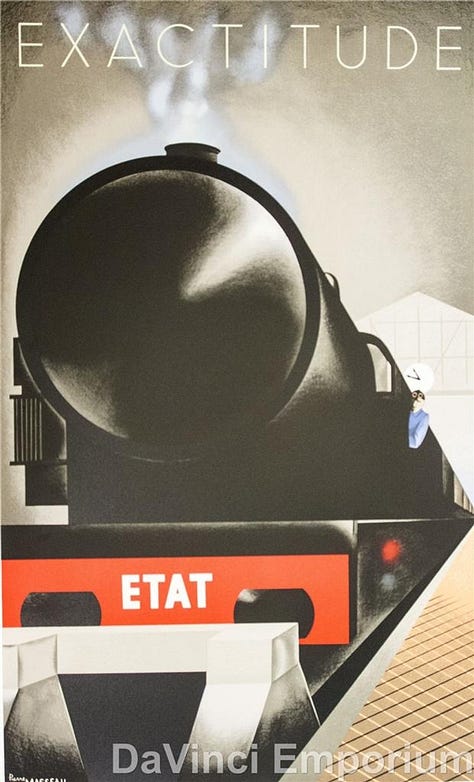

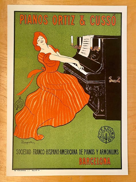
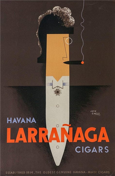
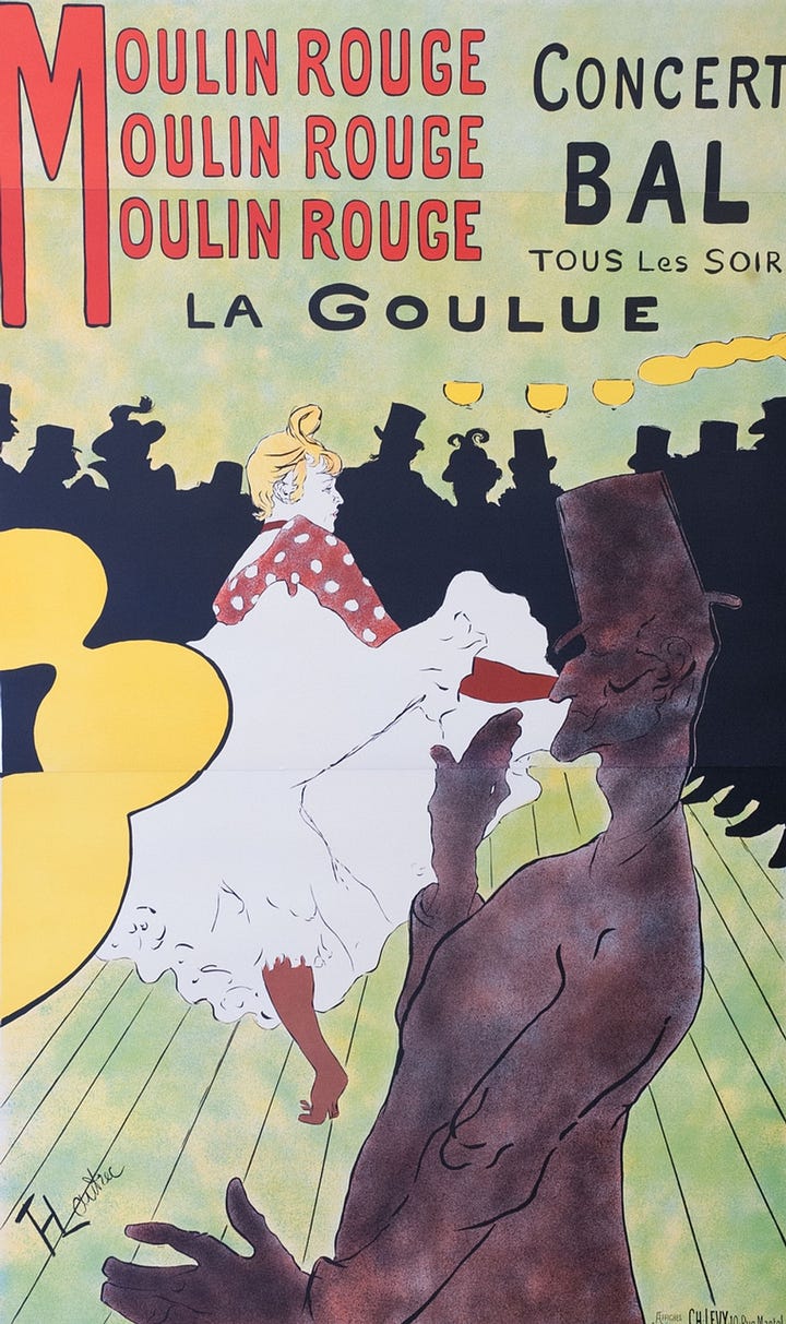
Although central to the commercial printing of the era, from a fine art perspective, lithography has seen its ups and downs. Perhaps the most prominent artist to embrace the medium in the 19th century was Toulouse-Lautrec (1864-1901) with his series of posters for the Moulin Rouge. However, other 20th century artists like Diego Rivera, M.C. Escher, and Andy Warhol also embraced the medium.


It is important to note that almost all offset printing – the most common form of non-digital printing in the world today, used in everything from magazines and commercially-produced books to brochures and junk mail – uses the same principles of repulsion of oil and water found in stone lithography. Rather than using stones, however, offset lithography uses polymer plates.
For our purposes, lithography in its stone iteration was simply not an option. The idea of having Carlos create fourteen illustrations directly on heavy limestone and ship them from Brazil to us was simply unrealistic. I would love to play with traditional stone lithography for a future project, but for Master and Commander, it was simply not the best choice.
Letterpress Printing and Halftone Illustrations
As we have seen with most previous printing technologies, printing presses are binary; they print a line or a dot, but not in continuous shades and intensities. With the rise of photography in the second half of the 19th century came the ability to reproduce continuous, smooth tones with countless shades of black/gray, and eventually colors. However, such images required the use of negatives, special coated paper, chemicals, and a darkroom.
How, it was asked, can these photographs be reproduced quickly and cheaply for a wider audience? Newspapers, in particular, became interested in how to print images en masse with their existing presses. Their answer? Halftones. The development of halftones permitted the reproduction of photographs… sort of. When you look at an actual photograph under a loupe, there are many shades of gray and no dots or pixels. Halftones replace the smooth tones of the photograph with dots. Grays are no longer made up of various tones, but by dots of black printed at various sizes and proximities.
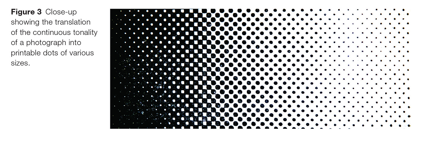
In 1869, the Canadian Illustrated News printed the first photograph using halftones:
Halftones became the standard for photo reproduction in newspapers, magazines, comics, and even books. Indeed, those of us of a certain age all remember that, within the images of current events, you could see the dots which created the image.


In its essence, the introduction of color photography did not change much in terms of printing using halftones. Rather, it merely saw a move from a single color of dot replaced by four colors of dots (cyan, magenta, yellow and black). Although more complex in execution, the same principles were at work. Individual dots combined at a small scale to create a color image when viewed in full.


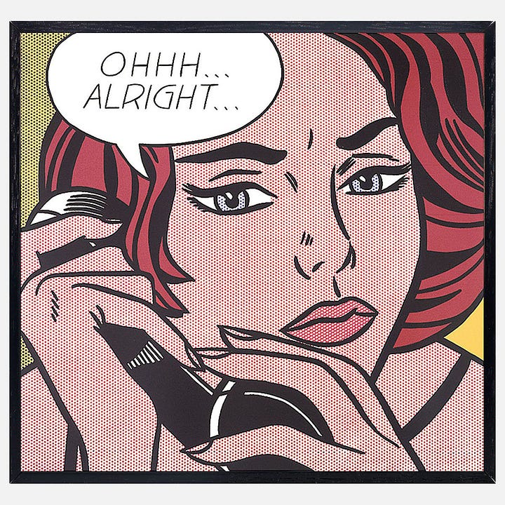
The dots of the halftone image became so familiar and iconic that they found their way into pop culture and art. Artists like Roy Lichtenstein drew upon our familiarity with them in creating many of his most famous works, exaggerating the dots and making them a central aesthetic element of his work.


Letterpress and Halftone
For many decades, images in newspapers were printed using the same technology as other letterpress printing. Thus, when we began to test Carlos’ images on the press, we did so having converted them to halftones. When his original drawings were converted to halftones at their full size (roughly 12” x 16”), they looked acceptable. However, when converted to a size to fit within our book, they lost a great deal of texture and detail. Although exaggerated for the sake of illustration, the details from one of the drawings (below) show the problem.


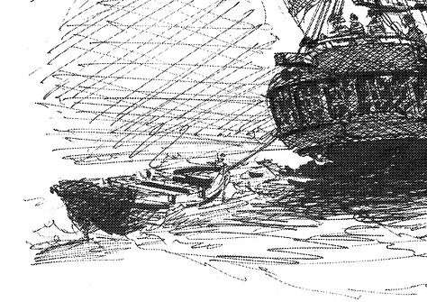
Despite our original intent to print Carlos’ illustrations using the same letterpress technique as the text, we simply could not do so. Too much of his artistry – too much quality – would be lost in the process. Sometimes, despite our commitment to tradition, technologies actually do improve things. Indeed, the entire history of printing has been a history of such marginal and revolutionary improvements.
Digital Printing
With the ubiquity of the modern computer came a completely new form of printing: digital printing in the form of laser and inkjet printers. Unlike all previous forms of image printing, in digital processes, there is no physical plate needed to produce an image. Rather, pigments are sprayed directly onto paper – toner (powdered pigments) in the case of laser printers and liquid pigments in the case of inkjet printers.
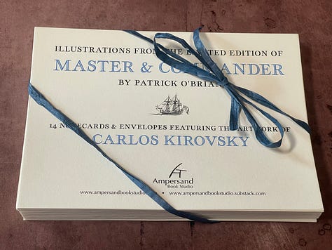
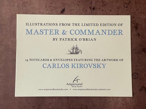
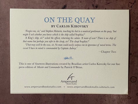
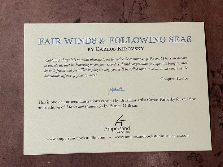
Although digital printing of text is, to my mind and that of many printers and readers, inferior, it offers tremendous benefits for the reproduction of images. Whereas the dots used in halftone images are relatively large (±120 DPI or dots per inch), digital printers can achieve extremely tiny dots of ink – often more than ten times that of halftones. For the reproduction of Carlos’ illustrations, digital printing was quite simply the better choice in terms of the quality of reproduction. We are delighted by the results on our set of notecards that feature Carlos’ illustrations.

Giclée Printing the Book Illustrations
Although we love the notecards, there are two limitations of laser printing for the purpose of the illustrations in our edition of Master and Commander. First, the toner used by laser printers has a slight sheen to it. Although wonderful for stand-alone pieces such as the notecards, this sheen feels a bit too “modern” for the aesthetic of the book. Moreover, for a really good result, laser printers require a very hard, coated modern paper. Such paper would simply contrast too dramatically with the soft, traditional laid papers we have used for our editions. Second, unlike all of the materials in the rest of the book, these images are not archival. We want our book – all elements of it – to survive for generations of readers.
The solution, however, was already built into our edition: archival giclée printing on a fine art paper. On the surface of it, giclée (french for “spurt”) is just a fancy term for inkjet. When one digs in deeper, however, there are some really important differences. Unlike the cheap inkjet printers we use at home or in the office, giclée prints are made using extremely sophisticated (and expensive) printers. Among the “secret sauce” of these printers? The ink they use. Much like when I wrote about letterpress inks, not all inks used in digital printing are the same. Fine art printers utilize twelve different archival inks to produce remarkable results. Grays are not produced by just using less black; rather, they are produced using a combination of black ink, a separate gray ink, and (when appropriate) small amounts of other inks. This leads to a much richer set of tones and greatly improved fidelity to the original.
Unlike the ink in the common inkjet printer, the formulation of giclée ink is also different. Most inkjet printers mostly use dye-based inks. That is, a color is dissolved in a liquid. When such dye-based ink dries on the page, they loose a degree of saturation and vibrancy; they also tend to fade over time. Fine art giclée printers, such as the one we use, feature an entirely different ink formulation, one relying on solid pigments suspended in a liquid medium. Such pigment inks operate on the same principle as letterpress inks – and the oil paints used by the Old Masters, for that matter: solid, rich pigments are laid on the page using a medium which dries with a hard finish. Thus, unlike dye-based inks, these pigment-based inks are archival, water resistant, and will last for generations.
We had already planned to use giclée printing for the reproduction of the map in our endpapers (see our article on Endpaper Design and Georgian Maps). It was only natural that we turn to the same high-quality production for our illustrations. However, despite settling on how to print both the endpapers and the illustrations, we were left with another key decision: on what paper should they be printed?
The Paper Chase (Part 2)
As we have discussed in a post regarding the paper for a previous Ampersand Book Studio publication, finding the right paper for fine press editions has become increasingly challenging: factors ranging from consolidation in the paper industry to climate change have led to a marked decline in the number and variety of fine papers available. Fortunately, for our edition of Master and Commander, we were able to identify wonderful laid papers from two of the most historical mills in Europe – the 500 year old Arches mill in France and the Velké Losiny mill which has been crafting handmade paper in (what is now) the Czech Republic since the late 16th century. For the illustrations and endpapers, however, we needed to consider alternatives, ones specially made for use with giclée printing processes.
In prototyping the endpapers and illustrations for our edition, we used a fairly standard matte paper. However, the more I looked at it, the more it just did not feel appropriate for our edition. Something was just off. Finally, I realized that it was just the wrong paper. It was a smooth, slick, modern paper that did not have any texture. It even had a slight sheen. It just felt out of place with our other period materials, especially such special papers are we are using for our text. So, I set off to find a better paper. Easy, right? Well, it turns out, not really.
For the endpapers and illustrations of books, there are several traits that one needs and/or desires. To wit:
• Texture – As noted in a previous missive, a map (and these endpapers) from 1800 would have been printed on handmade paper. Such paper – in contrast to those used for prototyping and proofing – has a subtle but noticeable texture that can be both seen and felt. It was the lack of such visual and tactile texture that led me to seek an alternative in the first place. Thus, I began to seek a paper that had enough texture to be pleasing without going overboard (e.g., a cold-press watercolor paper).
• Strength – The endpapers serve as a critical connection between the covers and the text block of the book; they are the “hinge” between the two. In modern, trade books they are almost all that connects the two. Fortunately, in our book we are using a much more robust binding that does not rely on them for a great deal of structural support. However, they are the part of the book that gets the greatest deal of use and sees the greatest amount of wear. Think of opening a book… We frequently open the cover prior to flipping to a portion of the text. Thus, although not structural, the endpapers need to hold up over countless openings and closing. Unfortunately, most modern paper is actually weaker than its hand-made predecessors.
•Archival Giclée Compatibility – Unlike the wonderful papers used for the text of our edition, the paper for the endpapers and illustrations needs to be specifically created for use with modern printing technology. Usually, this means that the paper must be coated to allow the pigments to rest properly on the paper rather than soak in and become “muddy.”
These considerations led me to look at the many (many!) “Fine Art Inkjet Papers” on the market. Although they initially seemed like the ideal solution, there was one additional requirement for our purposes that they failed to meet…
• Weight – Our tipped-in illustrations need to fit well within the book, not adding significantly to the thickness of the text block. Similarly, the endpapers need to be thin enough to be laminated (i.e., pasted together) with the first sheet of the text paper. If the paper is too heavy/thick, this can lead to a very stiff and unpleasant experience opening the book; it begins to feel like card stock rather than paper per se. Fine art inkjet papers are primarily used to print and display high-quality reproductions of art, usually for framing and hanging on a wall. This means that they tend to be extremely heavy/thick, in the 300-340gsm range. By contrast, our text paper is 105gsm (for the Arches MBM) and most cardstock is in the 200-220gsm range. These are heavy and thick papers; 50% greater than even cardstock. Clearly, these would not work.
So, what to do? Well, Japanese culture still seems to still care about the smallest details of so many craft items, including paper. For example, a couple of years ago, I went through a phase of testing dozens of papers for use with fountain pens; several Japanese papers definitely came out on top (although I, personally, do not like Tomoe River paper which has an almost cult-like status in the fountain pen community).
Japanese paper – washi – is lightweight, yet extremely strong. Kozo (mulberry) has been used for making paper in Japan for over 1000 years. Building on this heritage, Awagami Factory, an 8th-generation family-owned paper manufacturer, was among the first to find ways to combine traditional washi with the needs of today’s digital printing technologies.
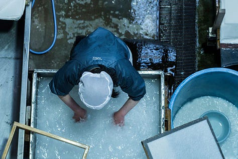
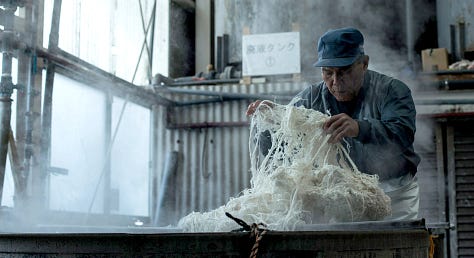

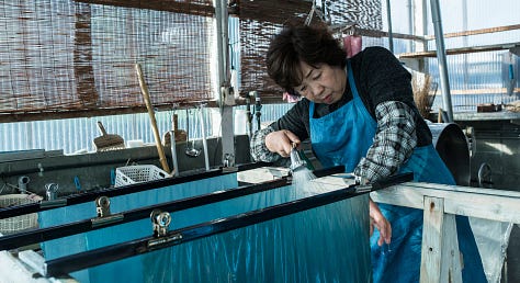


For the illustrations and endpapers for our book, we are utilizing Awagami Inbe 70gsm paper. I cannot better their own description:
'Inbe Thin' represents a unique achievement in Japanese inkjet papermaking as it is composed of a complex mix of ultra-strong hemp + kozo (mulberry) fibers yet has a finely textured surface. Inbe papers are some of our naturally whitest AIJP papers (no bleaching or brighteners) and are recommended for fine art photography, limited edition books and antique reproductions.
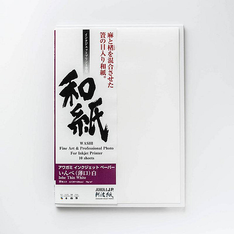
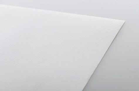
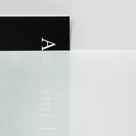
The Inbe paper reproduces our images extremely well. It matches our text paper perfectly in terms of color. Its slight texture and matte appearance harmonize with the book’s design. And it is so thin that it almost disappears when the illustrations are tipped in, yet is strong enough for the frequent handling the endpapers must endure. It is, dare I say it, perfect.
The Illustrations
The upshot of all of this – Carlos’ drawings, printing techniques, paper – is the creation of fourteen giclée prints on Awagami Inbe paper that will be tipped by hand into each copy of the book. The illustrations look wonderful. They are detailed and rich, capturing each stroke of Carlos’ pen.

Other Production Update…
Notecards
The notecards are complete! Although we originally planned on only printing six of the illustrations from the book, we could not choose… So, we now have a full set of all fourteen notecards. For those who ordered them as a part of the Kickstarter campaign, we have upgraded you to the full set and will be sending them out early next week. For those interested in ordering a set, you can do so on our website.
Bindery Update
We have completed the process of inspecting ±20,000 printed sheets, collating and hand-folding them into 16-page folios, and collating the folios into the each book’s completed text. The pages of each book now sit in their own numbered box, ready for us to begin the process of hand sewing them together.
The sewing will begin on Monday. The most time-intensive part of the binding process, the sewing, should take us five or six weeks. Look for updates about our progress, as well as an upcoming post about book structures and our binding choices for this edition.
Bookbinder’s Edition
Those who ordered an in-pages version of the book to bind themselves will be happy to hear that we plan to ship your orders late next week. We are just awaiting the final printed illustrations before packaging and shipping. We will send you tracking information once your order ships.




Great article thanks Tristan!