


Measure twice, cut 2700 hundred times
On gloves while reading, "tipping in," and boxmaking
After countless hours, many months, and even years (if you include dreaming and planning), my Anchor Edition of Master and Commander has started to enter the world. Those who ordered the book without the custom solander box should be receiving them as we speak – with some already in the hands of eager readers.
The response thus far has been very positive. Thousands of people “liked” what they saw on Facebook and elsewhere, and hundreds of people shared encouraging comments, even sharing stories of their own journey with the novel or bookbinding.
Most importantly, feedback from backers and readers has been enthusiastic. Amidst the generous words were also some questions about how to handle the book. This prompted me to think a bit more about the care of fine and old books, as well as the history of what are called “tipped-in” illustrations.
White glove service
Killick, laying the table in the dining-cabin said, “This will stop their gob for a while, thank God. Keep your great greasy thumbs off of the plates, Bill, do: put your white gloves on. Snuff the candles close, and don’t get any wax or soot on the goddam snuffers – no, no, give it here.” Killick loved to see his silver set out, gleaming and splendid; but he hated seeing it used, except in so far as use allowed him to polish it again: moderate, very moderate use. (Nutmeg of Consolation, Chapter 5)
White cotton gloves. Ships boys wear them when welcoming officers aboard naval ship; Killick dons them while serving guests in the captain’s cabin; and Jack uses one to check the cleanliness of the galley coppers during weekly inspections.
We, too, have similar associations with them. White glove service is meticulous. Artwork, antiques, and antiquities all get the white glove treatment. So, it should not have been a surprise when one of our backers, in sharing his delight at receiving his copy of Master and Commander on Facebook, wrote “I am afraid to touch it without gloves.” Shouldn’t the white glove treatment be applied to books? Well, the Library of Congress, the Smithsonian Institution, the British Library, the Folger Library – and librarians across the globe – agree that the answer is an emphatic “No!”
Just last year, The New York Times reported on how pervasive this belief is.

Last month, The New York Times reported on an ultrarare medieval Hebrew Bible that was headed to auction with a record-smashing estimate of up to $50 million.
The reaction was swift. “Why are they handling this without cotton gloves? Shame on them,” one reader wrote in the comments section, referring to photographs showing someone touching the worn pages. “This photo is disturbing,” wrote another. “Why is this person touching such an old book with ungloved hands?”
The alarmed tweets and emails kept rolling in. At the same time, a silent scream of exasperation arose at rare book libraries around the world.
People who handle rare books for a living are used to doing battle with a range of dastardly scourges, including red rot, beetles and thieves. But there is one foe that drives many of them particularly crazy: the general public’s unshakable — and often vehemently expressed — belief that old books should be handled with Mickey Mouse-style white cotton gloves.
“The glove thing,” Maria Fredericks, the director of conservation at the Morgan Library and Museum, said when contacted about the matter, sounding slightly weary. “It just won’t die.”
“Every time it comes up, I sigh deeply,” said Eric Holzenberg, the director of the Grolier Club, the nation’s oldest private society of book collectors. “And then I give my three-sentence explanation of why it’s” — to use a milder term than he did — bunk.
— The New York Times, March 9, 2023
Why is this? Wearing gloves reduces our tactile awareness, making it much easier to not feel the edge of pages, leading to more tears. The soft cotton gets caught on small tears, making them larger. And even more than clean hands, they catch and transfer dirt from one surface to another.
I appeciate the experts weighing in on the issue. It also reinforces my bookish values. A fundamental part of why I create books is for them to be read and enjoyed. Although I try to imbue them with artistry and craft, it is, ultimately, the words that matter. As T.J. Cobden-Sanderson – one of the founders of the Arts and Crafts Movement – wrote in The Ideal Book:
The whole duty of Typography [and the rest of the book arts] is to communicate to the imagination, without loss by the way, the thought or image intended to be communicated by the Author. And the whole duty of beautiful typography is not to substitute for the beauty or interest of the thing thought and intended to be conveyed by the symbol, a beauty or interest of its own, but, on the one hand, to win access for that communication by the clearness & beauty of the vehicle, and on the other hand, to take advantage of every pause or stage in that communication to interpose some characteristic & restful beauty in its own art.
As much as I value and am dedicated to the materiality of the book, my aim is to further the reader’s pleasure in the words and worlds of the author. Books are meant to be read.
Tipping In
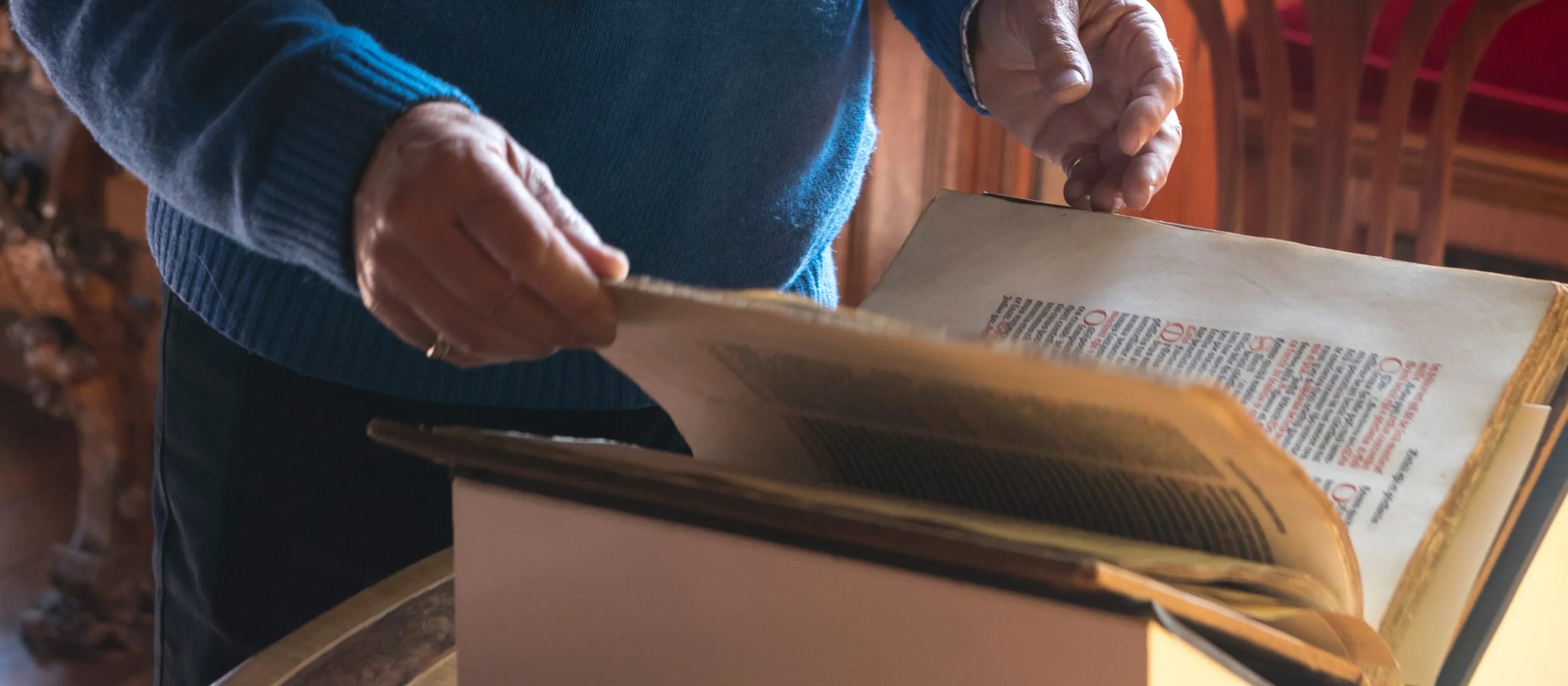
Another backer asked about the tipped-in illustrations in Master and Commander. They wondered about adding additional points of attachment to the tipped-in drawings by Carlos Kirovsky. This lead me down the path of exploring the history, purpose, and strategies for tipped-in illustrations.
For hundreds of years, illustrations have been tipped in to the pages of books. The reason is quite simple: the best methods of reproducing images and printing type are rarely the same. As I have written previously, the history of book illustrations has been one of artistic and technological evolution. Woodcuts, etching, engraving, stone lithography, halftones, silkscreen, photographs, and modern archival giclée printing each create images of different qualities and styles. Rarely is a printing press the best way to reproduce an image.
Tipping-in allows the book designer the opportunity to use the printing technologies and styles – as well as paper – best suited to the artwork. In such a book, two printing processes and papers are united, drawing upon the best of both worlds. This is a technique that has been especially useful when including color lithographic images popular in the 19th century and for maps of many eras. Indeed, we will be employing this approach in our HMS Victory Edition.


Traditionally, when illustrations are "tipped-in" like this, only a single edge is attached. This helps keep the paper "free." That is, it prevents it from puckering or bunching when the page to which it is attached is turned, allowing the top piece to move independently and slide over the page of the book. Doing it this way prevents such puckering. So, that is the traditional approach I used. I used a strong, archival adhesive, and the illustrations should be fine for many readings and years.
Cut to the chase
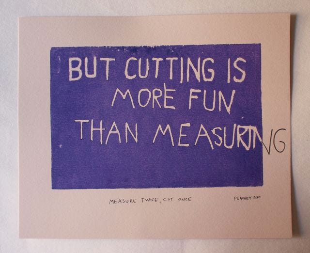
Despite this wonderful woodcut by master book conservator Jeff Peachey, precise measurements are essential to both bookbinding and box making. Each piece of the clamshell box for our edition of Master and Commander requires careful measuring and even more careful cutting of materials. In addition to ensuring a fine product, it also keeps me from additional visits to the emergency room, something my lovely wife appreciates. She once suggested one of those workplace “ # days without an accident” signs for the studio. Fortunately, that number is now nearing triple digits (at least accidents that require the attention of a medical professional). But I digress…
Each solander/clamshell box for our edition of Master and Commander requires 30 pieces – paper, board, leather, card and wood – each cut individually:
10 different sizes of 2.5mm thick binders board (13 pieces in total)
6 pieces of colorplan paper from England (in their Claret color)
2 pieces of standard card stock
3 pieces of the map that have been giclée printed on paper from Japan’s Awagami Factory paper mill
3 pieces of goatskin from Siegel Leather who specializing in bookbinding leather
2 pieces of marbled paper from Jemma Lewis carefully cut from the same sheet as the copy of the book it will hold
and, of course, one wood label made of wood salvaged from HMS Victory as part of its current restoration.
So, that is 2,700 pieces cut and carefully assembled. It should come as no surprise then, that much of the past week has been dedicated to cutting everything needed to complete to boxes.
It is only now that I have come to fully appreciate the fact that I spent so much time calibrating the century-old John Jacques & Sons board shear I added to the studio this past February (and briefly discussed then).


Designed to cut large, thick pieces of binders board, it is a beast of a machine. When it arrived a year ago, I sent the 45 inches/114 centimeter blade away for professional sharpening. Once I reinstalled it, I carefully adjusted the guide to ensure it was at a precise 90 degrees to the blade. Failure to do so might be disastrous (from a bookbinding perspective, at least). If, for example, the guide diverges by just a single degree, a piece of board might be 2 inches/50 millimeters wide on one end and 2.5 inches/63 millimeters at the other. It would be hard to make a rectangular box with such divergence. Fortunately, this wonderful tool still does with aplomb what it was built to do 100 years ago.


So, progress on the clamshell boxes is moving ahead with alacrity. I have moved from board cutting to tray assembly.


Thanks for all of the positive feedback. Other updates will be forthcoming, but for now, it is back to box-making so that the rest of the books can make their way to readers. Happy new year to you all.
I am thrilled with my Anchor Edition! I do have one bit of feedback you might consider for future projects. On the spine, both the gold lettering and the red background are similarly reflective and the letters are not embossed. Most of my older volumes have embossed lettering on the spine and the texture makes the lettering far more legible under varying light conditions.